

 Zara Logo PNG
Both the Zara brand and the logo have a long history, and they attract even those who have little to do with fashion. There is more about Zara than just ever-changing fashion.
Meaning and history
![]()
There are not so many brands that have such a large global recognition as Zara does. Its stores, located in almost every big city in the world, are the number one shopping destination for men and women of different ages, but with a value of beauty and style. The logo of the famous brand has always been strict and simple to accent the customer’s attention to fabrics and silhouettes of the fashion collections of the label.
1975 — 1980s
![]()
The very first Zara logo was introduced in 1976 and stayed with the iconic Spanish fashion brand for quite a long time. It was a diagonally oriented rectangular emblem with the two corners on the right part cut, decorated by a knot. The label was drawn in black, with two thin white stripes along the top and bottom sides, and the smooth and heavy uppercase logotype was written in white serif characters and underlined by the “Tiendas de Moda” tagline, which translates from Spanish as the “Fashion Stores”.
1980s – 2008
![]()
The very first logo for Zara was created in 1975 and featured a classy and chic serif lettering, executed in monochrome. All capital letters of the brand name’s inscription were solid and perfectly balanced, and its typeface was very similar to such fonts as TT Tsars Bold and Calmius Semi Bold, but with the contour of the letter “R” modified.
2008 — 2019
![]()
The redesign of 2008 slightly changes the logotype, keeping its style and mood. The letters were now placed far from each other, and featured shortened and flattened letter shapes. The new square style makes the brand look more confident and serious, pointing to expertise, authority, and timelessness.
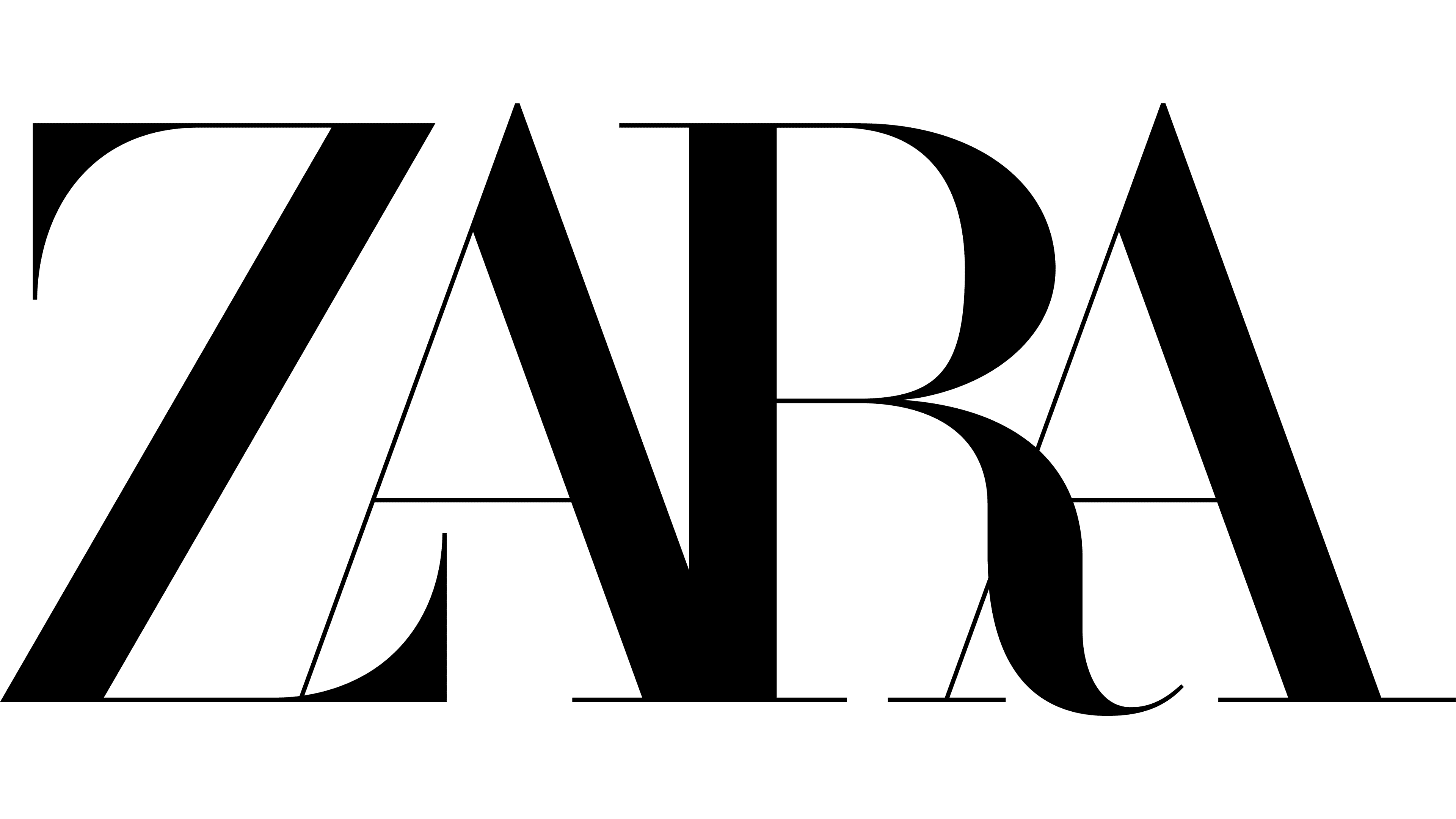
2019 — Today
In 2019 Zara logotype was changed again, keeping the monochrome palette and elongated sheriff of the bold letters. The current wordmark is executed in a custom font with tall narrowed letters intertwined on their bottom parts, and the bar of the letter “R” curved and elongated.
Symbol
The Zara symbol is just a combination of four Latin letters, which is known worldwide. The brand founder firmly rejected the idea of creating a highly meaningful (and fairly expensive as any high quality product is believed to be) symbol or logo. The four letters were to encode the new brand’s ultimate policy of making trendy products as simple and available as themselves.
Instead of using ad trailers and big boards, Amancio Ortega followed a different path. Scores of Zara stores appeared in Spain, then Portugal and other European countries (as well as overseas). Each particular store was a precursor of the new. First, they presented replicas of old collections and, later, brand new ones created within the renowned two weeks.
Every year Zara comes up with thousands of new pieces of clothing. It is noteworthy that they are made in Europe, not in countries with cheap workforce (and often poor quality). Zara uses an outstanding marketing strategy, as it has dumped annoying ads. Each customer is free to choose what he or she likes, thus cementing the brand’s reputation and generating highest profit. The cash is invested in new stores.
Emblem

The Zara emblem has conquered Europe. Spain surrendered first, Portugal – second. However, today it is France that has the largest number of the brand’s stores, as it hosts scores of ones with signboards sporting the Zara emblem. The French are among the pickiest fashion lovers, aren’t they! Both casual and festival dresses should look beautiful and feel comfortable. Zara employs more than 200 designers to tailor the brand to every buyer.
The secret of the brand’s success lies in pinpointing individuals instead of targeting categories (not even social ones). The Zara emblem has dotted the streets of European cities. You can find it in any fashion avenue around the globe.
Why tout it? That’s odd.
New stores are exactly what is needed.
Want a new collection? Please, come over in about a week, and you will definitely find a good thing. Well, what do you think is better for you?
Zara is a symbol of a rapidly evolving trend, which the world’s top designers strive to keep up with and materialize into truly fashionable clothes for each and every customer.
Months of waiting, seasonal delays and inevitable setbacks – no!
New colors, fabric and contours – yes! Zara comprises nearly all countries of the world, which the brand owner is dressing in top quality clothes in an infinitely thorough and original way. In summer and winter alike!
Zara Man logo
![]() Zara collection for men has a slightly different emblem. While sharing its minimalistic black-and-white color palette and the typeface for the first word with the brand’s primary wordmark, the Zara Man logo has the word “Man” written in a different font. The letters, which are smaller than the main wordmark, are placed under it and positioned to the right.
Zara collection for men has a slightly different emblem. While sharing its minimalistic black-and-white color palette and the typeface for the first word with the brand’s primary wordmark, the Zara Man logo has the word “Man” written in a different font. The letters, which are smaller than the main wordmark, are placed under it and positioned to the right.
Zara Home logo
![]() The emblem for the range of home accessories consists of the two words: “Zara” and “Home.” The latter is placed below the name of the brand or next to it and has the same width and height. What is important, both the words are given in a different font than the regular wordmark.
The emblem for the range of home accessories consists of the two words: “Zara” and “Home.” The latter is placed below the name of the brand or next to it and has the same width and height. What is important, both the words are given in a different font than the regular wordmark.
Font


