

Launched in 1874, the Sydney Swans are an Australian rules football team playing in the Australian Football League. Until recently, the club used an emblem that featured the recognizable silhouette of the Sydney Opera House. However, in the wake of discussions about the rightfulness of using landmarks for logos and trademarks, the Swans have taken decision to change their own insignia.
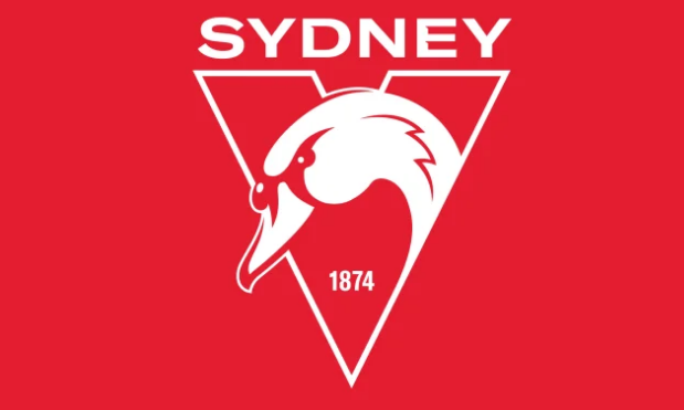
While the club’s old logo, along with the Opera House, included a swan, a big swan’s head is a main element of the new one. Although the famous symbol of Sydney was removed, we can still see a slight link to it in the feathers of the swan. In the emblem, the bird leans out of the letter “V” which is also a traditional symbol of the Swans as a reminder of the state of Victoria (the team was founded in Melbourne) as well as the Victorian Football Association, a predecessor of AFL.
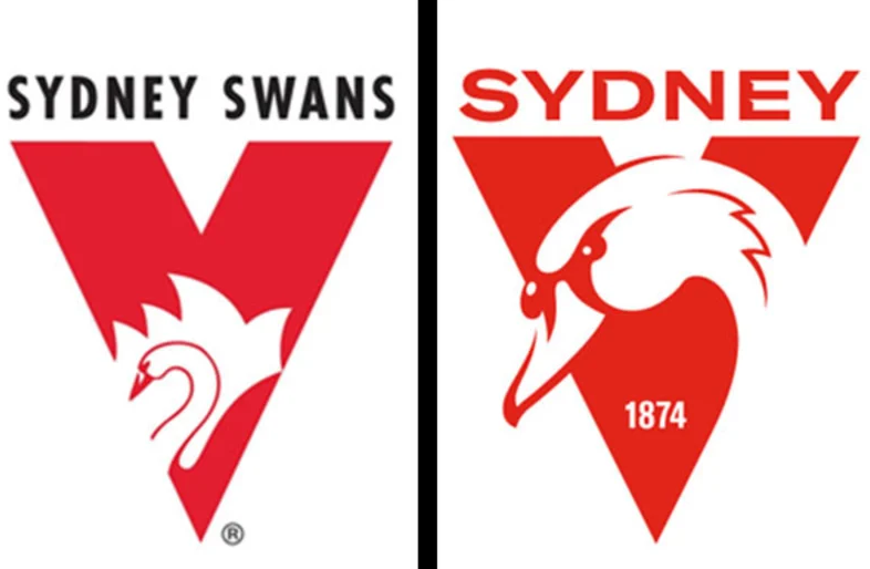
Additionally, the previous version’s black wordmark “Sydney Swans” was replaced with the “Sydney” – red or white, depending on the version – that looks more harmonious with its color and letterforms. Another new element here is “1874”, the team’s founding year – however, some people think that the emblem should display “1982” as their founding year, when the club, previously named the South Melbourne Football Club, moved to Sydney and adopted its current name, following the transformation of VLA into AFL.
Commenting on the update of the logotype, Tom Harley, the CEO of the Swans, said the new emblem is a result of the team’s aspiration to move with the times and be contemporary. Its design was based on a survey from the club’s players, stakeholders and fans.


