The New York–Penn League, a distinguished Minor League Baseball organization, operates under the ownership of Major League Baseball (MLB). This league, known for nurturing young talent, is integral to the development system of Major League Baseball. Geographically, its operations span across the northeastern United States, encompassing states such as New York, Pennsylvania, Maryland, and others. This widespread presence allows it to serve as a vital conduit for aspiring baseball professionals, offering them a platform to hone their skills and advance their careers.
Meaning and history
The New York–Penn League, established in 1939 by Ben Weisman, Cass Hough, and others, has a storied history in American baseball. Initially known as the PONY League, standing for Pennsylvania, Ontario, and New York, it has played a pivotal role in the development of players. Over the years, the league has seen numerous future MLB stars begin their journey on its fields. Its main achievement lies in its consistent track record of producing top-tier talent, contributing significantly to the sport at the national level. Presently, as part of the MLB’s restructuring of minor league baseball in 2021, the New York–Penn League continues to be a key player in the feeder system, shaping the future of baseball by fostering new talent.
What is New York–Penn League?
The New York–Penn League is a minor league baseball organization, integral to the MLB’s player development system. Operating primarily in the northeastern U.S., it serves as a breeding ground for upcoming baseball talent, playing a crucial role in shaping the future stars of Major League Baseball.
1976 – 2008
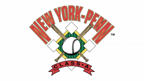
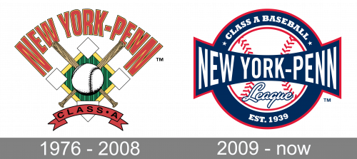
The 1976 logo is an elaborate composition. In its base, there’s a green rhomb with a yellow outline and smaller, white rhombs on the corners. Its middle is held by a big baseball image with bats crossed behind it. Above, ‘New York-Penn’ is written in curved, red letters. Below, a little red ribbon features the words ‘class A’ in black.
2009 – Today
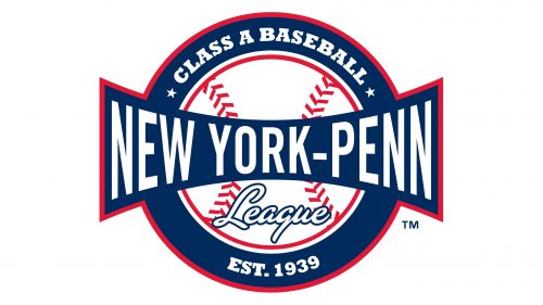
From the point of view of the color scheme and visual core, the New York-Penn League logo looks traditional. The combination of navy blue, red, and white has been used by many teams, to say nothing of the Major League and Minor League Baseball themselves. Also, there’s a white baseball with red seams.
What makes the logo recognizable is the hourglass shape of the lettering “New York-Penn” placed over the baseball. Its large ends stretch beyond the roundel creating a distinctive and memorable outline. Earlier, the League used a logo featuring crisscrossed bats and a baseball over a green square.
