Simple, effective, iconic – the New Balance logo is an example of an emblem that helps to sell. It seems to be as timeless as the athletic footwear on which it is put. The logo has retained its basic structure and overall look for almost half a century.
Meaning and history
The history of the brand dates back to 1906. It was established under the name of the New Balance Arch Support Company. It became known for its flexible arch supports, which offered greater balance and comfort in the shoe.
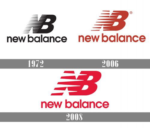
1972 – 2006
Although the company was founded more than a century ago, it was only in 1972 that it introduced its first notable logo. At first glance, it may seem very much like the current logotype, although the moment you take a closer look you definitely notice the differences.
The first logo featured the initial letters of the two words comprising the company name, “N” and “B,” blended. There were twelve speed marks (or wings) slashed across the “N.” Due to this, the logo looked dynamic and acquired a sporty feel. The name of the brand was placed below the emblem.
2006 – 2008
The symbol has gone through several subtle modifications. The most notable of them were connected with the color scheme and the number of the speed marks. There were only seven speed marks on the version of the logo introduced in 2006. In contrast to the original black-and-white logo, it featured the red “NB” and the black text “New Balance” below.
2008 – Today
Two years later, the version with five speed marks made its debut. While it is typically used with the lettering “New Balance,” there’s also a version where only the letters “N” and “B” are featured.
Emblem author
The original emblem was crafted by Terry Heckler, a prolific commercial designer and artist. Apart from the New Balance logo, he is known as the author of several well-known logos, from Cinnabon and Panera Bread to Starbucks, the ski equipment company K2, and the Seattle brewer Rainier Beer. He is also known as the person who named such brands as Starbucks, Encarta, Cinnabon, Teragren, and Palisade.
Font
The typeface looks very much like ITC Avant Garde Gothic Demibold. The font family was created by Herb Lubalin for the Avant Garde magazine.
Color
Although the color scheme has been modified throughout the New Balance logo history, it has always revolved around only three colors, red, black, and white. While the original logo was black-and-white, red was added later. Currently, there’re versions with the black-and-white and red-and-white color schemes.
How do I know if my New Balance are fake?
Apart from obvious signs, such as logo, and the quality of the seams, the original New Balance sneakers have a few hidden tricks in them. There will always be a difference in the unique numbers on the left and right sneaker on all original New Balance. If they are the same or missing, it is 100% fake. Also, on original New Balance sneakers shine an ultraviolet light on the sneaker labels, you can see the clear watermarks of NB.
Is New Balance owned by Adidas?
No, New Balance is a self-sufficient brand, which is almost as popular as Adidas and Nike, and sells its products all over the globe. The company is privately owned and has nothing to do with the Adidas corporation.
Who created the New Balance logo?
The author of the original version of the iconic New Balance badge is Terry Heckler, who introduced the dynamic and powerful badge for the popular brand in 1972. Since then, the badge was refined and modernized a couple of times by different design bureaus, but the core remained unchanged.


