Network Rail Limited owns and operates most of the railway network in Great Britain. Although the railway system in Great Britain was created by private owners, the state nationalized it in 1947. The infrastructure was operated by the state-owned company British Railways, which was known as British Rail since 1994 before being taken over by Network Rail.
Meaning and history
The Network Rail logo didn’t change that much during around two decades of the company’s history. The modifications primarily affected the palette.
What is Network Rail
Network Rail, which has been known as an “arm’s length” public body of the Department for Transport, is the owner and manager of Britain’s railway infrastructure. In 2019, its revenue was £6.6 billion, while the number of employees estimated the following year exceeded 42 thousand.
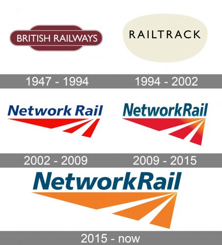
1947 – 1994 (British Railways)
British Railways had a distinctive logo featuring two parallel lines in red. On the lines, there were two arrowheads facing in opposite directions. The design, which was later used by other companies, represented two trains moving along the railroad track.
1994 – 2002 (Railtrack)
In 1994, the state started re-privatization of the railway system. It was finished in three years. Up to 2002, the owner and operator of the infrastructure was Railtrack, a group of companies created specifically for this purpose.
Its logo was nothing similar to that of its predecessor – just the name of the brand in black inside a beige ellipsoid.
2002 – 2009 (Network Rail)
When Railtrack’s operations were taken over by Network Rail, a state-owned company, in 2002, a new logo was introduced. Here, the name of the brand was set in an italicized sans above a red emblem, which represented a stylized railway track.
The emblem was a red triangle with two white stripes. There was a lot of implied motion in the image due to the proportions of the elements. The name of the brand was given in dark blue.
2009 – 2015
The design was slightly tweaked, to give it more depth and light. At the top right-hand angle of the triangle, a gold veil could be seen over the main emblem. It looked as if the sun was rising somewhere over there, and part of the railroad track was basking in all this light.
While the color of the wordmark remained dark blue, it was slightly muted and now had an obvious grayish tint. As a result, the orange veil looked brighter by contrast.
We can assume that the addition of the source of light in the Network Rail logo symbolized the motion towards the bright future.
2015 – present
The presence of the sun (or another source of light) became even more tangible due to the new palette – all the red elements were replaced by orange ones. Other than that, the design seems pretty much the same.
Since 2023 (Great British Railways)
Great British Railways (GBR) is supposed to become a state-owned public body that will replace Network Rail. It is to operate rail infrastructure and control the contracting of train operations.
Its emblem is effectively the same as that of its predecessors, British Railways (1947-1994). We can again see the familiar red railroad tracks and the “arrowhead” trains. Taking into consideration the fact that this emblem was a rather effective one, such a move seems natural.
Colors and font
From 2002 to 2023, the Network Rail logo was based on red and orange. These colors are dynamic and capture your attention.
The italicized typeface is one of the well-known ways of representing motion in logotypes. Due to the fact that there are no serifs, it looks highly legible and minimalist.


