Nemiroff is Ukrainian high-quality vodka brand, established in 1992 as one of the first enterprises in the country with foreign investments in the production of vodka. Nemiroff is ranked 3 among all vodka brands in the Duty-Free Category.
Meaning and history
Even though the world-famous Nemiroff vodka brand was founded only in 1992, its roots go much deeper into the past. In the town of Nemiroff, Vinnytsia region, the prerequisites for the creation of excellent vodka products were laid as early as the 19th century. Vodka from Nemiroff was mentioned in written sources in 1756, and in 1782 the biggest distillery was opened in the city.
Today the products of the Nemiroff brand are being exported to more than 50 countries across the globe. The company produces four lines of beverages, which include flavored vodkas in different price segments.
What is Nemiroff?
Nemiroff is an beverage brand, established in Ukraine at the beginning of the 1990s. Nemiroff is known for the production of classic and flavored vodka and is one of the most famous brands from Eastern Europe, which today is distributed all over the globe.
Old
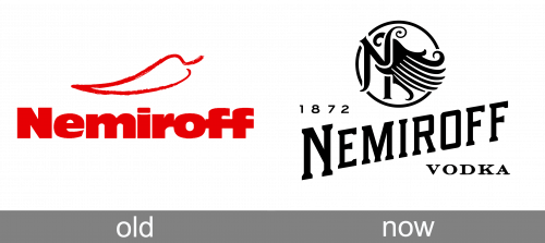
The previous Nemiroff logo was a bright red wordmark with a red hot pepper icon above it. And the first Nemiroff product that became popular worldwide was its Hot Pepper infused Vodka.
Today
The Nemiroff logo reflects masculinity and confidence. Its strict gray, black and white color palette symbolizes brave spirit and strong iron will.
The new logo design pays tribute to the brand’s history and tradition and features a wing icon, which symbolizes freedom.
Nemiroff calls itself “ a brand with soul and history” and it’s visible in every detail of its logo. Bold typeface, strict simple lines, yet very sentimental meaning of the wing image.
Font and Color
The geometric uppercase lettering from the primary Nemiroff badge is set in a custom serif typeface with thick lines and heavy serifs on the ends of the bars. To make the look of the logo more elegant and light, the lettering was placed diagonally, and the first letter was enlarged. The closest fonts to the one, used in the Nemiroff insignia, are, probably, Granic Slab Medium Italic, or Sharplion Regular, but with some modifications of the contours.
As for the color palette of the Nemiroff visual identity( it is based on a plain and flat shade of black, with all elements set against a white background, creating a powerful composition, which looks actual, and can be accompanied by any ornament or pattern.


