Need for Speed is one of the most popular raging video-games across the globe, which was released in 2002 by Electronic Arts. Today the game is owned by Criterion and is considered to be one of the most successful in history, with over 150 million copies sold.
Meaning and history
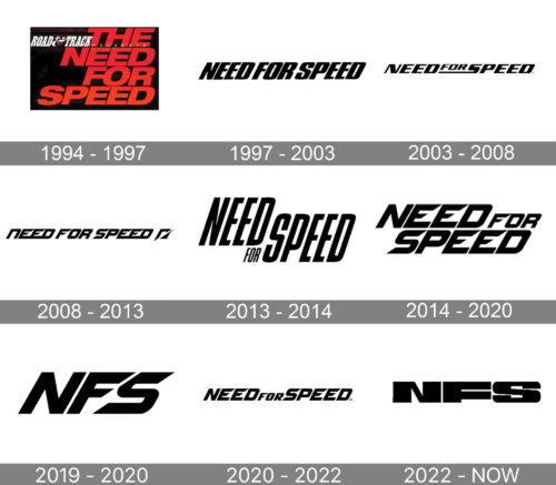
The Need for Speed visual identity was always text-based but has undergone five redesigns during the game’s history. It’s bold and strong wordmark was refined and gained more power with every change.
What is Need for Speed?
Need For Speed is the name of a popular video game in the racing genre, which was first introduced at the beginning of the 2000th, and by today has released several volumes, selling more than 150 million copies worldwide.
1994 – 1997
The original Need for Speed logo was designed in 1994 and featured four levels of the wordmark, each word on its separate line. All capital letters of the inscription were executed in a simple and neat sans-serif typeface, which was slightly italicized. The color palette was gradient red, which was the most intense in the upper part of the nameplate and became orange on its bottom part. It looks pretty dynamic and bright on the black background.
1997 – 2003
The redesign of 1997 brought a new typeface to the logo. The letters in a narrowed bold sans-serif font are now more inclined, which evokes a sense of speed and race. The logo looks simple yet strong.
2003 – 2008
In 2003 the “For” lettering gains a smaller size and is placed on the elongated tail of the letter “S”. This was something new for the brand’s visual identity, but it was a symbol of movement and high speed.
2008 – 2013
The new sharp typeface appears on the Need for Speed logo in 2008. The letter “N” is written in the lowercase, but has the same size as the other letters of the inscription. Letters “E” in both words are connected to each other and to the “D”. All the horizontal bars of the wordmark have a diagonal cut and pointed angles, which looks modern and powerful.
2013 – 2014
In 2013 the game simplified its logo. Now the simple sans-serif lettering with nar-rowed elongated letters creates the logo composition. The “For” is in smaller letters and placed under the “Need”.
2014 – Today
The redesign of 2014 combines two latest versions of the Need for Speed logo. All the letters are capitalized and separated from each other, but the diagonal cut of “E” and “F” horizontal bars is taken from the 2008 logo design.
The logo from 2014 replicates the gradient red from the original logo, but now it goes from left to right — from purple to light orange.
The Need for Speed logo is simple yet modern and evokes a sense of speed, energy, and dynamics. It looks bright and recognizable and is suitable for any placement.
2019 – 2020

The complete wordmark turned into a monogram in 2019. The bold black “NFS” was written in the same custom typeface as the logotype in the previous version, with the letters italicized and the edges of the “F”s horizontal bars cut diagonally, standing for speed, movement, and strength. This minimalistic approach became a really good choice for the brand, as depicted the essence and character of the famous online game better than any previous badge.
2020 – 2022
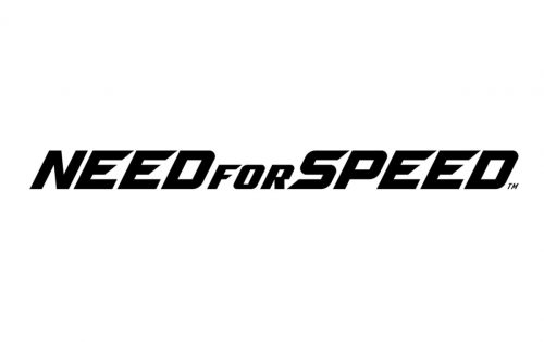
The redesign of 2020 brought back the concept from 2014 but placed the lettering in one line. Nothing but the disposition and the size (the letters of the wordmark for a bit smaller) changed here. It was still a black italicized inscription in a modern and exclusive sans-serif typeface with diagonal elements and clean lines, representing speed and freedom.
2022 – today
Font and color
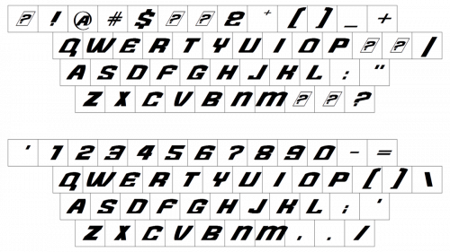
The bold and dynamic italicized uppercase logotype of the famous video game Need For Speed is set in a custom sans-serif typeface with sharp lines and diagonal cuts of the bars. The closest fonts to the one, used in this insignia, are, probably, TT Supermolot Neue Expanded Black Italic and Speed a regular, but with the contours of the glyphs modified.
As for the color palette of the Need For Speed visual identity, it is super laconic and minimalistic: black on white. This allows placing the logotype on various background, and decorating it with different colorful elements, without losing its strong character and distinction.


