Navistar is the name, which was given to the International Harvester Company in 1986. Today the American brand, specialized in the production of buses, trucks, and military vehicles, distributes its products not only in North America but on almost all continents, being one of the most well-known and reputable companies in its segment.
Meaning and history
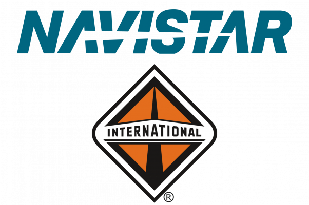
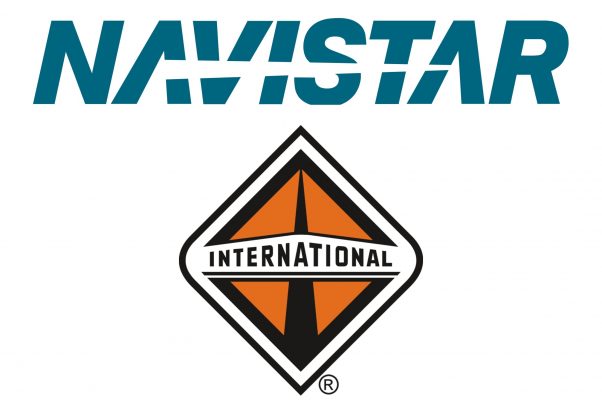
The Navistar logo has never been redesigned. The simple text-based badge was introduced in 1986 and still stays untouched today, though, for Navistar International, it is placed above another emblem — a rhomboid crest in a completely different style and color palette.
The official Navistar logo boasts a bold italicized inscription in all capitals of a stylized sans-serif typeface. From the first letter “A” to the second one there is a sharp white line crossing the inscription. It looks like a cut blade, which not only replaces the horizontal bars of both “A”s but also adds sharpness and strength to the character of the logo.
The calm blue color adds a sense of reliability to the energy and motion of the Navistar visual identity, making it softer and fresher. There is also a monochrome version of the brand’s logo, and being darker, it represents the power and masculinity of the American brand.
When used for Navistar International, the blue and white logotype is placed above the modern silver badge, located on a black background. The badge featured a rhomboid shape with top and bottom angles pointed, and the side ones — rounded. The orange body of the crest is outlined in black and has a thin tall triangle also in black, placed vertically in the middle. The thick silver frame of the medallion is accompanied by a thin horizontal banner with the “International” inscription in all-caps on it.
Font and color
The Navistar logotype in the uppercase is executed in a custom sans-serif typeface with thick lines and traditional shapes of the letters. This italicized inscription is based on one of the classic fonts, such as Helvetica Black Italic and Integral CF Demi Bold Oblique, but with some modifications.
The blue and white color palette of the Navistar visual identity represents the trustworthy and reliable company, which values the protection and comfort of its customers and aims to implement all the available innovations in the production of its vehicles. Sometimes the logo changes its shade to sea-blue, which looks even more friendly and relaxing than the original color.
As for the International badge, its color scheme consists of orange, black, and silver, colors of masculinity, strength, and energy, which also stand for confidence and progress.


