

![]() Planned Parenthood Logo PNG
Planned Parenthood Logo PNG
If you take a closer look, the Planned Parenthood logo may appear as controversial as the organization itself.
Meaning and history
![]()
Planned Parenthood is a very reputable and professional organization, specialized in sex education and reproductive healthcare. The specialists of the organization help people all over the country through more than 600 clinics and centers.
Planned Parenthood was created as a successor of American Birth Control League, an organization, founded by Margaret Sanger, an American activist, writer and nurse, whose target was a proper sex education of young population of the USA.
What is Planned Parenthood?
Planned Parenthood is the name of a non-profit American organization, which was established in 1916, and today has more than 600 clinic across the country, where distorts and specialists consult the population on reproductive healthcare, and sex education.
Before 2009
![]()
The original PP logo depicted a black emblem and a wordmark next to it. The emblem was a letter ‘P’ of sorts, but sharpened to look like a leaf. The organization’s name on the right was written in black, serif letters in a mundane style.
2009 – 2012
![]()
In 2009, the logo was turned into a blue rectangle with the name written on it. The style changed to fully capital letters with a sans-serif style.
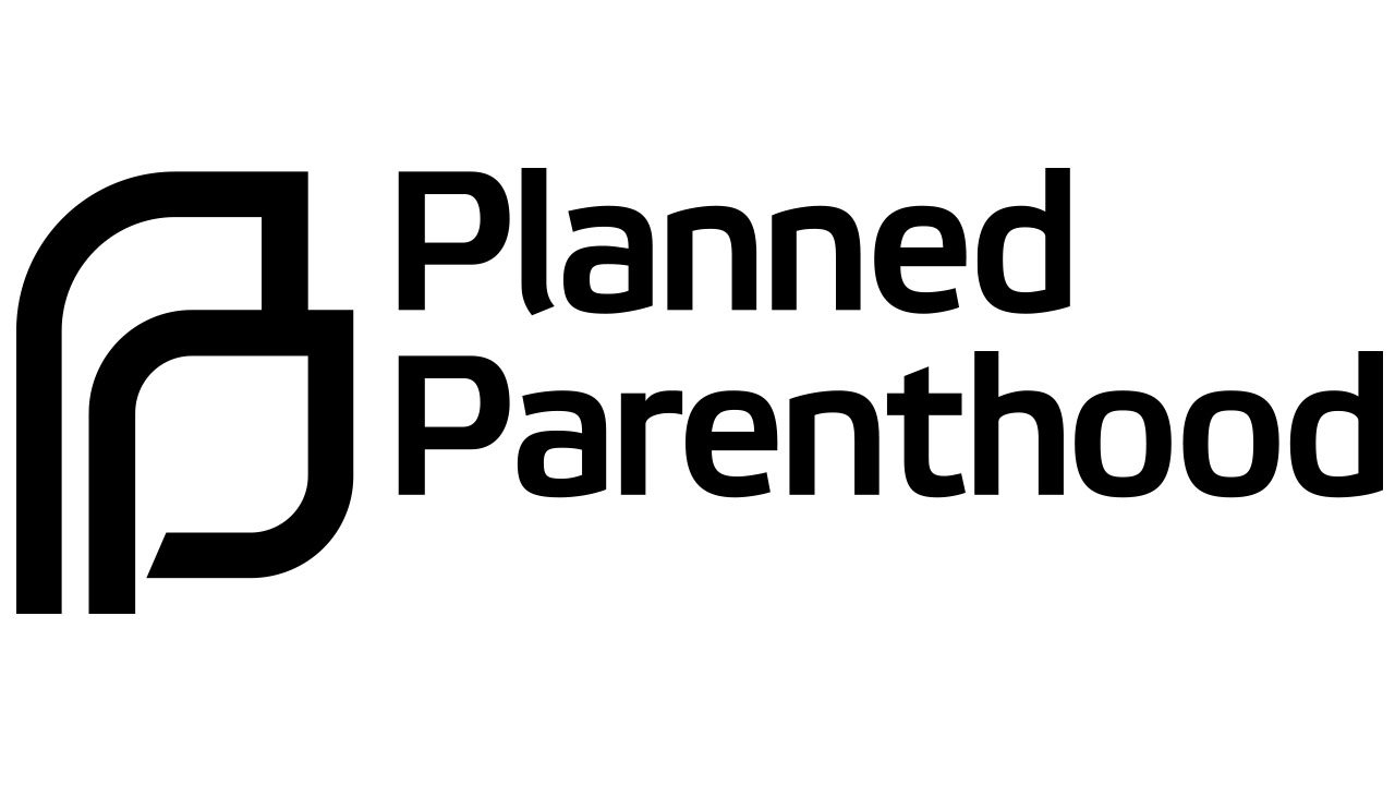
2012 – Today
The icon consists of two elements of a similar structure positioned one in front of the other. From the one hand, these elements can be regarded as two “P’s” (the initials of the organization’s name). From the other hand, it can be a man and a woman.
Also, it can be interpreted as a parent and a child. In this case, it’s interesting that the line of the smaller “p” is cut, not finished.
Typographical part of the symbol
Flexo Bold is the name of the type featured on the logo. On the wordmark, the font looks almost untouched, with only slight customization. For instance, if you take a look at the “e” on the logo, you’ll notice that its end is somewhat shorter than that in the original font.
Keeping this fact in mind, you may also notice many letters both on the source font and the logo have similar “cut” ends. While this is especially visible in case of the “l,” you may notice that the “a” and “d” are also shorter than average.
Interpretations of the emblem
The fact invites a variety of interpretations. Critics will establish a symbolic link with the abortion (Planned Parenthood is the largest single provider of abortions in the U.S.), while supporters will regard it as a broader symbol of anything that has to do with birth control and cite the words of Megan Crepeau of the Chicago Tribune, who called Planned Parenthood the country’s “largest abortion preventer.”
Font
![]()
What about Flexo Bold itself? The geometric sans serif font family Flexo was developed by Ben Blom in 2011 and released by the Durotype type foundry. According to the company, it’s its most successful font (MyFonts Most Popular Fonts of 2012). Also, the authors claim the main feature of the type is the combination of “mathematical straightforwardness and humanistic refinement.”
This is a squarish font, which is specifically noticeable in the structure of the “o’s” and “d’s.” The font family includes a variety of weights.
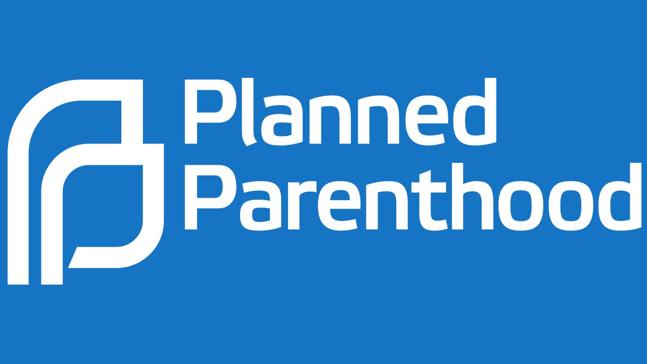
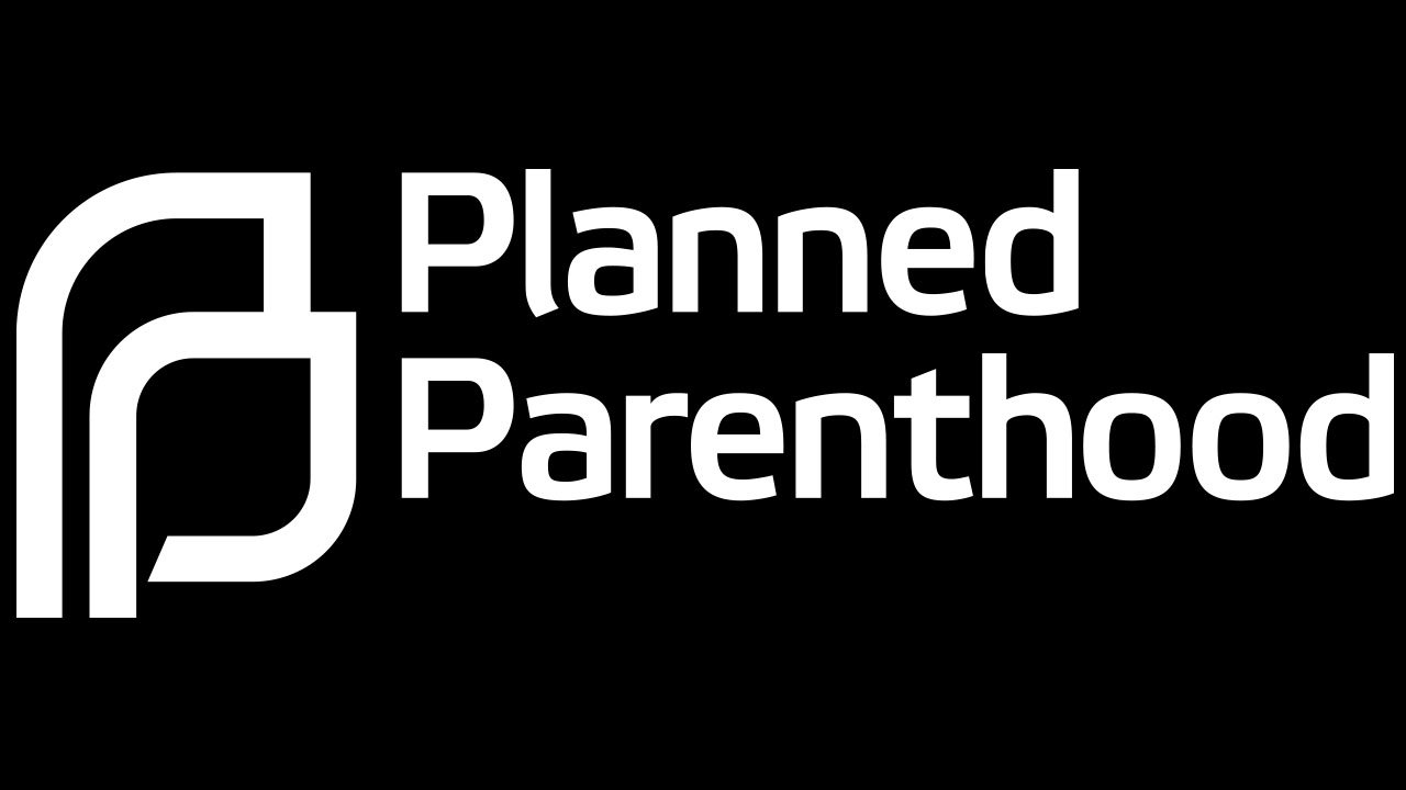
Colors
![]()
The color dominating the logo is sky blue, while the background is white. If you want to reproduce it, you may try the shade with the following coordinates: hex: #1775C2 or RGB: 23/117/194.
We should also point out that the palette can be slightly different. For instance, the design of the organization’s official website requires a darker hue of blue. Also, here, the palette of the Planned Parenthood logo is reversed: the background is dark blue, while the letters are white.


