 National Basketball League of Australia Logo PNG
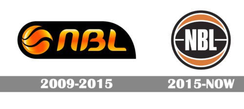
In 2015 the National Basketball League of Australia launched its new logo. While the previous emblem was over-stylized and embarrassing, the new one is minimal and has common sense. Yet, some critics think that it has a retro look, the one from the 1980s. What is more, basketball fans find it similar to the Detroit Pistons logo.
Meaning and history
The current NBL Australia logo consists of an icon and a wordmark to the right of it. The icon is a circle that is supposed to be a basketball with an oval inside it and the letters “NBL” in the centre.
The color palette includes black, orange and white. The orange color refers to a basketball. Indeed, people see a standard FIBA ball in the design, orange with black lines. The “NBL” may be white on black or black on white (an inverted variant of the logo).
2009 — 2015

The visual identity of the National Basketball League of Australia, reduced in 2009, featured a dark color palette and bold modern d sign. It was a smooth horizontally oriented banner in solid black, with a gradient orange-to-yellow emblem followed by a mix-case logotype on it. The emblem featured a stylized basketball, with the right parts of its three segments slightly elongated and waving. As for the abbreviation, the first letter was executed in the lowercase, while the “B” and “L” were set in capitals, although all letters featured the same size and thickness.
2015 — Today
The wordmark “National Basketball League of Australia” is in all caps. The sans serif typeface provides excellent readability.


