

![]() My Chemical Romance Logo PNG
My Chemical Romance Logo PNG
One of the most popular rock bands in the US, My Chemical Romance has gone through several logotypes since 2001, when it was founded.
Meaning and history
![]()
Probably the first notable My Chemical Romance logo was the one that could be seen on the cover of the band’s second album, Three Cheers for Sweet Revenge. It contained the name of the band in white against the black background.
2002 – 2004
![]()
The very first logo for My Chemical Romance was created in 2002 and is completely different from the classy and clean emblem we all can see today. The original composition featured a white handwritten wordmark with all the letters jumping, placed on a bright gradient pink and yellow rectangular background.
2004 – 2006
![]()
The redesign of 2004 changes the concept of the band’s logo to a more minimalist and strict. The new inscription was written in white lowercase letters of a smooth and bold typewriter-style font. The lettering was placed in two lines on a solid black background.
2006 – 2016
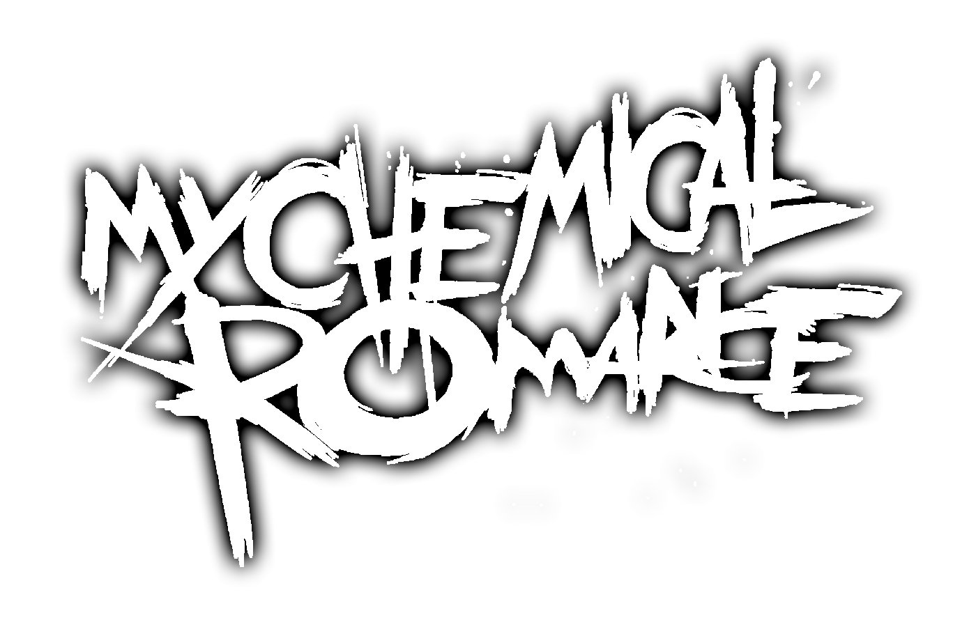 The Black parade logo (2006) featured a new, “scratched” typeface.
![]()
2016 – 2019
![]()
In 2016, the band posted a teaser video featuring a new logo, which was nicknamed “MCRX.” It was based on a cross, where each of the ends was divided in two pars curling outwards in opposite directions.
There was a letter on each of the corners. Three of them were the first letters of the band’s name (“M,” “C,” and “R”), while the fourth one, the “X”, as the Roman numeral for “10”, supposedly symbolized the 10th anniversary of The Black Parade album. This explanation seems perfectly logical, as the logo was released for a reissue of that album.
2019 – 2022
![]()
The logo, used by My Chemical Romance at the beginning of the 2020s featured a black and white composition with the small image of a burning candle placed in the upper left corner of a banner with a heavy stylized MCR monogram in a gothic style, with the letter “R” placed slightly lower than two others.
2022 – Today
![]()
In 2022 the new badge of My Chemical Romance was introduced. This time it is a very simple minimalistic insignia with the two-leveled name of the band written in a heavy and stable sans-serif font, where each letter is absolutely monumental, and evokes a sense of confidence and style.
Font
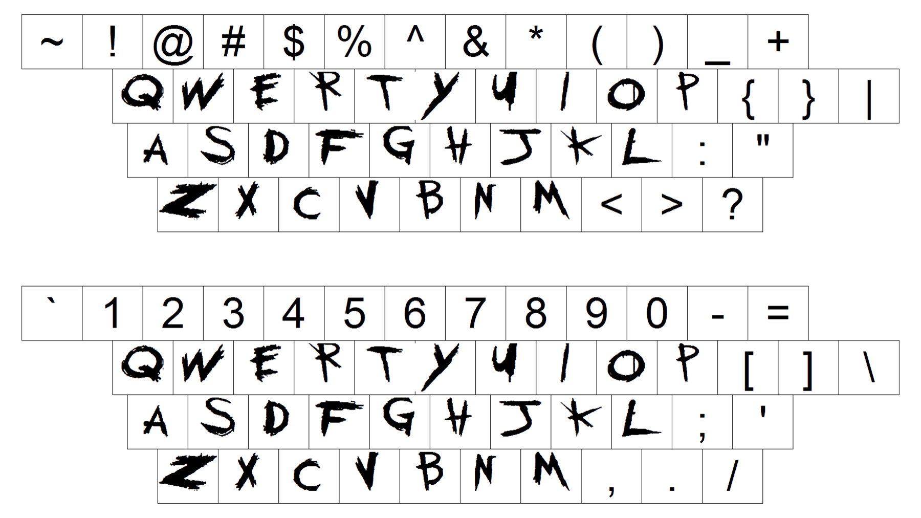
The letters “M”, “C”, “R”, and “X” on the 2016 My Chemical Romance logo were given in a bold sans serif typeface looking rather generic.
Color
![]()
The band has been consistent in its color palette: the combination of black and white was featured in the logos for the second and third albums, as well as the 2016 reissue of The Black Parade.


