

![]() MSN Logo PNG
MSN Logo PNG
The MSN (The Microsoft Network) is a web service presenting a collection of IT services and applications for Windows and mobile devices. The portal was founded in 1995.
Meaning and history
![]()
The visual identity of the Microsoft software has undergone many redesigns throughout tit history, and different styles were adopted by the brand until they finally found its unique image in 2000, which turned into the current iconic badge, instantly recognizable across the globe.
1995 — 1998
![]()
The very first MSN logo was introduced in 1995, with the launch of the product. It was a bright and strict black rectangular badge, stretched horizontally, with the “Welcome to MSN” lettering set in two levels. The first part was placed above the main wordmark, executed in a simple sans/serif typeface in light gray, white the “MSN” part had two first letters capitalized and written in white, while the “N” was in the lowercase, and featured red color and bolder lines.
1995 — 1996
![]()
In 1995 the whole inscription was executed in the lowercase. But the “N” was still written with thicker lines and featured scarlet-red shade, while other letters were thin and black. The wordmark was placed on the upper right corner of a pretty complicated composition, consisting of a large graphical part, where the halt of the globe had different icons around it, and a delicate sans-serif tagline “The Microsoft Network” in black.
1996 — 1998
![]()
In 1996 the black badge returns to the MSN visual identity, but this time it is a vertically oriented rectangle, with the lettering set also vertically and complemented by a yellow gradient circle, placed in its bottom left corner. The two first letters of the wordmark were set in the upper case again.
1998 — 2000
![]()
In 1998 a completely new badge was created for the brand. It was a horizontally stretched red oval with white lowercase lettering on it. The “N” had its right bar thickened with a red addition, repeating its contours. The “Microsoft” tagline was placed under the emblem and written in the same red color.
2000 — 2010
![]()
The iconic butterfly with its wings in four official Microsoft colors appeared on the MSN visual identity in 2000. This logo has stayed with the brand for ten years and is considered to be the most well-known among all the versions. The butterfly with transparent wings is blue, green, red, and yellow, was placed on the right from the bold italicized lettering in blue.
2009 — 2014
![]()
In 2009 the butterfly is being modernized and refined, while the wordmark changed its color to gray and its typeface to a stricter and lighter sans-serif, which looked more professional and serious.
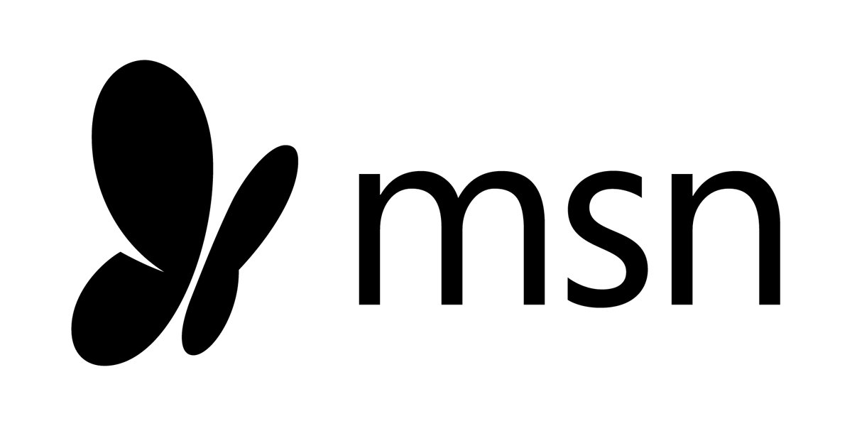
2014 — Today
![]()
The redesign of 2014 simplified the MSN color palette to monochrome, making both the lettering and the emblem black. The butterfly with its rounded wings is now placed on the left from the lowercase lettering, which is executed in a clean narrowed sans-serif typeface, looking modest and minimalist.
Symbol
The butterfly, which has followed all MSN logo versions since 2000, is a symbol of freedom, joy, and love.
Emblem

The new logo changed as dramatically as did the website. This MSN logo version appears on all new MSN products.
Font
![]()
The MSN logo uses a font from the san serif family.
Color
![]()
The logo is entirely black. This color symbolizes excellence and integrity.


