Miro, originally known as RealtimeBoard, is a digital collaboration tool designed to foster visual communication, collaboration, and problem-solving across teams. Founded by Andrey Khusid and Nikolay Bezhko, this platform has transformed how organizations conceptualize and strategize. Miro operates on a global scale, serving companies everywhere from Silicon Valley to Southeast Asia. Their expansive canvas, which offers features such as sticky notes, drawing tools, and templates, facilitates effective remote and in-person teamwork. The platform’s robust integrations with other tools make it an essential hub for many businesses seeking to innovate and streamline their workflows.
Meaning and history
Miro was established in 2011 by Andrey Khusid and Nikolay Bezhko. Initially named RealtimeBoard, it rebranded to become the globally recognized platform it is today. Over the years, Miro’s primary achievement has been in revolutionizing digital collaboration, offering an expansive interactive whiteboard interface that supports brainstorming, project planning, user story mapping, and more. The platform has since garnered millions of users and facilitated collaboration for big names like Netflix, Shopify, and Twitter. Miro continues to expand its reach, solidifying its position as an indispensable tool in the modern work environment, especially in a world increasingly reliant on remote collaboration.
What is Miro?
Miro is a collaborative online whiteboard platform established in 2011 by Andrey Khusid and Nikolay Bezhko. Designed for distributed teams, it provides tools for brainstorming, planning, and visual project management, making remote teamwork more efficient and interactive.
2011 – 2012
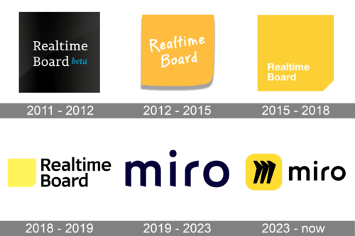
Drenched in a profound shade of black, the first logo radiates a sense of professionalism and modernity. At its core, the phrase “Realtime Board” is presented in a sleek, white typeface, a stark contrast to the shadowy backdrop, ensuring immediate attention. Accompanying the primary text is a teal-colored “beta” – a hint of the software’s developmental phase, suggesting ongoing innovation and enhancement. The choice of the color teal breaks the monochromatic scheme, adding an element of intrigue and depth. Its simplistic design, combined with the bold choice of colors, embodies the perfect blend of elegance and forward-thinking. The message is clear: this is a platform where real-time collaboration and innovation are paramount.
2012 – 2015
Bathing in a warm, sun-kissed orange hue, the second logo exudes a sense of warmth, approachability, and dynamism. It features the phrase “Realtime Board” artistically hand-scribbled in white, infusing a touch of human essence into the digital realm. The hand-written style reflects a personal touch, evoking feelings of creativity, spontaneity, and organic brainstorming. Its playful curvature contrasts the linear rigidity typically associated with board software, positioning itself as a user-friendly, approachable platform. This version seems to advocate for brainstorming sessions that feel as organic and spontaneous as jotting down ideas on a notepad. The inviting palette and design hint at a user-centric platform that values creativity and collaboration.
2015 – 2018
The logo showcases a vibrant golden-yellow background that covers almost the entirety of the rectangular design. In bold, centered typeface, the words “Realtime Board” stand prominently, taking up a considerable portion of the vertical space. The typography is modern and crisp, exuding an air of professionalism and innovation. The color choice of golden-yellow, often associated with energy, positivity, and creativity, hints at the dynamism and collaborative spirit the brand may represent. The simplicity of the design ensures memorability, while its boldness promises reliability and authority in its domain.
2018 – 2019
This design offers a fresh and minimalist take on the brand’s identity. Set against a stark white backdrop, a square, filled with the same golden-yellow hue as seen in the first logo, sits to the left of the brand’s name: “Realtime Board”. The square is slightly tilted, almost as if it’s a sticky note on a board, echoing the brand’s name and possibly its function. The typography is bold and assertive, yet the spacing between letters offers a breezy, modern feel. This logo speaks to a younger, tech-savvy audience. Its design suggests efficiency, innovation, and a forward-thinking approach, making it perfect for a brand that’s likely rooted in technology and collaboration.
2019 – 2023
The Miro logo featured in the first image is minimalist, yet has an iconic presence. Dominated by a deep navy hue, it employs a clean and modern typeface that emphasizes simplicity and clarity. The letter “m” is seamlessly integrated into the design, with smooth, flowing curves that evoke a sense of fluidity and openness. Above the lowercase “i”, a circular dot stands out, adding balance and breaking the monotony of straight lines. The typography feels inviting and user-friendly, reflecting a brand that is both accessible and forward-thinking. Its design leans on the contemporary, hinting at the brand’s tech-oriented nature and its role in facilitating collaboration in the digital space. The absence of any flashy graphics or intricate designs underscores Miro’s commitment to providing a straightforward and efficient user experience.
2023 – Today
This variation of the Miro logo is an ensemble of striking contrasts and bold choices. The backdrop is a vibrant, sunlit yellow square which instantly grabs attention. Centered on this yellow canvas is a trio of diagonal, black slashes, reminiscent of forward arrows or fast-forward symbols. These slashes convey a sense of motion, direction, and speed, symbolizing rapid innovation and progress. Just beside this abstract emblem, the brand name “miro” is spelled out in a more reserved, yet assertive black typeface. The juxtaposition of the bright yellow and the solid black creates a visual tension that is both compelling and memorable. The lowercase “i” retains the signature dot, bridging the design elements of the two logos. Overall, this logo version hints at a dynamic, evolving brand, always on the move, yet grounded in its core identity.


