MinuteClinic is a brand of a medical service retailer, created in 200 by CVS Health. It was the first company of our type in America and today had over a thousand locations across the country.
Meaning and history

The retail healthcare provider, Minute Clinic, is a brand, owned by the CVS Health corporation. As part of the pharmacy business, the company sells prescription drugs and consumer products, including health products, and manages citizens’ drug benefits. In addition, CVS provides health insurance services, including dental and mental health.
The chain of clinics was established by CVS Health in 2000, and started a very fast development, so that by today, it already has almost a thousand locations across the country, serving millions of patients.
What is Minute Clinic?
Minute Clinic is part of CVS Health, a network of urgent care clinics that offer a wide range of health services, from coronavirus and flu shots to smoking cessation assistance. The division was formed in 2000, and by today has grown into a huge chain with more than 800 locations across the United States.
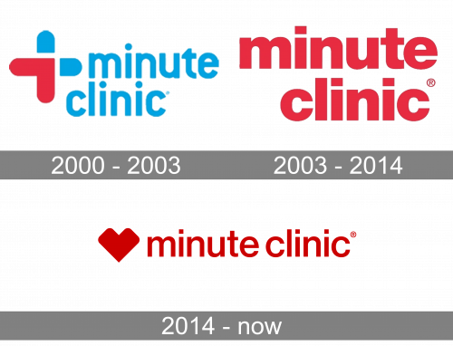
2000 – 2003

The 2000 logo depicts the firm’s name written in turquoise lowercase letters, in addition to an emblem in the left top corner. This emblem is a combination of the blue healthcare symbol (the cross) and the number ‘1’ colored in red (referencing their ‘1-minute’ service).
2003 – 2014

The later logo is instead just the name, written in red lowercase letters in more-or-less the same style as the previous one. They are bigger and wider, but otherwise very similar.
2014 – Today
The MinuteClinic visual identity is based on the logo of its main company, CVS Health. The wordmark is complemented by the iconic emblem on its left.
The MinuteClinic nameplate in all the lowercase lettering is executed in a simple sans-serif typeface, which is Helvetica. The inscription looks neat and tidy, yet modern and strong at the same time, due to the use of a scarlet red color.
The famous CVS emblem, the main element of the MinuteClinic visual identity, is a stylized image of a heart, with straight lines yet rounded angles. It looks contemporary and confident, showing the company’s progressive approach and power.
The red color palette of the MinuteClinic logo is a reflection of passion and love, with which it treats its clients. Red also evokes a sense of strength and authority, which are two important qualities of one of the healthcare segment leaders.
The MinuteClinic logo is minimalist, yet stylish and modern. It is instantly recognizable and represents the company as a forward-looking and innovative.
Font and Color
The bold lowercase lettering from the primary badge of Minute Clinic is set in a simple yet confident and distinctive sans-serif typeface, which looks pretty close to such fonts as Nimbus Sans Novus D SemiBold, or Neue Helvetica Georgian 65 Medium.
As for the color palette of the Minute Clinic’s visual identity, it is based on a deep and bright shade of red; the color, which stands not only for power and passion, but also for love and care, reflecting the main purpose of the company, and its attitude to the patients.


