While the original logotype of the Milwaukee Bucks basketball team featured a friendly cartoonish buck, the following versions have been “serious” and even aggressive.
Meaning and history
Over the first 25 years of its existence, the club has been very consistent in terms of its branding. It stuck to one and the same cartoon buck spinning a basketball. The animal, which was dressed in a green sweater with a capital “B” on it, was sitting on the lettering “Milwaukee Bucks” in bold black italics.
1968 — 1993
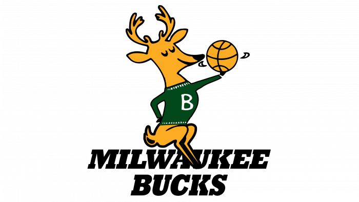
The very first emblem for the club from Milwaukee was introduced in 1968 and stayed for more than two decades. It was a funny yellow cartoonish deer in a green sweater with a white “B” on it. The animal was spinning the ball and sitting on a classy black wordmark, written in all capitals of a massive italicized serif typeface.
1993 — 2006
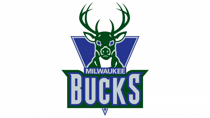 In the spring of 1993, the club introduced a completely new logo featuring a frontal view of a buck’s head. This time, the animal looked much more realistic. It was placed over a purple triangle. Instead of the yellow and black colors of the previous logo, the new one featured purple and silver, while the forest green remained. The emblem was developed in collaboration with the Marketing Department of NBA Properties.
2006 — 2015
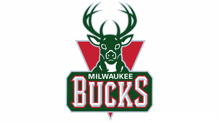 The 2006 version looked very much like its predecessor, except for the color scheme and the lettering. Now, the typeface sporting an etched effect was placed in a different frame. Purple was replaced by red.
2015 — Today
Prior to the 2015/16 season, both the logo and the uniform went through a complete overhaul. While its predecessor’s rack had 8 points, the new rack had 12 points, which was supposed to reflect a more mature animal. The buck now looked more determined and focused, even aggressive.
The logo made use of the negative space: you could notice a basketball between the antlers. Also, the buck’s chest formed the letter “M,” to remind of the team’s home city.
The emblem combined curvature and hard edges, which symbolized the connection between the rural and urban Wisconsin.
Font
Both the wordmark and the lettering of the primary Milwaukee Bucks logo is given in one and the same type looking very much like the MKE Block Varsity font. In the wordmark, however, the word “Buck,” which is placed under the “Milwaukee,” has larger letters, while the logo features letters of the same size.
Colors
GOOD LAND GREEN
PANTONE: PMS 350 C
HEX COLOR: #00471B;
RGB: (0, 71, 27)
CMYK: (80, 0, 90, 75)
CREAM CITY CREAM
PANTONE: PMS 468 C
HEX COLOR: #EEE1C6;
RGB: (240, 235, 210)
CMYK: (6, 9, 23, 0)
GREAT LAKES BLUE
PANTONE: PMS 2935 C
HEX COLOR: #0077C0;
RGB: (0, 125, 197)
CMYK: (100, 40, 0, 0)
BLACK
PANTONE: PMS BLACK 6 C
HEX COLOR: #000000;
RGB: (6, 25, 34)
CMYK: (20, 20, 20, 100)


