Microsoft Azure is a cloud platform, which is used for online storage and analytics, as well as networking and other services. It was created in 2010 and was originally called Windows Azure.
Meaning and history

Microsoft Azure is a giant platform, served by more than 160 data centers and growing every year. The service was developed by Microsoft in 2008.
The platform represents different types of cloud services: IaaS, PaaS, and SaaS, of which there are more than 500 positions with the ability to implement any tasks and projects.
Azure is used by different companies for absolutely different tasks. Some companies, implementing a strategy of developing internal business processes, choose to place their infrastructure on the IaaS model. Other companies are focused on creating software, and various applications and use Azure as SaaS.
What is Microsoft Azure?
Microsoft Azure is a cloud platform that combines both IaaS computing infrastructure solutions (servers, storage, networks, operating systems) and a set of tools and services that facilitate cloud application development and deployment (PaaS).
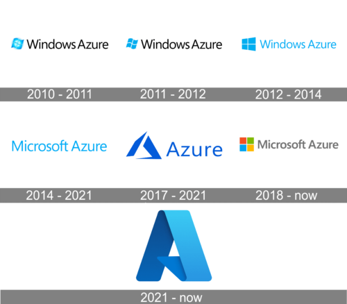
2010 – 2011

The initial 2010 logo was based off the contemporary Windows 7 logotype. It meant a wavy ‘window’ emblem, as well as the word ‘Windows’ exactly as written on the original, followed by the word ‘Azure’ in the same style. The coloring for the emblem was azure, but there was also an excessive amount of an illumination effect.
2011 – 2012

In 2011, they decide to remove the lighting, making the logo plain and monochrome.
2012 – 2014

Windows 8 came out in 2014, and the logo was thus updated. The service also changed the name from Windows Azure to Microsoft Azure, and that was reflected on the wordmark. Speaking of it, it also became azure in color. As for the emblem, it was updated to the one used with Windows 8, but nothing else changed.
2014 – 2021

The old logo didn’t contain the emblem. There was only the name of the brand in a bright and light shade of blue – it looked lighter than the current one. The type was the same, though.
2017 – 2021
Named after the shade of the blue color, Microsoft Azure’s visual identity is fully based on that sky-blue.
The Microsoft Azure logo is composed of a traditional wordmark and an emblem on its left. The inscription is executed in Microsoft’s signature typeface, which is Segoe.
The “Microsoft” part features thinner lines than the “Azure” one, which puts an emphasis on the software, not its developer.
The Azure emblem is a geometrical figure, composed of one big triangle with a white triangular cut part on its left, and a quadrangle with its pointed upper right peak.
The Microsoft Azure logo is instantly recognizable as a Microsoft brand, as it shares the same principles of the visual identity as all the other products of the legendary company. It is clear, neat and strong.
The bright blue color with white accents is a reflection of professionalism and reliability, as well as loyalty and transparency of the company.
2018 – Today

Two more additional logotypes were adopted in 2017. The first one used Windows symbols, in particular – the multicolored ‘window’ emblem. The name of the service was written in bold grey letters to its immediate right. The second is a blue letter ‘A’ made from a single piece of ribbon (or so it seems). This one was adopted as an icon.
2021 – Today
The redesign of the Microsoft Azure logo, held in 2021, has created a sleek modern emblem, composed of just one element, the three-dimensional capital letter “A”, formed by a wide blue ribbon, with its end triangularly bent to the middle, making up the horizontal bar of the character. The gradient shades of blue look serious and bright at the same time, representing the software as a trustworthy one, and its developer as a true professional.
Font and Color
The simple and modest yet bold lettering from the primary Microsoft Azure logo is set in the title case of a modern sans-serif typeface, which looks very confident and solid. The closest fonts to the one, used in this insignia, are, probably, LCT Picon Semi Bold, or United Pro Semi Bold.
As for the color palette of the Microsoft Azure visual identity, it is based on the corporate Microsoft color scheme, composed of red, green, blue, and yellow, and accompanied by a light shade of gray, standing for professionalism and excellence. The badge looks bright yet stable and strict, due to the right shade of gray, chosen for the lettering.


