The Miami Dolphins, who are members of the Eastern Division, American Football Conference (AFC East), of the National Football League (NFL), are the oldest football team in the AFC from a region called the Deep South. And the team is very proud of its historic heritage and roots, which can even be seen in the Dolphins’ logo, which is familiar to all football fans. Ever since its introduction in 1966, the Miami Dolphins logo has been using the same symbols: a teal dolphin and an orange circle representing the sun. However, the emblem has undergone several subtle modifications.
Meaning and history
Joseph Robbie and comedian Danny Thomas became the owners of the ninth AFL franchise on August 16, 1965. The same year, a competition was held for the best name for the team, and among thousands of different proposals, the name “Dolphins” took first place. The prototype for the club’s logo and name was the dolphin afalina. On October 8, 1965, at the unveiling of the new name, club owner Joe Robbie explained it by saying that Dolphins are the smartest and fastest animals in the ocean, capable of attacking and killing a shark or whale. Since then, the Miami Dolphins have lived up to their name many times over.
The history of the Miami Dolphins is full of legendary memorable moments because the legendary Dan Marino himself played for the team – from 1983 to 1999. The Dolphins played in the Super Bowl five times and won it twice (in 1972 and 1973). It is these years that are considered the most successful in the history of the club.
In 1984, the Dolphins won their first 11 straight games. Marino plays his first full season in the starting lineup and draws impressive stats, becoming the first player in soccer history to gain over 5,000 yards, and was named the 1984 Most Valuable Player of the season. The loudest and the most intense times for the team finished by the end of the 1990s, and today the club has quietly yet steadily established itself in the middle of the league’s lineup.
In terms of visual identity, Miami Dolphins is one of the football clubs with a strong value of its roots and heritage, thus it still uses a modified version of its original logo, keeping two main elements and the bright and remarkable color palette as they were created, just having their contours modernized.
What are Miami Dolphins?
Miami Dolphins is the name of a professional football club from the United States, which was established in 1965, and today plays in the East division of the National Football League. The club has Hard Rock Stadium as its home arena, Mike McDaniels as the head coach, and is owned by Stephen M. Ross.
1966 – 1973
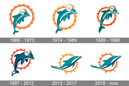
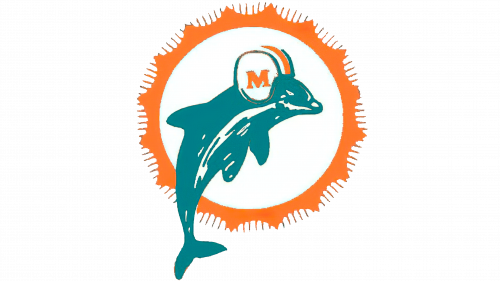
The initial emblem for Miami Dolphins featured a large white sun with an orange ring with numerous rays around it, and a friendly smiling dolphin in a white and orange football helmet, placed vertically over the abstract sun. The dolphin was drawn in intense turquoise, color of creativity, kindness, and caress, while orange stood for energy, passion, and speed.
1974 – 1989
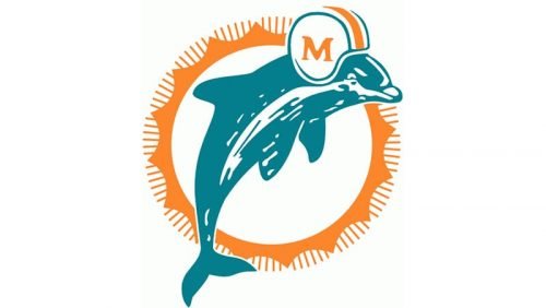
In 1974 the logo was slightly refined by enlarging the dolphin’s figure and its helmet. Now the white helm with blue and orange stripes had the serif orange “M” placed on it more distinct and visible. The contours of the sun rays were also cleaned and lines — elongated.
1989 – 1996
The redesign of 1989 brought some minor changes to the iconic Miami Dolphins visual identity. The color palette was elevated by making orange deeper and darker, and the turquoise shade with more green tone. The orange “M” on a white helmet changed its typeface and was now bolder and more massive than on the previous version.
1997 – 2012
The logo version, introduced by the club in 1997 was cool and fun, wrapped into a modern and sleek execution. The dolphin and the sun were redrawn in thicker and smoother lines, adding some dark blue touched to the dolphin’s body. The face of the mascot was now more detailed, as well as the helmet on its head. The stripes and the “M” got their contours cleaned and strengthened. The silhouette of the sun was also modernized, and all the thin rays were erased, leaving only a bold circle with pointed elements, which looked minimalist yet confident.
A secondary version of the logo featured the same dolphin, but placed on a white background, without a sun-disk, though it was holding a white football between its fins, and the ball had four orange lines coming out of it, to represent speed and power.
2013 – 2017
After the club’s rebranding in 2013, the new logo was adopted by Miami Dolphins. Though it is fully based on the original version, the contours of both the sun disk and the dolphin were cleaned and modernized to represent the progress and growth of the club, and add a contemporary touch to its visual identity. The dolphin was now drawn without any helmet and featured a turquoise, blue and white palette, while the sunburst had some of its lines elongated and sharp.
2018 – Today
The redesign of 2018 was all about the emblem’s color palette, and the only shade that was changed was orange, which turned darker and closer to red. The new palette looks more dramatic and powerful, creates strong contrast with a white background, and makes the Miami Dolphins logo stand out.
Font
It is hardly possible to discuss the typeface, as the only letter present in the logo, “M”, was removed from it in 2013. We can mention that this was a classic, clear serif type.
Color
The iconic color scheme bears a symbolic meaning. The orange color represents the bright South Florida sun, while the teal color was inspired by the characteristic hue of the Atlantic Ocean by the local shores. A navy shade of blue has been also present in the logo since 1997.
Helmets
The design of the Miami Dolphins helmets hasn’t changed much throughout the years. It was mostly an “organic” evolution, followed by the helmet’s shape modification and strengthening the colors of the emblem. Each logo refinement of the professional football club was reflected in the new helmet design.
1966 – 1973
The very first helmet of the Miami Dolphins team was introduced in 1966 and featured a solid white background with a triple turquoise and orange stripe in the middle, and the iconic Dolphins emblem in the same color palette, drawn on the side.
1974 – 1979
In 1974 the Dolphin from the emblem was moved a bit higher, and now the head of the animal was overlapping the orange circular frame (before it was located a bit more down, with the head under the frame’s upper part). All other details remained unchanged.
1980 – 1989
The redesign of 1980 was all about the grille of the helmet. First of all, it got bigger and safer. Secondly, its color was changed from the calm grayish metallic to intense turquoise, the same as the one, used for the emblem of the team.
1989 – 1996
The contours of the dolphin in the emblem were modified, and the shade of turquoise both in the graphical elements on the helmet and on the grille got darkened up. Hence, the helmets started looking brighter.
1997 – 2012
In 1997 the graphical elements, drawn on the white Miami Dolphins helmets were refined and modernized, with cleaner lines and bolder strokes. This was the last design from the “first” Dolphins era, which lasted up to 2012.
2013 – 2017
Radical changes to the logo, uniform, and Helmet of the Miami Dolphins football club took place in 2013. The redesign has played with the shades of the team’s visual identity and refined the contours of the dolphin, which is placed on the sides of the Dolphins’ helmets.
2017 – Today
The white helmets of the players today have a wide turquoise stripe enclosed between two thin orange ones, coming through its middle, and the turquoise dolphin, drawn over the bright orange ring on the sides. There is also an option of a helmet design with a glossy turquoise background with thin orange stripes.
Uniform
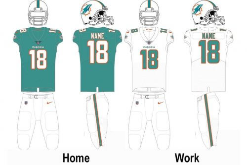
The official color palette of the Miami Dolphins club is based on four shades: aqua blue, marine blue, white, and orange, although orange is used only doll for small details, which looks very stylish and exquisite. The club has two options for the uniform: the aqua-blue jerseys with white and orange decorative elements,white pants with aqua and orange stripes; and the white uniform with blue pants and delicate orange and white details. Both options look very fresh on the field and distinguish the players of the club from their competitors.
Stadium
Logo
View
Since 1987 Miami Dolphins play at Hard Rock Stadium, an arena with a capacity of 64,767 seats. It is the second home ground for the football club from Florida. The first was Miami Orange Bowl stadium, where the club was playing until 1986. The Orange Bowl Arena was built in 1937 as Burdine Stadium and closed in 2008. For the last few years, the arena had a capacity of 72,319.
Miami Dolphins Mascot
The mascot of the Miami Dolphins football team has a very unusual name — T. D. The official meaning is that it’s an abbreviation for “The Dolphin”, while the non-official one is short for “TouchDown”. T. D. was first introduced to the public in 1997, and since then its design hasn’t changed much. The gray creature is wearing a white uniform with turquoise detailing and looks very determined yet friendly.
Miami Dolphins Colors
AQUA
PANTONE: PMS 321 C
HEX COLOR: #008E97
RGB: (0, 142, 151)
CMYK: (100, 21, 42, 2)
ORANGE
PANTONE: PMS 1655 C
HEX COLOR: #FC4C02;
RGB: (252, 76, 2)
CMYK: (0, 73, 98, 0)
BLUE
PANTONE: PMS 7701 C
HEX COLOR: #005778
RGB: (0, 87, 120)
CMYK: (100, 61, 35, 15)
Why did Miami Dolphins change their logo?
The logo of the Miami Dolphins has been changed several times throughout the years, with the most significant one held in 2013, when the white helmet with the orange letter “M” was removed from the head of a dolphin of the team’s logo. As for the latest redesign of the badge, it happened in 2018 and brought only minor changes in the color palette. This was made to strengthen the badge and to make it look more confident and progressive.
Do Miami Dolphins have a dolphin?
The Miami Dolphins club used to have a real dolphin for two years in the 1960s. But today the mascot of the club is a man in a dolphin costume. Although in 1966 — 1968 the real dolphin mascot of the club was a local celebrity. The creature used to show tricks after each win of the team.
When did the Miami Dolphins change their helmet?
The white helmet with the stylized orange letter “M” has been a part of the Miami Dolphins’ visual identity for decades and was completely removed from the badge in 2013, causing a lot of contradictions among the club’s fans. Many still say that the club has to bright the helmet back.
Does Gloria Estefan own the Miami Dolphins?
The Miami Dolphins football club is owned by Stephen M. Ross, a famous American businessman, and real estate developer. As for Gloria Estefan, she and her husband Emilio Estefan, bought a minor stake in the Miami Dolphins club in 2009.


