 Mexican Primera División Logo PNG
Meaning and history

The Liga MX is considered the main league within the Mexican football league system. Its history started in 1943, and today it includes almost 20 clubs. The name of the organization as well as its brand identity has been changing depending on its sponsor. In the summer of 2013, BBVA Bancomer was announced as the official sponsor, and two years later the deal was extended until 2019.
1991 – 2012

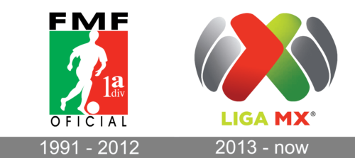
The bold and bright logo of the Mexican Primera Division features bright and bold colors, which are also seen in the Mexican flag. For a little twenty years, this logo served as a visual representation of the league. It has a vertical rectangle as the base with a white figure of a football player and a football (soccer) ball at the bottom. The figure serves as a dividing line between the left green half and the right red half. The red portion also has “1a div” printed in white.
2013 – Today

The Mexican Primera División logo has a vivid and particularly distinctive design. It seems to have absorbed the energy of a football game.
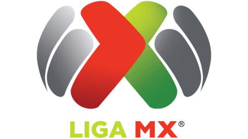
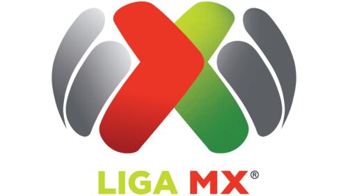
The centerpiece of the emblem is a large letter “X” formed by two ticks rotated 90 degrees in opposite directions. The tick on the left is red, while the tick on the right is green.
From both sides of the letter, you can see metallic ellipsoids. Their cool greyish shades create a great background for the vivid shades of red and green and help to create a 3D effect. Below the pictorial part of the Liga MX logo, there’s the lettering “LIGA MX” in lime green and red. It features an all-cap sans-serif type. The font is perfectly legible and transparent, although it doesn’t look highly recognizable. While the wordmark looks flat, the pictorial emblem has a gradient texture adding some dimension.


