Since 1961, when the Confederation of North, Central American and Caribbean Association Football was established in its current form.
Meaning and history
Concacaf, the Confederation of North, Central America, and Caribbean Association Football, was founded in 1961. Its inception was driven by the desire to unify football (soccer) organizations across North and Central America and the Caribbean. This unification aimed at fostering growth and development in the sport across these regions.
Throughout its history, Concacaf has achieved several significant milestones. Notably, it has been instrumental in increasing the popularity and standards of football in its member countries. Concacaf organizes various tournaments, including the Gold Cup, which is the primary men’s football championship in the region, attracting widespread attention and showcasing regional talent. Additionally, Concacaf plays a crucial role in the FIFA World Cup qualification process, creating platforms for teams in its regions to compete on the global stage.
As of now, Concacaf continues to hold a pivotal position in the world of football. It actively works towards enhancing the quality of the sport, expanding its reach, and ensuring fair play and development for all member associations. Its ongoing efforts in promoting youth and women’s football, alongside its flagship tournaments, keep it at the forefront of football governance and development.
What is Concacaf?
Concacaf is a governing body for association football in North America, Central America, and the Caribbean. It oversees the organization and promotion of football tournaments, development programs, and represents its members in international football affairs.
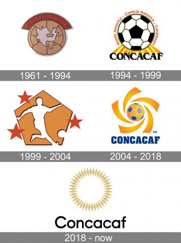
1961 — 1994
 The original CONCACAF logo depicted the area on the map where the association works. The map was placed over a large light brown football topped by an arched lettering “CONCACAF” over the red background.
1994 — 1999

The CONCACAF logo, designed in 1994, was a bit more detailed than the previous version, and showed more affiliation with football, as was based on the black and white ball as the central element. The ball was underlined by an elegant black logotype with an elongated and even exaggerated yellow and orange shadow, which was connecting the inscription with the emblem. The “North America-Central America-Caribbean” lettering in dark orange title case was arched above the football, around its perimeter.
1999 — 2004
 While the second version was also built around a football, the next logo (1999) depicted a player on a golden pentagon.
2004 — 2018
 The emblem used in 2004-2018 depicted a football surrounded by golden “sunrays”.
2018 — Today
While the 2018 logo features a circle symbolizing both the sun and football.


