Media Markt is a German commercial network for the sale of consumer electronics and household appliances. It was founded in 1979 in Ingolstadt, Germany. From the very beginning, its management decided in favour of a business strategy that relied on offering a huge assortment of goods at permanently competitive prices in a huge sales area, which later received the name of a hypermarket. Today Media Markt is the largest European retailer of consumer electronics; it operates in 13 countries from Turkey to Portugal through its 800 stores dealing with about 350 thousand articles of more than 200 brands.
Meaning and history
Media Markt was established in Germany at the end of the 1970s, and today it is hard to imagine a European country without the stores of the chain. The Media Markt assortment includes all kinds of electro domestic appliances of all possible sizes and brands, as well as gadgets and tech devices.
Since the opening of its first store in Munich in 1979, the company started growing at an impressive speed and in ten years it already had ten locations across Germany. As for the international market, the first Media Markt store outside of Germany was opened in France in 1989. And this was just the beginning, as today the company has almost a thousand locations across the European continent.
What is Media Markt?
Media Markt is a German retail chain of domestic electronic goods, which was formed at the end of the 1970s and by today has more than a thousand stores across Europe and Russia. Today Media Markt is the largest retail chain, the European leader in the market of home appliances and electronics.
1979 – 2006
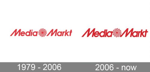
The very first logo for Media Markt was designed in 1979 and looked pretty much the same as the insignias the whole world knows today. The calm red logotype had its two parts separated by a swirl-line emblem, executed in the same color palette. The lettering was executed in a bold and smooth sans-serif typeface with the lines of the capital letters “M” slightly inclined.
2006 – Today
Media Markt logo appeared during the period of expansion of the network. It consists of the company’s name in a noticeable red colour. The letters of the wordmark resemble the commercial font ITC Avant Garde Gothic Paneuropean Demi Oblique with somewhat modified graphics. Thus, the letter “M” is inclined rightward, especially its left leg. Most of the letters are interconnected.
Between the two words of the wordmark, there is an emblem depicting a whirlwind. Apparently, the author of the idea of the emblem was Walter Gunz, one of the founders of Media Markt. He is believed to be the creator of most of the company’s extraordinary marketing campaigns and slogans, which are so well remembered all over Germany and beyond its borders. The whirlwind is to symbolize the avalanche of emotions and impressions that accompany purchases in stores in the network. Anyhow, for about 40 years Media Markt logo has been associated with innovation, determined client orientation and a comprehensive spectrum of client and post-sales reliable and high-quality service.
2006 – 2018 (Russia)
In 2006 Media Markt created a separate logo for its Russian stores. The composition and style remain untouched, but the color palette was switched from red on white to fuchsia pink on white. Sometimes the logo could be placed on dark backgrounds, and it made the insignia look even stronger and more stylish.
1991 – present (Italy)
On the Italian market, the brand chain is called Media World, this is why the logo is slightly different. By the only difference is in the wordmark, which is also executed in an intense red and white color palette and features the same swirl emblem dividing the two parts of the inscription. The “World” part of the logotype has its first capital “W” drawn exactly like the “M”, just turned upside-down.
Font and color
The Media Markt logo has the inscription as its main part, and this inscription is set in a custom typeface, which makes the badge memorable and instantly recognizable. The title case Media Markt wordmark is set in a sans-serif font, which has some contours in common with Gacor Regular and TT Fors Display DemiBold, but the main feature of the lettering is the “M”, with its left bars diagonal.
As for the color palette of the Media Markt badge, it is based on a bright and intense shade of red, a color of warmth and love, of passion and energy. And this is how the company, which provides its customers with good deals on domestic electronics and small electronic goods, shows its values. For the retail chain, it is important to make their buyers happy.


