JCPenney is the name of one of America’s leading chains of department stores, which was established at the very beginning of the 20th century by James Cash Penney. Today the chain has more than 800 locations all over the United States and Puerto Rico.
Meaning and history
JCPenney is a brand that in the USA has already become synonymous with a department store. In the JCP locations, which by today are counted as almost 900 across the United States and Puerto Rico, you can find literally everything from clothing and accessories to electronics. One of the largest American retailers has annual sales of around 12 billion USD.
Shopping at JCP is affordable, as JCPenney positions itself as a hypermarket for the middle class and specializes in selling a wide range of goods from mass-market brands. The store quite often holds promotions and makes discounts on different types of goods, which allows you to buy things famous brands for a relatively low price.
What is JCPenney?
JCPenney is the American chain of departments stores, which offers a wide range of clothing for the whole family, along with houseware, electronics, and cosmetic products. One of the largest retailers in the USA was established in 1902 and by today has grown into a chain of almost 900 locations.
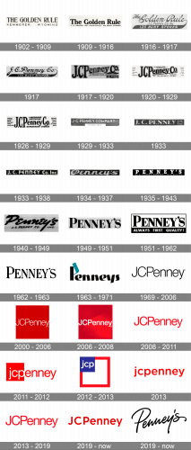
As for the visual identity, JCPenney had many experiments with its logo throughout the long history of the chain. There have been almost two dozen emblems created for the retailer during the years, but all of them are based on the wordmark.
1902 – 1909
For the first fifteen years, the name of the retailer was “The Golden Rule”, so three logos in the very beginning were designed with this name in the core. The very first logo for JCPenney was introduced in 1902 and stayed with the brand for almost seven years. It was an elegant uppercase logotype in a fancy serif typeface with tall letters and a hostile ally stretched underline.
1909 – 1916
In 1909 the logo was redesigned for the first time. The uppercase inscription was replaced by the title case one, and the elegant typeface with thin lines was changed to a bold and stable one, with thick bars and rounded serifs. The tagline was rewritten, got more text in it, and its typeface was also switched to something more traditional. This version stayed with the retailer for another six years.
1916 – 1917
The last logo for The Golden Rule was introduced in 1916, and stayed active for just a few months, as the chain of department stores got rebranded in 1917. It was a script logotype with the elongated tail of the last “E”, which was curved to the left underlining the wordmark. The “JCPenney Co Inc” lettering was set between the top line of the inscription and the bold black underline, while the “125 Busy Stores” was set on the tail itself.
1917
After the rebranding of the retail chain, “The Golden Rule” inscription was replaced by the “J. C. Penney Co”, with the delicate “Incorporated” set between it and the curved tail with the same “175 Busy Stores” tagline. The number of the stores and the new naming were not the only changes of the new logo, as the typeface was also refined and emboldened, getting more professional and confident.
1917 – 1920
A few months later the JCPenney logo was redesigned again. This time it was an extra-bold serif lettering in thick lines and a thin double outline. The narrowed and tall “JCP” was set on the left, with the “enney” coming out of “P” diagonally, and being underlined by a white banner framed into two horizontal lines. It was “A Nation-wide Institution” in fancy cursive, with the new number of stores, 297, written on a black crest, in the bottom right corner of the logo.
1920 – 1929
In 1920 the badge gets refined and the contours of all elements are being cleaned and strengthened. Now the company had 475 stores across the country, and it was reflected in the new badge, being written under the main part of the logo, in all capitals of a stable and solid serif typeface.
1926 – 1929
The diagonal direction of the logo’s part was switched to straight horizontal after the redesign of 1926. The typeface of the badge was switched to a more elegant one, with slightly rounded ends of the bars, and narrowed contours of the letters. The logotype was complemented by “A Nation-Wide Institution” in the uppercase of a slanted sans-serif typeface on top, and the “Department Stores” in the same typeface under it.
1929 – 1933
In 1929 the visual identity of JCPenney became more minimalist and contemporary. The white uppercase logotype in a clean and bold sans-serif typeface was now set over a dark-gray background and accompanied by a white rectangular banner, horizontally stretched under the wordmark.
1933
For a few months in 1933, the company used a fancy automaker typeface with bold letters and elongated sharp serifs. The most interesting elements of the inscription were the two “N”s, with their diagonal bars thick and elongated, going out of the letter contours up and left. This white on darks gray composition didn’t stay with JCPenney for long.
1933 – 1938
A few months later the new logo was introduced. Gray was replaced by black, and a fancy serif typeface — by a modern sans-serif with a mix of uppercase and lowercase letters, rounded bars, yet straight cuts of the lines. In this version, the eye-catching elements were the two “E”s with their horizontal bars elongated and stretched to the left.
1934 – 1937
In 1934 the brand was renamed Penney’s, and the first logo of the new chain was introduced in the same year. It was a bold and smooth cursive inscription in white, set on a plain black rectangular banner with a white outline. Sometimes the script lettering was accompanied by the sans-serif badge from 1933, set on its right in a smaller size.
1935 – 1943
With the redesign of 1935, the script lettering was replaced by a bold white serif inscription with a massive stable letter set on a solid black background. The geometric contours and straight cuts of the lines made the badge look powerful and trustworthy. The logotype was underlined by an uppercase inscription in the same font but thinner lines.
1940 – 1949
In 1940 the alternative version of Penney’s badge was introduced. Executed in a cool and modern hand-written cursive with bold lines and strokes, it looks very self-sufficient and strong, with its unique character and determination. There was also a version where the inscription was set in all capitals, it did look different, but the mood was very close.
1949 – 1951
In 1949 the company decided to come to basics and rewrite its logotype in all capitals of a bold traditional serif typeface, with the first letter slightly higher than all others. The black inscription was set over a plain white background without any additions, not even a tagline, which everyone got used to seeing on JCPenney’s badges.
1951 – 1962
The inscription was refined and emboldened in 1951. It was also enclosed into a black rectangular frame, with the bottom line thicker than others, and having an uppercase sans-serif “Always First Quality” written over it in white. A very simple composition but clean and distinctive execution, which together made a modern and powerful badge.
1962 – 1963
For a few months in 1962, Penney’s logo was executed in a new slightly narrowed serif typeface with tall letters, bold lines, and massive triangular serifs. The first letter was enlarged compared to others. No additional elements were present on the badge. Simple and clean, it o my stayed with the company until the end of 1962.
1963 – 1971
In 1963 Peter Schladermundt Associates bureau designs a completely new concept for Penney’s logo. It was a bold custom logotype in a title-case, with the first letter composed of two elements, black and turquoise, where the turquoise part was drawn like a flag, placed a bit diagonally, pointing up and left.
1969 – 2006
Starting in 1969 the company decided to slowly brighten the JCPenney name back as a primary one. Hence for the first two years, the new logo was used along with Penney’s one and starting in 1971, it was the only emblem used by the retailer. The JCPenney badge, designed in 1969 featured a lightweight sans-serif inscription in a modern and clean typeface with the black letters set on a white background. Simple as it is.
2000 – 2006
The redesign of 2000 redrawn the JCPenney logotype in white color and placed it over a solid red square. The new color palette looked powerful and evoked a sense of passion and style. It is curious, that the new badge had an old motto at its core. In the very early years of the company’s history, its motto was “Fair and Square”.
2006 – 2008
In 2006 the white lettering became bolder, and the red square gained some gradient shades, making the upper part darker, and the bottom right segment — lighter. The two-part of the badge were diagonally split with a wavy line, coming from the bottom left corner to the upper right one. The square also gained a thin frame, also in red, hence not very visible.
2008 – 2011
In 2008 the solid red square was removed from the JCPenney visual identity, and now the lettering was set in red over a plain white background, with no additional framing or decorations. This is, probably the most famous logo of the retailer, ever created, and can still be seen on some of the brand’s locations.
2011 – 2012
The company went through a complete rebranding in 2011, and now its name was written in the lowercase. The new logo was executed in a red and white color palette, with the horizontally stretched rectangular banner visually split into two parts/ the solid red square on the left, and a white rectangle on its right. Over the red square there was a white lowercase “JCP” in a traditional sans-serif type, and over the white part — a red “enney” in the same style and font.
2012 – 2013
The redesign of 2012 was held after Ron Johnson became the CEO of the company. He decided to completely change the look of the retailer and introduced the new logo. It was now a large white square in a thick red frame, with a small solid blue square in the upper left corner. The white lowercase “jcp” was written over the blue square, making the whole badge look like the American flag.
2013
The redesign of 2013 brought back the minimalistic approach to the JCPenney visual identity. The lowercase logotype in a full-shaped sans-serif typeface with bold lines and clean contours was set in a bright shade of red over a white background. Powerful yet simple and friendly.
2013 – 2019
The red sans-serif lettering, used by the company as the official badge in 2008, was brought back to the JCPenney logo in 2013 and stayed untouched until 2019. Its simplicity was brilliantly blacked by the bold and bright color, creating an elegant and passionate mood.
2019 – Today
The redesign of 2019 brought back the traditional way of writing the name of the retailer, with the first three letters capitalized, and the last five in the lowercase. The inscription was set in a darker shade of red, which looks more professional and exquisite. As for the typeface, it features modern and bold shapes, which look cool and progressive.
2019 – Today
The Penney’s logo, created in 2019, is designed with a completely new approach. The name of the brand is set diagonally in a hand-written cursive typeface with smooth elegant lines. It is written in black over a light beige background, which looks very warm and smooth.


