

![]() Darty Logo PNG
Darty Logo PNG
Darty is a French chain of retail stores that mostly sells appliances, electronics and hardware. It’s one of the biggest such brands in the country, and some of the oldest (active since 1957). The company merged with another electronics vendor, Fnac, in 2016, creating the company Fnac Darty.
Meaning and History
![]()
The company was created in 1957 by the Darty family. They originally sold textiles and clothing but went on to offer furniture, electronics, appliances, computing hardware and more. Through their Fnac part, they also sell cultural products like books, DVD, CD, games and also electronics.
The company was created in its current form in 2016, when Fnac and Darty merged into a single entity. Darty has already become a well-known major chain of retail stores, and it’s now become the biggest such company in France, with branches in Western Europe, Africa and the Middle East.
What is Darty?
Darty is a chief French chain of retail stores that sells electronics, hardware, appliances and many other products. It was opened in 1957 and quickly became one of the main sources of such wares for many Frenchmen (and even abroad). In 2016, they merged with another chain of electronics, Fnac.
1957 – today
![]()
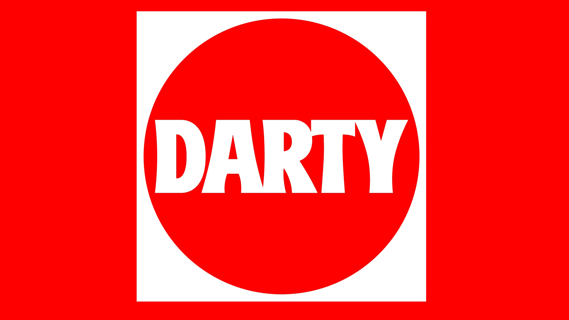
The original Darty logo, still used in many instances, is a red square with a white (sometimes black) circle put in its center. In the middle of that circle is a black (alternatively white) line of text that spells the company name, ‘Darty’. The letters are all bold and capitalized, written in a sans-serif font.
It’s still used on many Darty stores, with preference given to the version with the white circle and black letters.
2016 – today
![]()
This logo is used for Fnac Darty as a single entity, mostly for corporate purposes. It depicts the name, ‘Fnac Darty’, written in one line of text. It can be either black or white, but the letters are universally capitalized. Unlike the previous design, they are thin and quite white. The font is also simpler regular sans-serif.
Beneath this line of text is a thin horizontal line of color, about half the length of the text bit and placed squarely in the middle. Its left half was colored yellow, and the right – red. These two colors correspond to the Fnac and Darty parts of the brand, respectively (yellow being Fnac’s brand color).
Font

The Darty’s main font, used since 1957, used bold and fully capitalized letters. They were also tall and somewhat thick in the lines. They didn’t simply use straight strokes, though. These characters were commonly curved and bent into more artistic shapes and corners. The font of Fnac Darty, by comparison, is a simple sans-serif.
Color
The main color of the Darty brand itself is bright red. Other hues were used in the branding, such as white and black, but red is what they are mainly associated with. So much so, the interior decorations of Darty stores heavily use red. The Fnac Darty style by comparison uses colors more sparingly and doesn’t really prefer any single hue.


