 Dick’s Sporting Goods Logo PNG
Dick’s Sporting Goods is the name of the most popular sports equipment retail company in the United statesman which was established in 1948. Today the company has almost one thousand sports shops across the country and has its place in the Fortune500 list.
Meaning and history
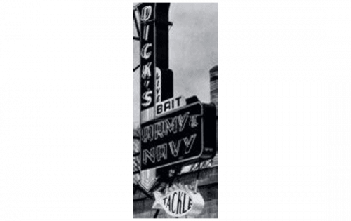
1948 – 1958
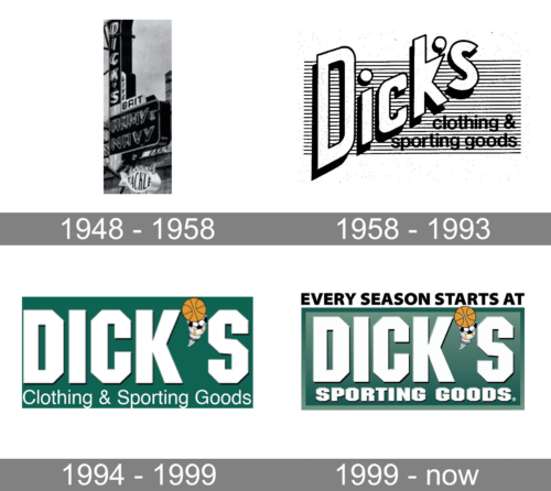
 Dick’s Sporting goods was established in the 1940s under the name Dick’s Army & Navy, and it obviously specialized in clothing and accessories for military men. The first logo was a simple wordmark, where the “Dick’s” inscription was placed vertically under the 90-degree angle to the square with the “Army & Navy” wordmark was placed in two levels. It was a minimalist logo, which still looked bold and solid.
1958 – 1993
The name of the company was changed to Dick’s Clothing & Sporting Goods then years later, in 1958. And for the next thirty years, the retailer used another text-based logo, executed in red. It was a diagonally placed “Dick’s” lettering in a bold sans-serif typeface, with the “clothing & Sporting Goods” in lowercase placed on the right and set in two levels.
The logo was pretty modest and minimalist, yet due to the use of bright colors, it was bright and instantly recognizable.
1994 – 1999
The new era for the retailer’s visual identity started in the 1980s. The company was still known under the “Dick’s Clothing & Sporting Goods” name, yet the approach to the logo design was completely changed. The new insignia was composed of a horizontally stretched rectangle in calm green color with white geometric lettering on it and a small emblem, replacing the comma between “Dick” and “S”. The emblem was a stylized image of four different sports balls in white, orange, and black.
The “Clothing & Sporting Goods” tagline was placed under the main wordmark and executed in thin white lines of a traditional sans-serif.
1999 – Now
The redesign of 1999 made the contours modern and strong and the wordmark – shorter. The name of the company was changed to “Dick’s Sporting Goods” in the same year, so the lettering on the logo followed this change.
The green rectangle gained a thick framing in another shade of green, while the whole inscription now has a thin black outline and a delicate dark shadow, which adds volume and dynamics to the logo, and makes it look more three-dimensional.


