Maxwell House is an American brand of coffee manufacturing and distribution company, which was established in 1892. Today the label is one of the most famous and top-selling not only in the USA but all over the world.
Meaning and history
While the brand was officially started in 1892, its roots can be traced even further, to 1884. It was in 1884 that Joel Cheek met Roger Nolley Smith and they started working on a perfect coffee blend.
1921
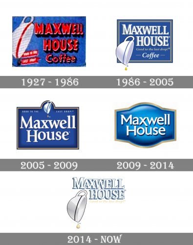
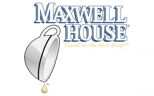
The tilted coffee cup seen on the current Maxwell House logo can be already spotted in a newspaper ad of 1921. This image was a visual representation of the slogan “Good to the last drop,” which was introduced in 1915.
1927
While newspaper ads did not give a chance to experiment with the palette, the company also used colorful labels to add a bright touch to its brand identity. For instance, you can find a version where the tilted cup had a red ring going around its border. The lettering “Maxwell House Coffee” was red here, while the background was blue – the color that has been used in the logo ever since.
1986
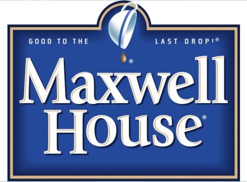
Over time, the design grew more refined. The heavy sans serif type was replaced by an elegant serif one. The red disappeared leaving the image calmer. Now, the lettering was white, while the ring on the cup was blue. You could also notice subtle gold accents.
2005
The design became slightly more minimalist and easier to grasp. To begin with, the cup grew smaller and moved to the top of the logo. The complex shades behind the letters were replaced by simpler ones. They were less visible but still provided the 3D effect. The glyphs were lowercase. There was now a little more breathing space between them.
Another very notable modification referred to the blue – it grew richer, more saturated.
2009
The saturated shade of blue on the Maxwell House logo was replaced by a lighter one. The gradient was added to the background, due to which it got a 3D effect.
While the serifs were still there, they were now somewhat unusual and unpredictable – the same was true for the very shape of the letters, too (note, for instance, the “M” and the “x” with their irregular ends).
This logo could be seen both with the cup and without it.
2014
The design forces behind the brand made one more step towards simplicity and minimalism. The old-fashioned blue shape was removed from the background. The blue, however, was still present – it now became the color of the letters and the outline of the cup, which grew more prominent and was moved to the bottom right corner. The ring on the cup grew orange, while the drop became very large and brownish.
The iconic “Good to the last drop” slogan was preserved, too.
So, while the current Maxwell House logo features contemporary type, it also preserves the brand’s visual heritage and even the slogan from 1915.


