Manitowoc is an American manufacturer of professional lifting solutions for builders and engineers. The company was established in 1902 and today has also a sub-division, which produces commercial refrigerators.
Meaning and history
One of the world’s leading manufacturers of lifting equipment, Manitowoc Company Inc. was founded in the USA in 1925.Another area of the corporation’s activity is the production of ice machines and refrigeration equipment.
Under the wingof Manitowoc Crane Group, there are companies that produce tower cranes, lattice boom crawler cranes, and industrial and mobile hydraulic cranes. The company’s products are represented by such world-renowned brands as Grove, Manitowoc, Potain, National Crane, and Shuttlelift.
The combination of Manitowoc, Grove Crane, and Potain in 2002 was driven by a desire to present the entire range of crane technology under a single corporation, thereby expanding the company’s presence in the market.
What is Manitowoc?
Manitowoc is the name of the brand, which belongs to the Manitowoc Crane Group, a division of the multinational corporation Manitowoc Company Inc., which was founded in the United States in 1925, producing America’s first lattice boom crawler crane.
Before 1999
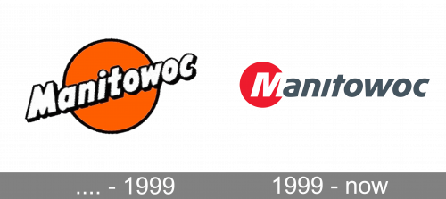
The pre-1999 design depicts an orange circle with a black contour around it. In front of it, they’ve written the brand’s name diagonally across this circle. The letters were a usual white sans-serif font with a black contour.
1999 – Today
The Manitowoc visual identity is minimalist yet bright and modern. The company’s logo is composed of a wordmark with a graphical element on its left.
The wordmark in dark gray is executed in a custom sans-serif typeface which is italicized and features rounded shapes of “a” and “n”. The letter “I” had no dot above it, although all the letters except “M” are in the lower case.
The first “M” is drawn in white and placed on a red circle, which is a symbol of energy and power. The traditional color combination shows the brand as the one which values quality and aims to provide its customers with the best products.
The Manitowoc logo is contemporary and modest, with no extra details it reflects the strength and confidence of the brand.
Font and Color
The heavy and energetic lettering from the primary logo of the Manitowoc brand is set in an extra-bold progressive sans-serif font with clean contours of the slanted title case characters. The closest typefaces to the one, used in this insignia, are, probably, Hybi11 Amigo Extra Bold Italic, or FS Split Sans Bold Italic, but with the contours of the “N” and the “T” modified, and the dot above the “I” removed.
As for the color palette of the Manitowoc visual identity, it is based on a brutal and powerful combination of Red,white, and darkgray, which looks professional, masculine, and reliable. Red is the color of strength, enhanced bygray, which also stands for quality, while white is the symbol of transparency and responsibility.


