Lucky Strike is a famous cigarette label, established in 1971 in the USA. in the 1940s it was considered to be one of the best selling labels of tobacco products in America. Today the Lucky Strike cigarettes are sold all over the world. The brand is a part of British American Tobacco.
Meaning and history
Lucky Strike Company The brand was first introduced by R. Patterson in Richmond, Virginia, as chewing tobacco and then as cigarettes. In 1905, his company became a part of the American Tobacco Company, and in 5 years the products entered the market, being a worthy competitor to Cameland Chesterfield. Cigarettes owed their appearance to a fire in a tobacco warehouse. The owners did not throw away the burnt tobacco but mixed it with normal tobacco. The result was a whole new flavor, which made the brand different from its competitors.
In 1917 a famous slogan “It’s Toasted” was introduced, telling the customer about the toasted tobacco in cigarettes. The pack itself was a soft wrapping paper, withthicker, a green paper on the outsidea red circle with a black and gold border on the front side, and the Lucky strike inscription in the middle.In the late 1920s, cigarettes of this brand were actively promoted as a product for weight loss.
As for the name of the legendary brand, it was invented by its founder. R.A. Patterson was inspired by the speculation of the gold rush era. He put into it the idea that when a consumer bought cigarettes and chewing tobacco from his company, he became the lucky one who got the gold, that is, the quality product.
What is Lucky Strike?
Lucky Strike is the name of an American cigarette brand. One of the oldest cigarette brands traces its history back to 1871. In 1905 it was purchased by American Tobacco Company (ATC), which later became British American Tobacco.
1940 – 2013
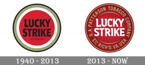
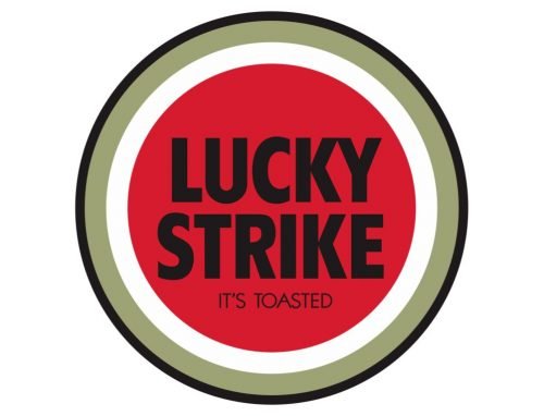
The original logo, which remained with the company from 1940 to 2013, featured the name of the brand in black inside a red circle. The red circle was followed by white, gold, and black rings, each of different thicknesses. The type was a compact, elongated, rather bold sans.
You could also notice the writing “It’s roasted” in smaller letters.
2013 – Today
Both the roundel and the lettering “Lucky Strike” in the middle were preserved. Their proportions were pretty much the same.
The new logo, which was developed by G2 Germany, resembled a seal, which made it look more precious. The combination of gold and noble red made the effect even more pronounced. The updated design was inspired by vintage hipster cool.
Font and Color
The type in the new Lucky Strike logo is slightly more unique due to the unusual elements in the ends imitating serifs.
The custom recognizable lettering from the primary Lucky Strike logo is set in a fancy geometric font with square elements slightly standing out of the straight characters’ bars. Even though this font was exclusively designed for the brand, it has something in common with such commercial types as MPI Republic Gothic and Dynamo Pro Medium.
As for the color palette of Lucky Strike’s visual identity, it is based on a sleek and elegant combination of red, gold, and white, which stands for quality, attention, and professionalism. Red is a color of power, and this red circle has been on the Lucky Strike packages for decades, while gold is the color of precision, and white is here to empha size the brand’s loyalty to its customers.


