LucasArts is an American entertainment company, which was established in 1982. The company, founded by George Lucas, is known for its video-games and films, based mainly on Starwars and Indiana Jones franchises. The company is a part of Disney since 2012.
Meaning and history
Lucasfilm Computer Divison was founded in 1979 and specialized in video games and computer graphics. In 1982 Lucasfilm Computer Divison mutated into Pixar and was run by none other than Steve Jobs. After the metamorphosis of the animation division, Lucasfilms Games, the future LucasArts, was created in 1982.
Originally a game studio founded by George Lucas in May 1982, it was a rank-and-file division of a major company. The studio’s first name was Lucasfilm Games.
The main focus of the new-found team was the Atari 2600 console and the production of the least expensive games for it. So Lucasfilms Games developed BallBlazer, based on then the hit Pong. The next game was Rescue of Fractalus – almost a cosmos game in which it was necessary to control a ship and fly around the planets to rescue crashing pilots.
Maniac Mansion, released in 1987, not only quickly became a cult, but also created a fashion in quests for false branches of the plot and useless objects.
1988 saw the birth of Battlehawks 1942, the first flight simulator of its time, which told the story of the most important battles of World War II.
From its founding in 1982 until its closure in 2013, the company released more than fifty games.The company was bought out by Disney in 2012 and was suspended in 2013, but in January 2021 Lucasfilm announced that it was reinstating the Lucasfilm Games brand for all future games in the Lucasfilm franchises as a licensor.
What is LucasArts?
LucasArts is a company, established by the famous movie director George Lucas in 1982. LucasArts is specialized in the creation and distribution of video games and film content, based on the most famous Lucas’ franchises — Star Wars and Indians Jones.
1982 – 1987
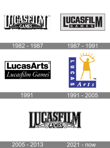
The studio’s original logo was based off the emblem of their parent company, Lucasfilm. The studio was called Lucasfilm Games back then, and they basically replaced the ‘ltd.’ part from their parent’s logo with the word ‘Games’.
1987 – 1991
This emblem was actually very similar to the one before it, except the letters now used a sans-serif font and were more geometric. Basically, instead of a curve and a gradual size increase, there letters were all sized the same, except for the two on the sides. A black rectangle with the word ‘Games’ on it was between the bottoms of these two letters.
1991

The 1991 logo was two rectangles of the colors white and black fused together into one. The white one above contained the wordmark ‘LucasArts’ in bold black letters. The black one below instead had ‘Lucasfilm Games’, written in white cursive letters.
1991 – 2005
The iconic LucasArts logo was designed in 1991. Before its creation, the company used a strict wordmark, executed in monochrome and placed inside a black and white rectangle.
The famous “Gold Guy” emblem, created in 1991, depicted an abstract scratch of a human GM with his hands up and an arch with 5 rays above him. The figure was colored gold and placed on a big letter “L”, where the “LucasArts” lettering was lo-cated.
The original version featured “L” in purple, which was later changed to blue. There was even an attempt to make the “L” three-dimensional, but that version didn’t live long.
2005 – 2013
In 2005 the LucasArts logo was redesigned again. The signature emblem remains, but gets a refined contour and now is placed above the wordmark, on a white back-ground.
The LucasArts nameplate in all the capitals is executed in an elegant serif typeface with the lower edge of the lettering slightly arched, which harmonized the arch of the emblem.
The yellow and black color palette of the LucasArts logo is fresh and sophisticated. This color combination represents the creative and powerful company and makes its logo timeless.
2021 – Today
The LucasArt badge was redesigned in 2021, introducing the reincarnation of the company ‘a original logo, designed in the 1980s. The elegantly outlined uppercase logotype, with its bottom line arched, is set above the solid black “Games”, decorated by black vignettes on the sides. The main difference between this version and the original one is the color of the logotype, and its font, which is now an outlines serif, with distinctive triangular details on the ends of the bold bars of the slightly narrowed capitals.
Font and Color
The arched lightweight lettering from the primary logo of LucasArts is set in the uppercase of a traditional serif typeface with medium-eight bars and sharp short serifs on their ends. The closest fonts to the one, used in this insignia, are, probably, Trajan Bold, or Goudy Titling Semi Bold, but with some insignificant modifications.
As for the color palette of LucasArt’s visual identity, it is based on a clean and bright combination of yellow and black, which created a strong and lively contrast with a white background. Yellow is a color of happiness and energy, while black stands for stability, professionalism, and expertise, creating a great mix of essential qualities.


