Universal is one of the most famous film studios, which was established in 1913 in the United States. Today the company has three main locations, where dozens of movies are being made annually. Being the oldest studios of the USA, Universal hasn’t lost its reputation and popularity by today.
Meaning and history
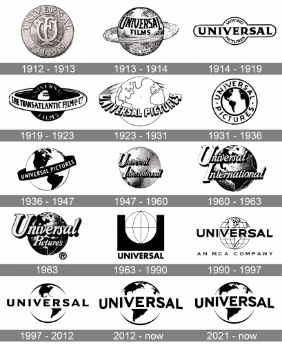
The visual identity of the world’s famous filming studio has always been consistent. Though there were more than ten redesigns made to its logo throughout the company’s history, all the versions were based on the same idea and featured a monochrome color palette, with the globe as the main graphical element.
What is Universal?
Universal is a famous American film production company, which was established in 1912 and is headquartered in California. Motion pictures of the company are known all over the globe, and there are dozens of super popular films, released by Universal throughout the years.
1912 – 1913
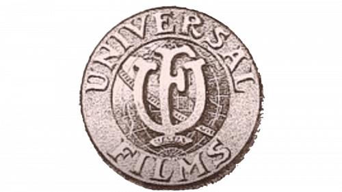
The very first logo was designed in 1912 and featured a globe with a thick orbit around it. The “Universal Films” inscription in a candy serif typeface was placed on the upper part of the globe and featured a solid black color.
1913 – 1914
The 1913 logo is a monochrome drawing of a planet with a meteor disk around its equator. The top portion of this planet is marked with the black ‘Universal Films’ inscription, done in tall serif letters.
1914 – 1919
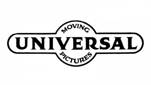
Later, in 1914 the only logo without the globe was used by the company. Even though there was no planet on the logo, the framing of the nameplate featured a big circle in the middle, which stood for the globe
1919 – 1923
Starting in 1919 the visual identity has always had a planet and lettering in it. In various combinations, with the nameplate around the globe, on it, or overlapping it, the Universal Pictures logo could be easily recognized after each new redesign.
1923 – 1931
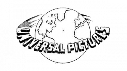
In 1923 the logo of Universal was redrawn in a lighter and more modern manner: now white became the main color and all the details were outlined in thin black lines. The lettering was set as an orbit around the planet, being written in bold sans-serif capitals with a massive black shadow.
1931 – 1936
The redesign of 1931 made the logo flat. The planet was now enclosed into a thick white frame in a double black outline, with the strict yet modern black sans-serif inscription set around its perimeter. More black details were added to the insignia, which made the whole picture look brighter and stronger.
1936 – 1947
In 1936 another version of the logo was introduced, and this version stayed with the company for almost a decade. The globe was surrounded by a black ribbon-orbit with a white “Universal Pictures” inscription on it. The wordmark was set in the uppercase of a simple hand-drawn sans-serif typeface with the letters full and bold.
1947 – 1960
The Universal logo gained a more professional look in 1947. The globe was drawn in a three/dimensional way, with lots of details and gradients. As for the inscription, it was now set in two levels and written in the title case. The modest sans-serif font from the previous versions was replaced by a fancy smooth cursive, where the neat and elegant letters got a thick black shadow, which added volume and style to the whole logo.
1960 – 1963
Stylistically, everything stayed as it were. The inscription from the previous logo was increased in size. Moreover, they finally drew continents on what was supposed to be Earth. In particular, America is the focus here.
1963
The wordmark over the globe was changed from “Universal International” to “Universal Pictures” with the upper line of the inscription being enlarged. Now the “Universal” lettering was the main and the most visible part of the badge. It was a memorable Logo, though it stayed with the company for only a few months.
1963 – 1990
The new area of the Universal visual identity design started in 1963 with the introduction of a stylish and minimalist badge. The logo was composed of a flat globe drawn in white with black lines, placed “inside” the solid black square, which was cut out on its top part, to fit the globe. It was a very contemporary and sharp image, which stayed with the company for almost thirty years.
1990 – 1997
 The new era for the visual identity design started in 1990 when the wordmark was shortened to just “Universal” lettering in all capitals. It all began with a pretty ornate globe image and bold enlarged lettering in black.
1997 – 2012
 Later, in 1997, the image was simplified and all the extra details were removed.
2012 – Today
The current version of the Universal logo was designed in 2012. It boasts a minimalist and sleek globe drawing in black and white, with the “Universal” nameplate slightly arched.
The wordmark is executed in a bold traditional sans-serif typeface, which reflects confidence and professionalism, while the arched placement adds playfulness and shows the unique character of the company, pointing on its creativity and value of style.
2021 – now
This version is exactly the same, except everything is squeezed vertically, increasing the overall breadth.


