Food Network is the name of the American tv-channel dedicated to household and cooking. The cable-channel was established in 1993 and today is owned by Discovery Group, being one of the most popular channels for housewife’s not only in the United States but worldwide.
Meaning and history
The red circular logo of the Food Network channel is known by the families all over the globe, as with this image the best recipes for their dinners are provided. The Food Channel visual identity has been pretty consistent throughout the years, and the circle first appeared on its logo in 1997. It came there to stay.
1993 — 1997

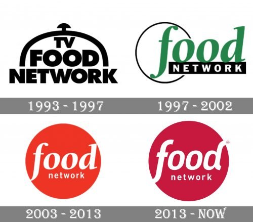
The very first logo for the Food Network was introduced in 1993 and stayed with the tv channel for four years. It was a monochrome badge with the logotype as the main hero. The inscription “TV Food Network” was set in three levels and written in the uppercase of a bold and modern sans-serif typeface. The size of the letters varied from level to level, with the middle “Food” featuring the largest letters. The whole nameplate was covered by the stylized arched cap, also drawn in thick black lines.
1997 — 2002
 The logo from 1997 featured a thin and delicate circle in a black outline, and a wordmark, set in two levels, and executed in two different styles. The upper part, “Food”, was written in the lowercase of smooth cursive serif font, and featured a calm green color, when the bottom “Network” in white capitals used a strong and sharp sans-serif and was placed inside a black horizontal rectangle.
2003 — 2013
 The logo was simplified in 2003 when the white wordmark was placed inside the red circle. This design got nicknamed “The Red Dot” and became iconic within the first year after its creation.
2013 — Today
In 2013 the logo was redesigned again. But not many things changed — the red color became a bit darker and more intense, while the typeface of the “Food” was switched from elegant serif to a modern and smooth sans-serif, making the whole logo look contemporary and progressive.
The red and white color palette of the Food Network visual identity is a reflection of passion for cooking, of the household warmth, and of the love the channel brings to each house. And the circular shape symbolizes the balance and unity of the family, harmony, and friendship.
It is a simple yet very stylish and meaningful logo, which will stay actual for many more years and will always be associated with home and the loved ones.


