

![]() Lorient Logo PNG
Lorient Logo PNG
Lorient is the name of a French football club which was established in 1926. The team played in Ligue 2 until 2020 but got promoted. Today the club, nicknamed “Les Merlus”, is managed by Christophe Pelissier.
Meaning and history
![]()
The visual identity of the French football club has always been based on an image of a fish, which stayed almost unchanged until the 2000s. The color palette of the logo has also been very consistent throughout the years, so the team’s style is easily recognizable.
1926 — 1994
![]()
The original logo, designed for Lorient in the 1920s has stayed with the club for al-most seventy years.
1994 — 2002

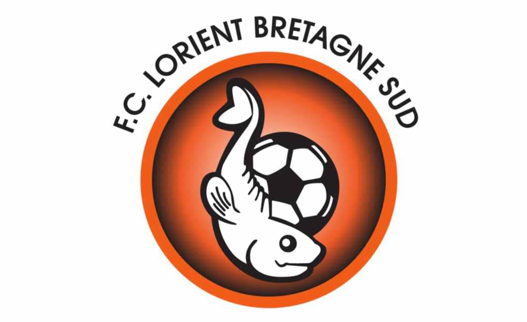
In 1994 the iconic image was placed on a solid orange circle, which was enclosed in a thick black frame. The wordmark was now located inside the badge, placed around the circular perimeter, written in black.
The typeface was refined, though it was still a serif lettering, with all the parts written in capitals, “Lorient” — enlarged.
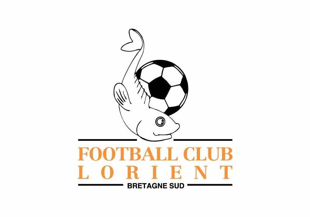
It was a monochrome badge with the fish and a ball depicted on it. Under the picture the orange wordmark pas placed, framed into two horizontal black lines.
The “Football Club Lorient” inscription was written in a bold and elegant serif typeface, which looked strong, traditional, and bright.
The fish on the logo was placed vertically, overlapping the ball, so that it looked like it was swimming around it.
2002 — 2010
The badge was redesigned in 2002 — all the contours were modified and the picture itself became more contemporary and strong. The fish and football lines became bolder and more confident, and the circular badge was now colored in gradient orange, which was dark close to the perimeter and became lighter in the middle.
The “F. C. Lorient Bretagne Sud” inscription was now placed outside the badge, lo-cated above it, and arched. The typeface was switched from serif to a clean and modern sans-serif with strict sleek lines.
2010 — Today
![]()
In 2010 the concept of the Lorient visual identity was slightly changed — now the fish was placed on a modern shield, in its bottom part. The football was completely removed from the image, but the new heraldic symbols in monochrome appeared on the top part of the shield.
The wordmark got shortened to just “FC Lorient”, written in white geometric sans-serif with bold clean lines and placed in the middle of the shield, on a horizontal black line.
The iconic fish is now located horizontally and has its tail curved, making a frame for the “1926” inscription in outlines white.
The Lorient logo is fresh and modern, yet it celebrated the club’s roots and heritage, making it look timeless and stylish.


