

![]() Tottenham Hotspur Logo PNG
Tottenham Hotspur Logo PNG
One of the oldest football clubs in England, Tottenham Hotspur has had not so many logos over the course of its 136-year-old history. But the story lying behind its name and the club emblem is rather interesting.
Meaning and history
![]()
The visual identity of the famous British football club has had many redesigns throughout the team’s history. Established in 1882, the club used various images of spurs as its logo, but the first official badge appeared only at the beginning of the 1920s, and this was when the bird was taken as the team’s symbol.
What is Tottenham Hotspur?
Tottenham Hotspur is the name of a professional football club from Great Britain, which was established in 1882, and it makes it one of the oldest football teams in the world. Today Hotspurs compete in Premier League, have Tottenham Hotspur Stadium as the home arena, and Antonio Conte as the head coach.
1921 – 1951
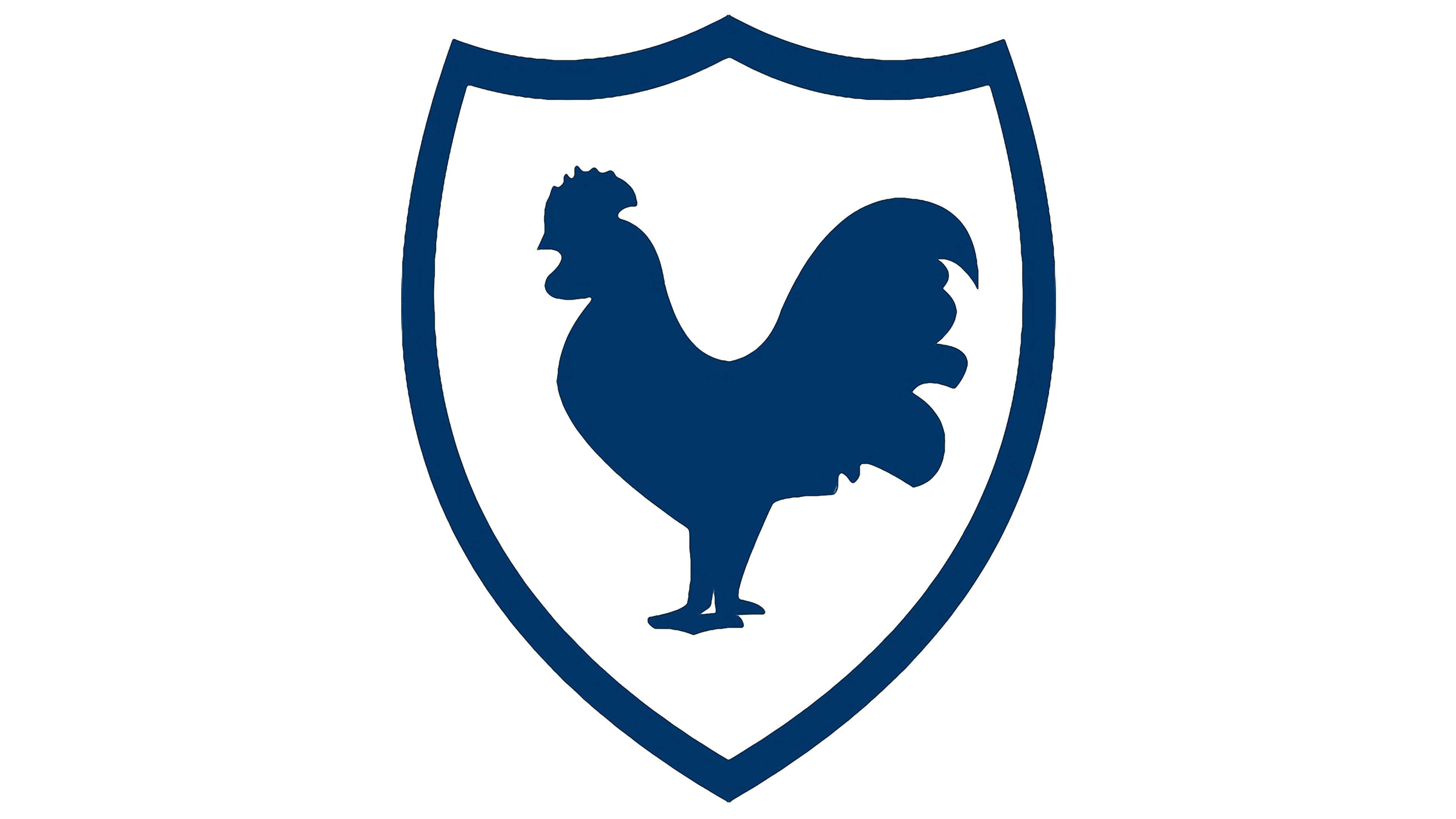
The emblem, designed in 1921 depicted a solid and strong cock, enclosed in a frame, repeating the shape of the shield. It was a blue and white logo with minimal details, but there was something really stylish and powerful in it. The fighting cock stayed with the club for thirty years and hasn’t been changed much during that period.
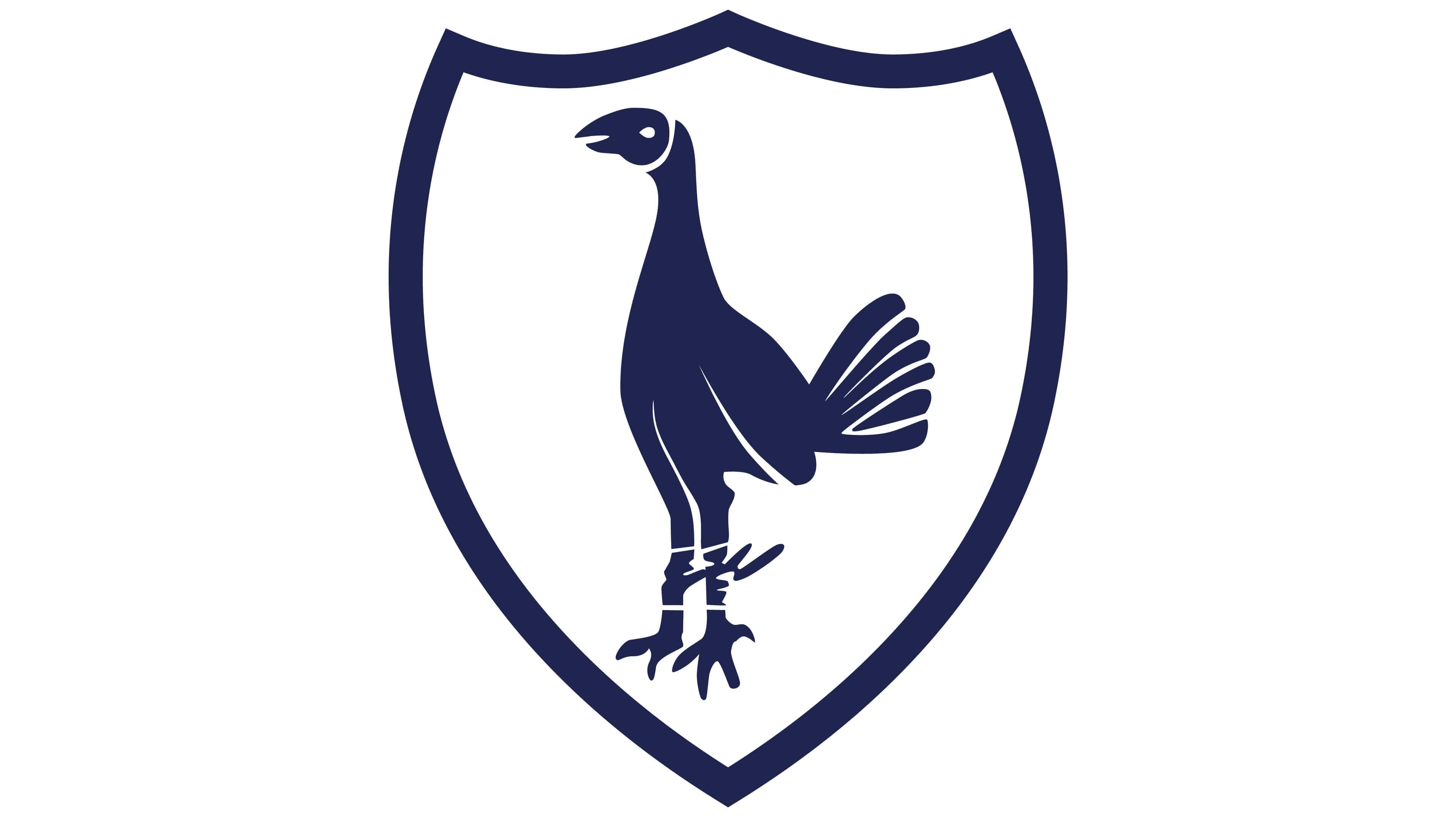
1951 – 1967
![]()
The logo, used by Tottenham Hotspur club from 1951 to 1967, featured a more detailed silhouette of a rooster, taken against a plain white background of an elegant triangular crest, which was slightly extended to the sides. The new drawing, along with the outline of the crest, was set in a light and smooth shade of blue, which created a very sophisticated color palette.
1967 – 1971
In 1967 the cock was replaced by a cockerel, which was drawn in the same manner and color palette. The shield and its thick framing also haven’t changed. So, basically, it was the same logo, just with another mascot.
1972 – 1981
![]()
The redesign of 1972 introduced a completely different badge; with the stylized bird in purple, outlined in gold, and enclosed into a thick circular frame with the top half colored yellow, and the bottom one — purple. The lettering was written around the frame in gold sans-serif capitals, supporting the outlines of the elements.
1973 – 1981
The new image was introduced in 1973. Now the cockerel was standing on a big blue football and the framing was removed. It was a solid and confident picture with delicate and thin white accents, which balanced it completed.
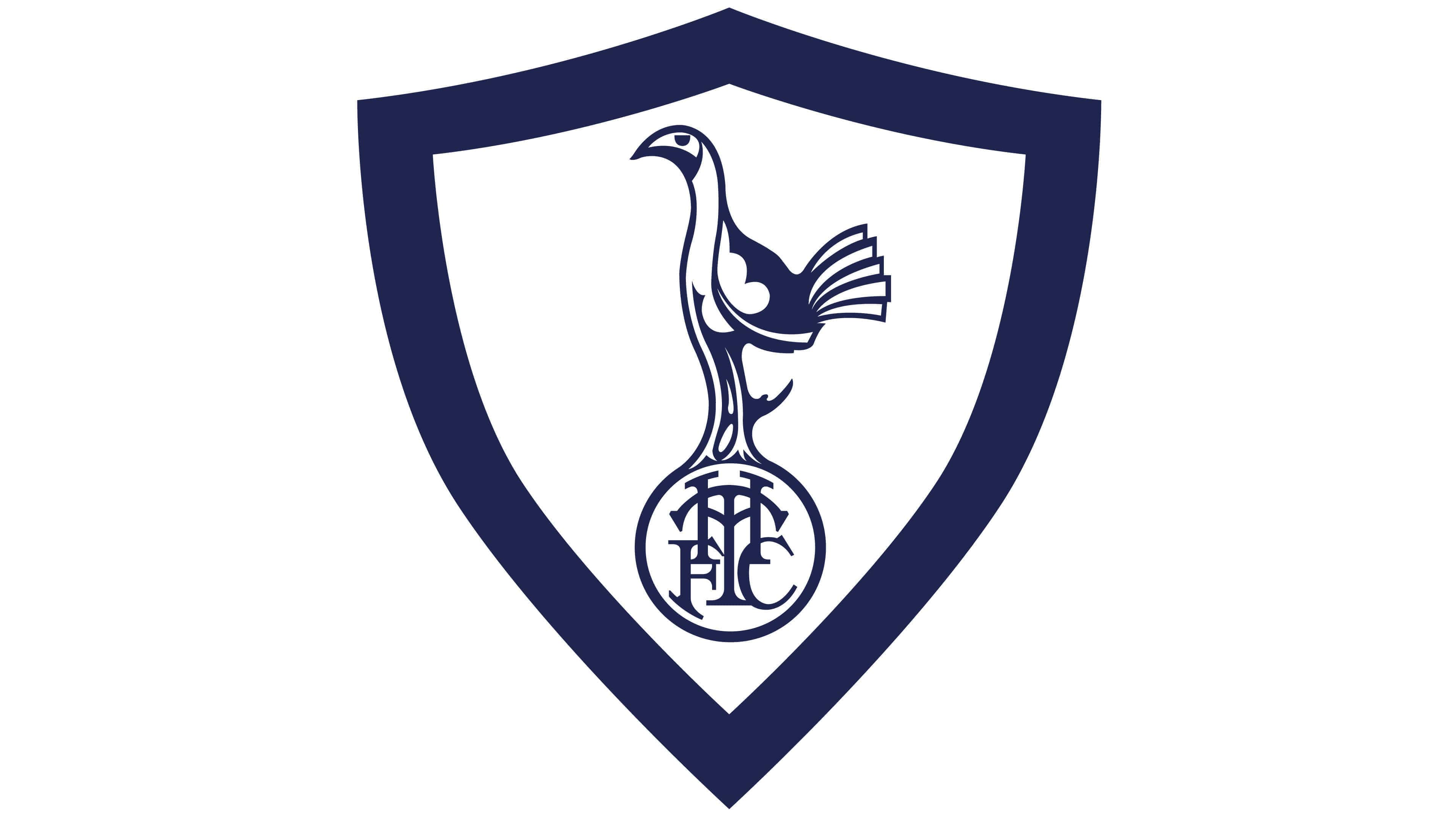
1983 – 1984
![]()
For just a few months the club was using a badge with a traditional crest, executed in a blue, gold, and red color palette, with the elegant golden bird drawn in the center, supported by the golden frame of the shield, and surrounded by other golden elements. At the bottom of the logo, there was a white shield with two red rampant lions on the sides.
1985 – 1986
![]()
The colors of the badge got lightened up in 1986, keeping the composition from the previous badge, but slightly enlarging all elements, making them more visible and distinctive. The gold was replaced by yellow, which made the whole image very bright and vivid.
1987 – 1988
![]()
The redesign of 1987 has played with the Tottenham Hotspur color palette again. The new logo featured a light background, an intense yellow frame, and a turquoise-blue ribbon at the bottom of the composition. In this color scheme, the crest looked very elegant and lightweight.
1988 – 1989
![]()
Another Tottenham Hotspur badge was introduced in 1988, with the same crest, as in the previous versions, but executed in an even lighter color palette. With bright and delightful badge stayed in use by the club for just a few months, and was replaced by a completely new concept in 1989.
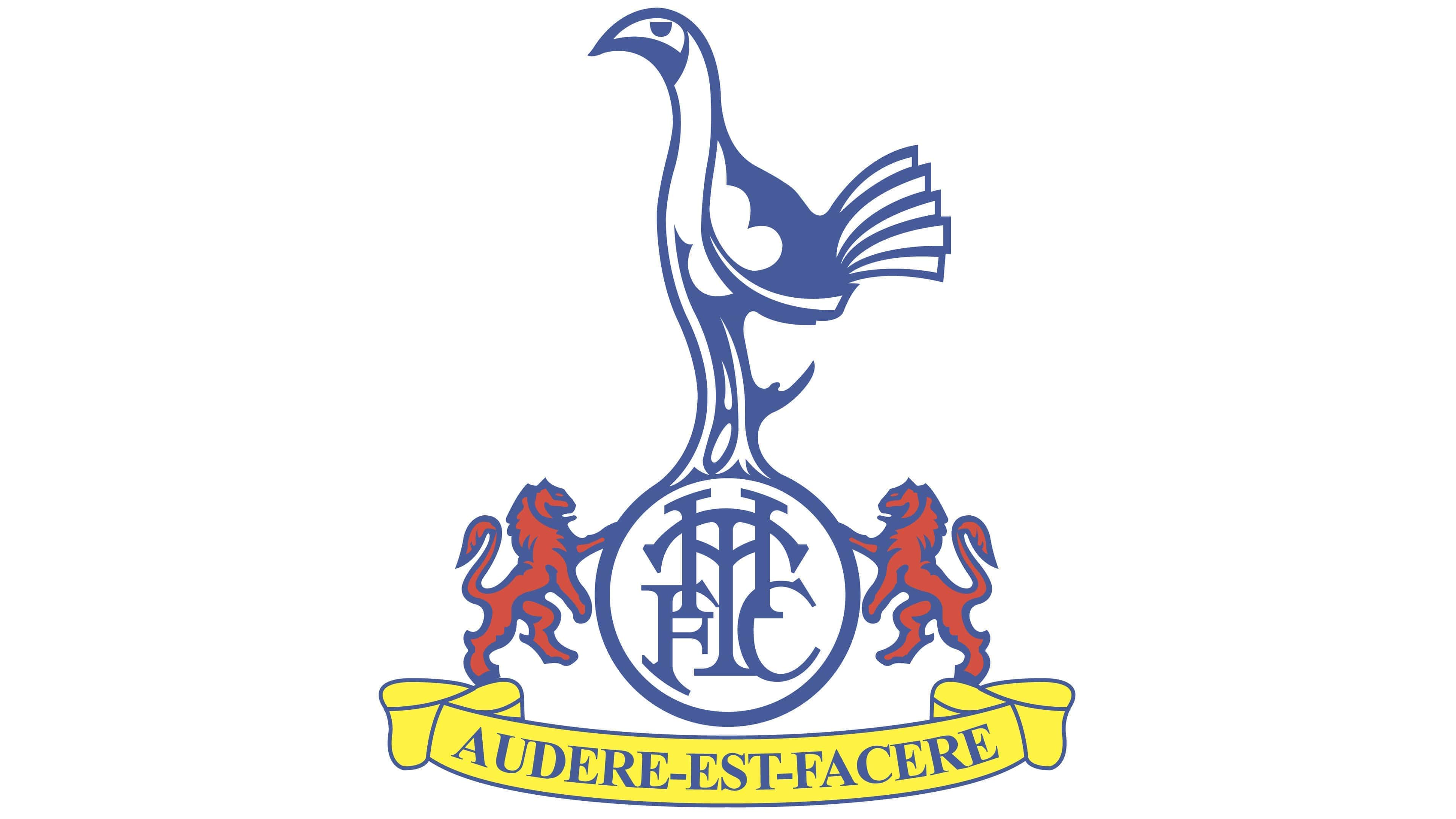
1989 – 1995
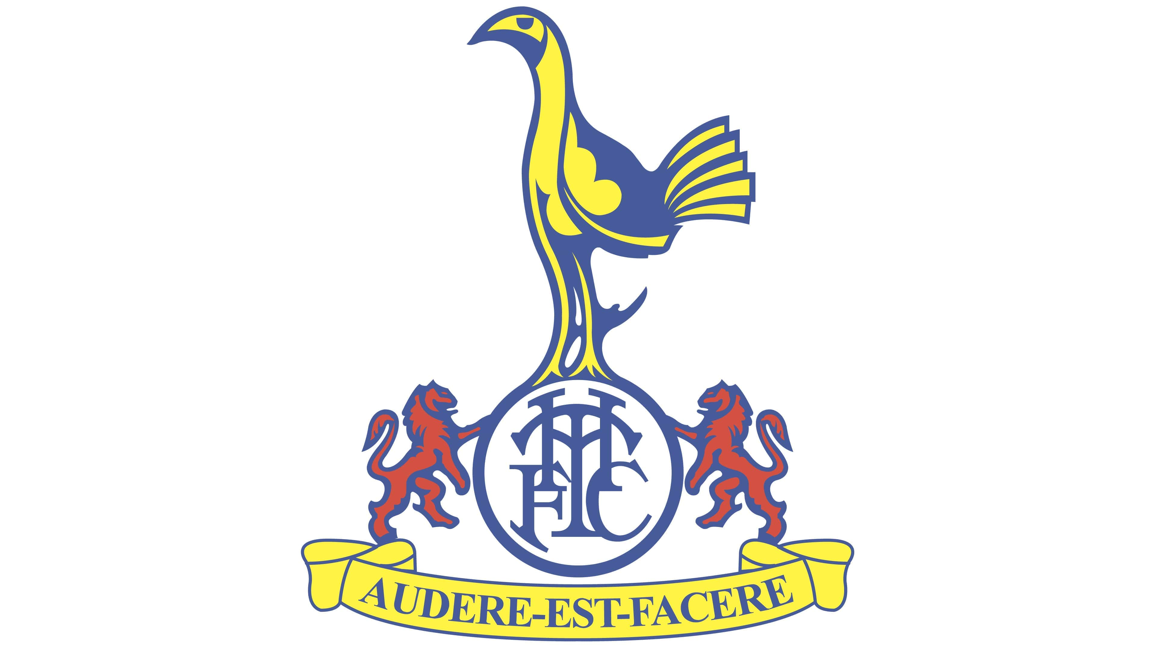
The logo, created in 1989 was one of the most ornate in the club’s history. The cockerel was redrawn and now featured more white color and blue contouring, the ball was turned into a circle with an old-style elegant monogram, and two red rampant lions appeared in both sides of the medallion.
Another significant detail of this version is a yellow ribbon with the club’s motto “Audere Est Facere”, which means “To Dare Is To Do”. The lettering was written in blue serif typeface with bold clean lines.
1995 – 1997
The previous version gets simplified in 1995. The blue cockerel on the monogram in a circle was placed inside a crest in a wide blue outline again. This was a mix of several older logos and only stayed with Tottenham Hotspur for a couple of years.
1997 – 1999

The brightest and the most colorful Tottenham logo of all time was introduced in 1997. It was a Royal-blue crest in a thick yellow frame with many graphical symbols on it. The brown football was placed in the middle and a cockerel in white and blue was standing on it as usual. On the left from the bird there was a brown castle, and on its right side — seven green trees. The bottom part of the crest depicted the club’s monogram and two red lions.
Under the shield the blue ribbon with the motto was placed, featuring yellow lettering and outline.
This was a celebration of the Tottenham Hotspur legacy and heritage, showing the main symbols of the club itself and their homeland.
1999 – 2006
In 1999 the club comes back to their emblem from 1983. The composition and color palette is exactly the same, but the contours and lines were slightly modified and cleaned. This version stays with the club for another seven years.
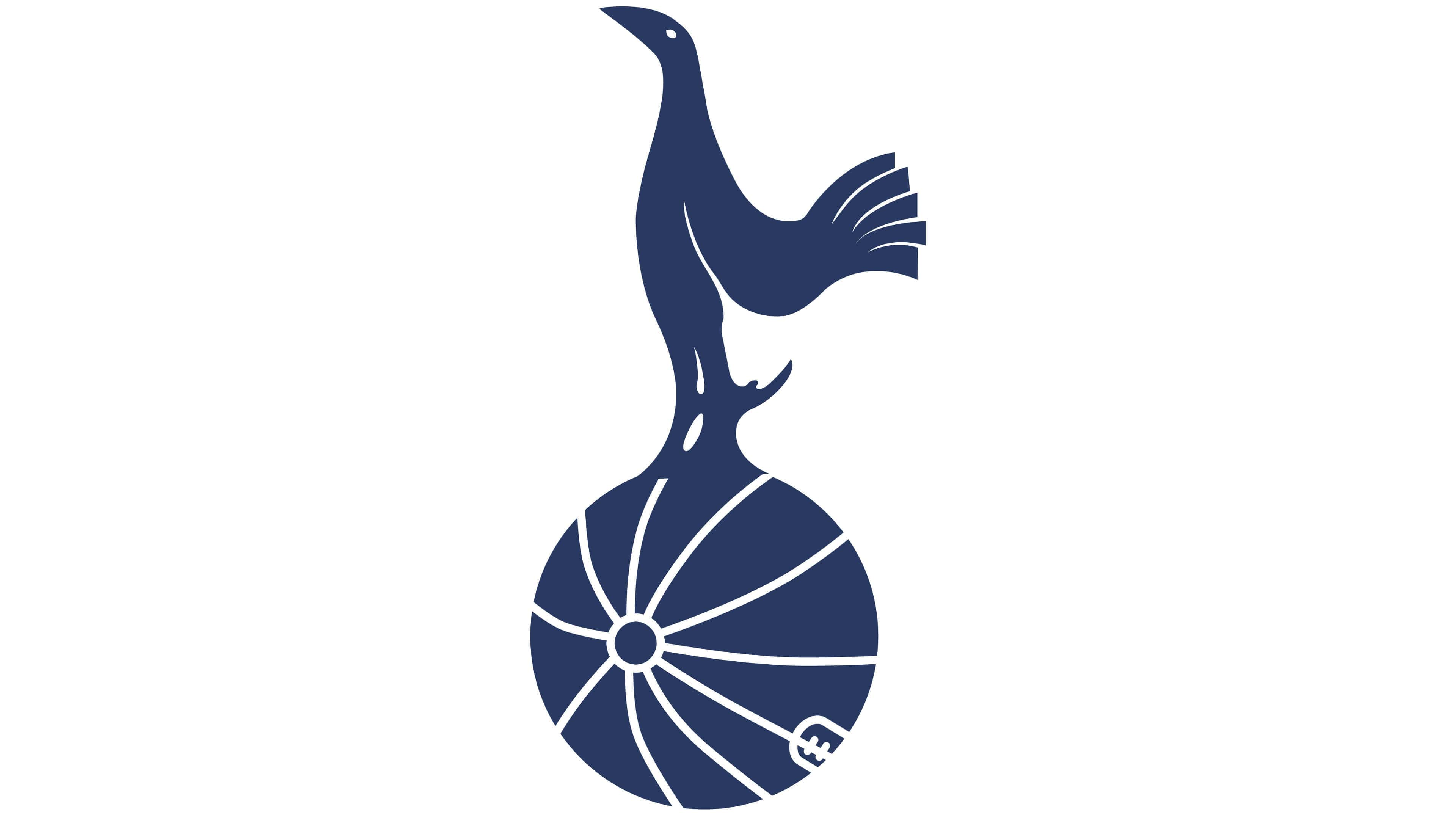
2006 – 2013
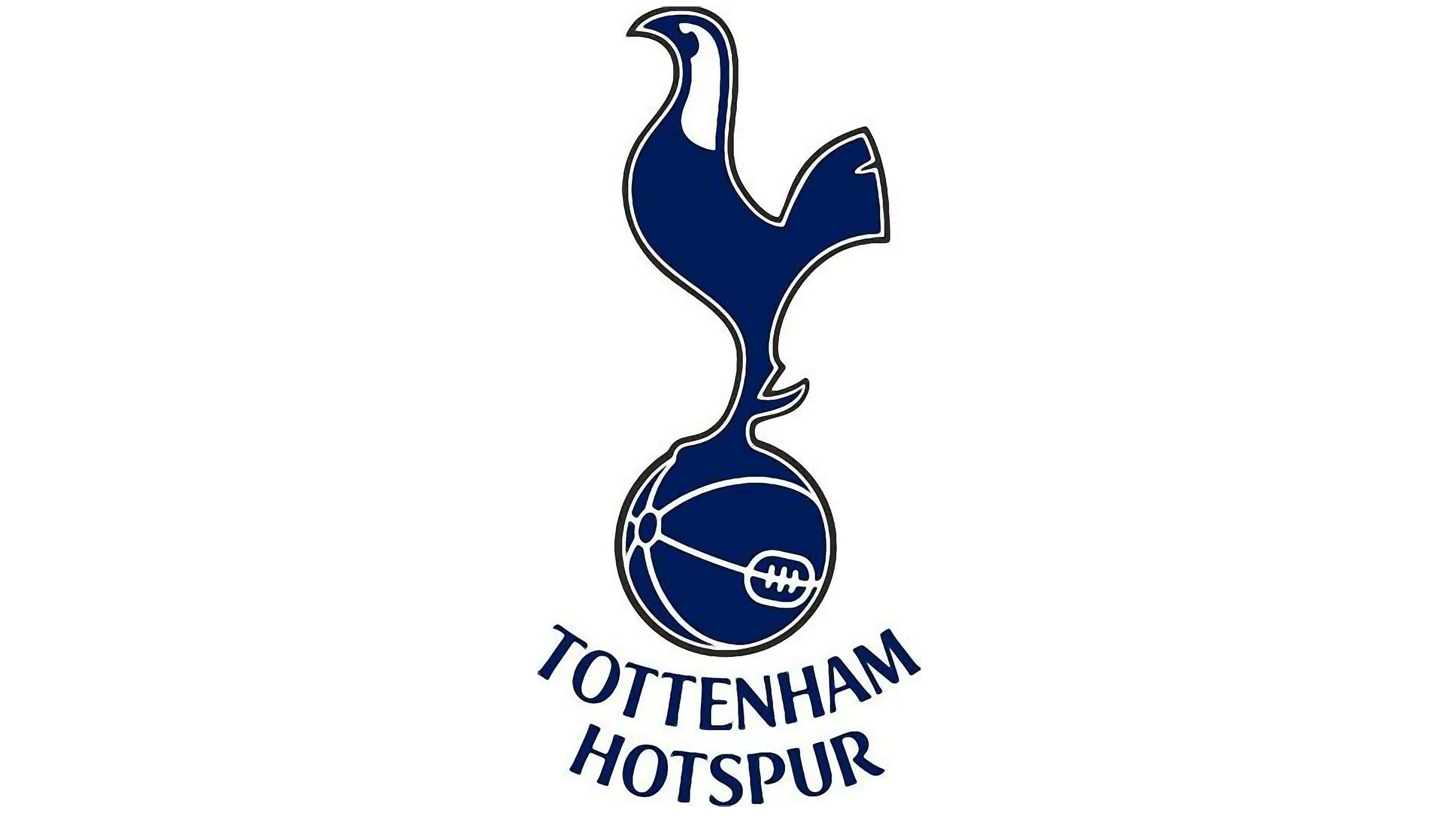
The Hotspur logo was redesigned again in 2006, and this is when the emblem we all know today was created. It is a modern interpretation of the club’s logo from 1967, but it looks sleek and contemporary.
The blue cockerel with a white head is standing on a blue football with white stitched. All contours are clean and smooth.
When the wordmark is used, it is placed under the emblem, slightly arched. Its capitalized letters are executed in a simple yet bold and modern sans-serif typeface, which looks strong and stylish.
2013 – now
![]()
The redesign of 2013 has removed all the additional outlines from the Tottenham Hotspur badge, elongating the silhouette of a bird, and cleaning up the contours, which has led to an extremely beautiful and professionally executed emblem, that is still in use by the club today.
Font and color
The elegant yet modern arched inscription on the Tottenham Hotspur emblem is written in all capitals of a custom typeface, with slightly visible sharp serifs on thick straight lines. The type of the football club’s logotype is pretty close to such fonts as Cabrito Flare Condensed Ex Bold and Greenleaf Bold Pro, but with lines and contours of some letters modified. The lettering looks sophisticated yet confident, brilliantly reflecting the uniqueness of the club.
![]()
The color palette of the Hotspur visual identity is based on a royal-blue shade with white accents. The combination represents the loyalty and responsibility of the club to its fans, along with professionalism and expertise. This shade of blue stands for mobility and courage and white elevated the look of the whole emblem, making it timeless.
Tottenham Hotspur Colors
NAVY BLUE
PANTONE: PMS 2766 C
HEX COLOR: #132257;
RGB: (19, 34, 87)
CMYK: (100, 92, 32, 35)


