Club America is the name of a professional football club, which was established at the beginning of the 20th century in Mexico City. Today the club, nicknamed The Eagles (or Las Águilas in Spanish) plays on Estadio Azteca and is managed by Santiago Solari. The strongest team in Mexico, Club America, is owned by Grupo Televisa since the end of the 1950s.
Meaning and history
The strongest and most titled team in Mexico, playing in one of the largest stadiums in the world. Of course, with its visual identity, Club America had to stand out too. And if the composition and style of the club logo do not stand out in anything special, in terms of the number of redesigns it is quite capable of competing with other world-renowned teams.
What is Club America?
Club America is the name of a professional football club from Mexico, which was established in 1916, and today plays in the Liga MX, the most reputable football league in its country. The club has Estadio Azteca in Mexico City as its home arena and is owned by the Televisa company.
1916
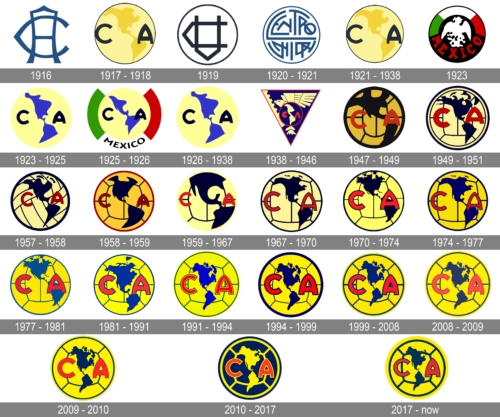
The very first badge for Club America was designed in 1916 and stayed in use by the team for just a few months. It was a very simple and minimalistic composition of two overlapping letters “CA”, executed in a stylized wishbone typeface with softened contours. The letters were set in a calm and muted shade of dark blue color.
1917 – 1918
The redesign of 1917 brought color and a modern mood to the Club America badge. The new logo featured a light yellow circle stylized as a globe and outlined in dark blue. Two letters, “CA” were set in dark blue on a yellow globe, with the “C” placed on the left side of the image, and “A” — on the right one.
1919
For the season of 1919 the football club used a very interesting and memorable badge. It was a super-minimalistic logo, composed of an outlined monogram in the dark blue and white palette. But here everything was about the geometry of the letters and their placement. Both letters were drawn as triangular horseshoes, and placed under a 90 deeper angle to each other, having the vertical bars overlapping. The simple circular framing of the bandage was significantly thinner than the lines of the letters, which made the main part of the badge emphasized.
1920 – 1921
A few months later, in 1920, another logo was designed for Club America. It was an Aztec-stylized dark blue lettering in two levels, inscribed into a circular frame of the same color, repeating the contours of the roundel. In this version, the circular framing became a bit bolder, so the composition started looking more solid and bright.
1921 – 1938
In 1921 the club came back to its globe logo in yellow and blue, created in 1917. No major changes were made to the badge, just slight refinements of the letters’ contours, which did not affect the overall style and recognizability of the Club America visual identity.
1923
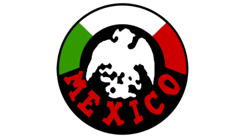
The Club America logo, designed in 1923, featured a colorful yet slightly aggressive badge executed in the color palette of her National Flag of Mexico. It was a roundel with a white stylized image of an eagle set against a plain black background, enclosed into a circular frame with the top part set in green, white, and red, and the bottom part in solid black with the red stylized “Mexico” inscription.
1923 – 1925
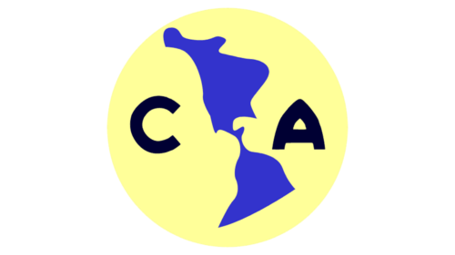
The logo was redesigned several months later, bringing back the concept of 1921, but refining the contours of the elements, and switching the color palette to yellow and blue, with the black “CA” abbreviation becoming smaller yet bolder. As for the contours of the countries, they kept their shape but also got a bit smaller in size.
1925 – 1926
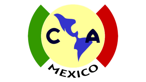
In 1925 the logo got enclosed into a circular frame, divided into four equal parts, with the top and the bottom segments in white, the left one in green, and the right one in red. All other elements remained in their places and kept their colors, but the contours got slightly softened, and the abbreviation got reduced in size.
1926 – 1938
The redesign of 1926 removed the frame and came back to the design version of 1923, with all the parts of the roundel kept unchanged. In this color palette and style the Club America badge has stayed with the team for a decade.
1938 – 1946
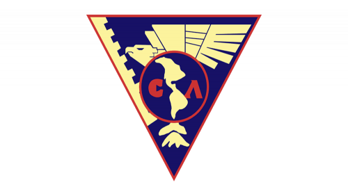
Something new was introduced to the public with the Club America logo redesign in 1938. The circular globe badge was redrawn and placed inside a sharp triangular crest, pointing down. The triangle, outlined in red, featured a bright and intense blue background with a geometric image of a light yellow eagle, flying to the left on it. As for the roundel, it was now all blue, with a red outline and lettering, and the continents were set in the same shade of yellow, as the eagle on the main badge.
1947 – 1960
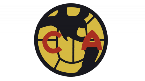
In 1947 the round logo began to take shape of the emblem that we are used to seeing over the years and to this day. Just a few strokes were added to the badge of 1917, but they changed everything. The change of the color palette to yellow and black was not that important, but the addition of smooth lines, which added a texture of the football ball, that’s what played the biggest role. As for the letters, they became red and changed the typeface to an extra-bold modern sans-serif.
1949 – 1951
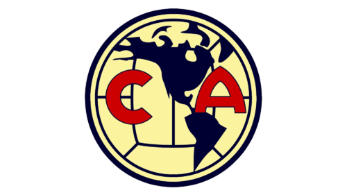
Another redesign was made to the Club America logo in 1949, with the colors of the roundel getting lighter and more contrasting. The letters of the monogram were refined and got a thin black outline, with the heavy red characters placed on a straight horizontal line, unlike the characters from the previous badge.
1957 – 1958
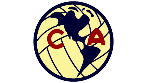
In 1957 the Club America badge was refined again: now it was outlined in a thick blue line, the contours of the football got drawn diagonally, and the shape of the country was redrawn and softened. As for the letters, they got darker and smaller and started looking more professional and stable. This badge was only used by the club for less than a year.
1958 – 1959
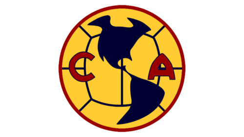
The redesign of 1958 has played with the color palette of the Club America logo, making all the shades darker and calmer. As for the contours of the events, they all were also refined, giving a wider and more stable look to both the country contour and the characters. But this badge hasn’t stayed with the club for long either.
1959 – 1967
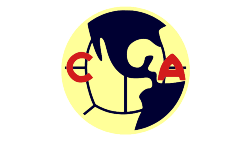
Finally, in 1959 Club America gets a logo, which stays with them for more than a year. It is absolutely the same concept — with a light yellow football, a solid blue silhouette of Mexico, and two red capital characters, but all contours were refined and slightly expanded, and the roundel got its outline thinner and stricter.
1967 – 1970
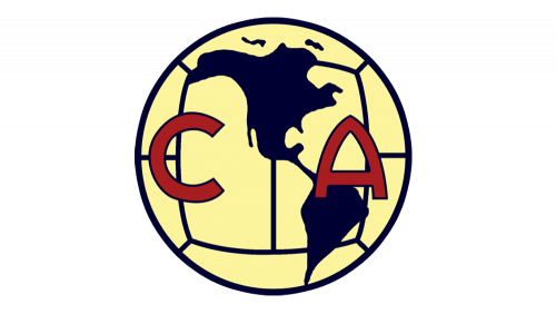
The color palette from the 1910s came back to the logo again in 1967, and in a mixture with the design from 1947, it created a new memorable badge. The lines on this version were thinner and more elegant than on the previous badge, but the mood remained the same. Both letters were drawn in a darker shade of red and got a thin yet distinct dark-blue outline.
1970 – 1974
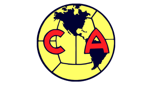
In 1970 the Club America logo become brighter and gets the contours of all elements were cleaned and slightly modified. The main change was made to the red “CA” monogram, where both capital letters became thicker and more stable, gaining a more interesting geometric shape.
1974 – 1977
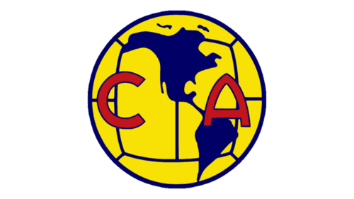
The redesign of 1974 has brought back the Club America logo, created for the club in 1967, but with a refined and strengthened color palette. All three shades, yellow, blue, and red, became deeper and brighter, which made the whole look of the badge more confident and professional.
1977 – 1981
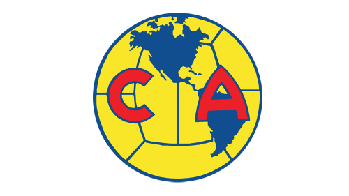
The colors got brighter and the Club America circular logo was doubled in 1977. Now it was not one medallion, but two. Completely the same in shapes and style, but the left one was executed in yellow and featured blue details, while the right one was all blue with yellow continents and lines all over it. The letters on each part of the logo were in red, but the color of the outline varied — blue for the left circle, yellow for the right.
1981 – 1991
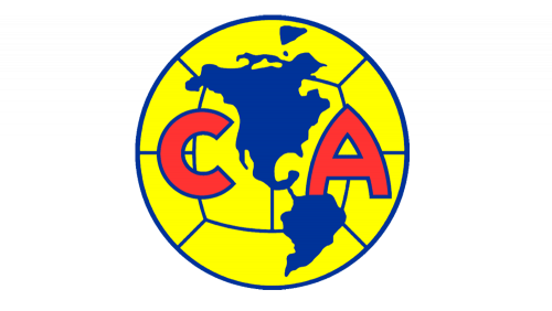
The redesign of 1981 didn’t change the composition and styling of the logo, but played with its color palette, making colors more intense, bright, and even acid. In the new shade, the red letters started being more visible and eye-catching, becoming the main part of the logo.
1991 – 1994
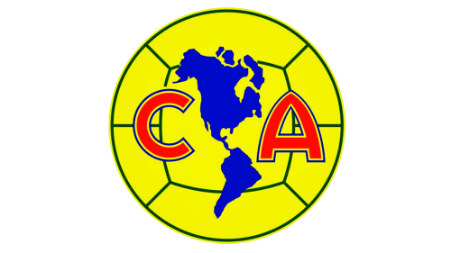
The redesign of 1991 made the outlines of both circles and all letters double. It was now composed of two thin contrasting lines in blue and yellow, which added air and light to the badge, and also enhanced its elegance, which was needed as the color palette of the logo was too intense during those years.
1994 – 1999
The lines got bolder on the badge, introduced after the redesign of 1994. The double outline was replaced by a single thick line, and the colors got deeper and darker. Overall the logo became stronger and more dramatic. The red letters on the globes changed their typeface to a bolder one too, gaining a more brutal and powerful look.
1999 – 2008
The double outline of the circles came back with the redesign of 1999. Although the lines here were bolder than on the logo, created in 1991, but much thinner than on the previous insignia. The shade of blue was elevated and became lighter, while the yellow remained the same, and the new color contrast was smoother and fresher. As for the letters, they were still outlined with one layer, a line of a medium thickness made the look of the abbreviation more solid and serious.
2008 – 2009
The composition remained untouched, but the color palette and the thickness of the contours were changed in 2008. Both blue and yellow shades of the Club America globes were muted, as well as the red, used for the letters, which now featured a very thin outline. As for the framing of the circles, it was still double but also got a bit thinner than on the previous version of the badge.
2009 – 2010
The redesign of 2009 was again about the color palette. All three shades of the Club America visual identity got brighter, and in the new shade, the red letters started looking bigger. Overall, the logo still looked the same, evoking a sense of energy and motion, with that “international” accent, given to it by the map pattern drawn over the football texture.
2010 – 2017
The outline and lines on the circles became thicker in 2010. As for the color palette, contours, and the outline of the letters, everything stayed as on the previous version. But this minor change made the logo look more powerful and professional. The bold lines enhanced the feelings of strength and masculinity, evoked by the bright yellow and blue globes on the insignia.
2017 – Today
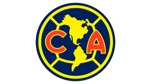
The red letters on the logo became smaller yet bolder in 2017. The same redesign switched the color palette of the Club America visual identity to a darker and deeper one, with the shade of blue getting closer to black. The contours of the continents on the badge were redrawn and now appear to be more detailed and clean, adding to the professionalism and reliability of the Mexican football club.


