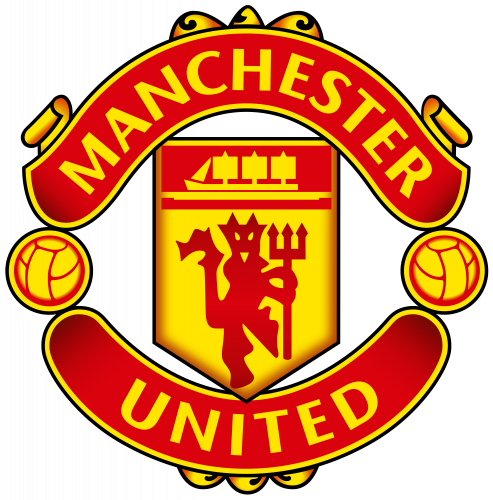
The Manchester United football club has had four emblems so far. The earliest Manchester United logo was officially unveiled at the 1963 FA Cup Final. The emblem based on the coat of arms of the Manchester City Council made its first appearance on the shirts of the team members.
Meaning and history
Who owns Manchester United?
Manchester United is owned by the famous Glazer Family from the USA, since 2003. The Glazer family also owns football clubs in America.
Shortly after, a new badge was developed. The shield and ship remained on the logo, while the Antelope and the Lion disappeared. Also, the emblem featured “Manchester United” and “Footbal Club” inscriptions. The logo was in use throughout the 1960s.
What is Manchester United?
Manchester United is one of the most awarded and famous professional clubs in the UK and Europe. Established in 1878, it is also considered to be one of the oldest clubs on the continent.
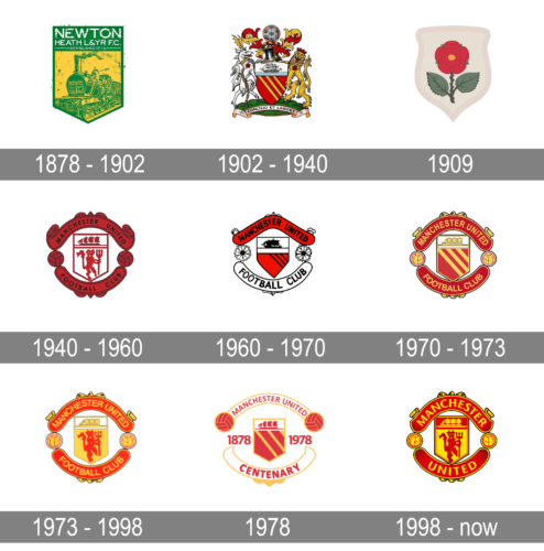
1878 – 1902
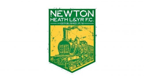
The club’s original name, Newton Heath LYR Football Club, was reflected in its earliest logo. Also, the shield, which was dominated by yellow and green, featured a train.
1902 – 1940
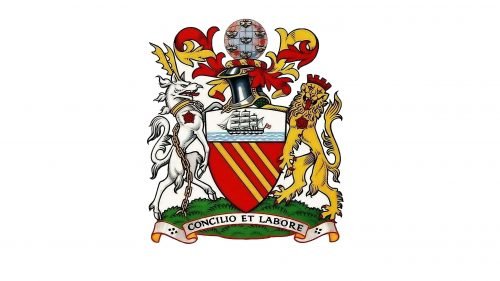
When the club received its current name in 1902, a different emblem was introduced. It was pretty detailed and looked more like a medieval crest than an athletic logo.
1909
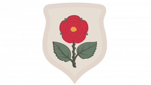
The shield introduced in 1909 did not have anything sporty about it either. The rose embroidered on a white patch looked stylish and elegant, though.
1940 – 1960
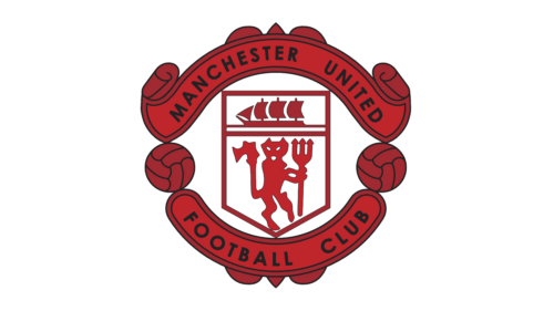
The predecessor of the current Manchester United logo was introduced in 1940. It was a white and red crest with the clipper drawn above a rampant geometrically-styled creature with a trident. The crest was enclosed between two solid red ribbons with black lettering. The red, used in the logo was very dark and dramatic, creating a powerful look and evoking a sense of determination.
1960 – 1970
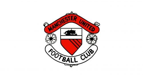
This was a corporate Manchester United logo – it was not used on kits. At the center, there was a shield featuring a ship over a white stripe and a red field. The lines “Manchester United” and “Football Club” were placed above and below the shield respectively.
1970 – 1973
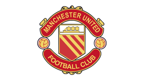
Another redesign happened to the Manchester United logo in 1970. Not only the contours of all elements were refined and emboldened, but also the color palette was switched to red and yellow, with the shades a bit muted, although still creating a vivid image for the football club.
1973 – 1998
While the structure of this emblem is pretty similar to that of the previous one, there are also several notable differences. A devil appeared below the ship. The type was modified, as was the palette.
1978
The shield corporate logo of the 1960s was placed over the white and black stripes pattern. The colors and shape of the Manchester United logo were slightly modified.
1998 – Today
The design team played with the shades and inverted the color of the ship and the background. Also, only two words were left: “Manchester United,” while the lettering “Football club” disappeared.
Manchester United Badge
The bright and intense badge of the famous British football club is executed in a dark red and gold color palette and is usually placed on the bright red jerseys of the players. The red shades of the badge and the uniform vary, with the emblem red darker and deeper, which makes it more visible on the players’ chests. The Man UTD badge boasts a sharp geometric crest with a straight top line and a triangular bottom, set in yellow, and with a narrow red banner with a yellow ship above the red geometric heraldic image with the trident.
The crest is placed between two arched red ribbons with the name of the club written along them. The two ribbons are separated by the two yellow footballs with red details and a double yellow and black outline.
Font
The Manchester United logo features a simple san-serif font.
Color
Starting from the 1960s, the official color scheme of the emblem has stayed the same. It comprises two basic colors (red and yellow) and two auxiliary ones (black and white).
Manchester United Colors
RED
PANTONE: PMS 485 C
HTML HEX COLOR: #DA291C;
RGB: (218, 41, 28)
CMYK: (0, 95, 100, 0)
YELLOW
PANTONE: PMS 107 C
HTML HEX COLOR: #FBE122;
RGB: (251, 225, 34)
CMYK: (0, 0, 92, 0)


