The name Looney Tunes is familiar to people from different parts of the world. The American animated comedy series produced by Warner Bros. has gradually turned into a global media franchise, including more than one television series, feature films, comic books, etc.
Meaning and history
Looney Tunes is an entire animated universe created in the 1930s by former Disney animators Rudolph Ising and Hugh Harman, along with another universe, Merrie Melodies. In 1934, the rights to both universes passed to director and producer Leon Schlesinger, and after his death the year World War II ended, to Warner Bros. Studios. Thus began the story of success.
The very first short film in the Looney Tunes universe was called “Sinkin’ in the Bathtub” and was released in 1930, with graphics and character designs borrowed from Disney’s Oswald the Rabbit cartoons. For the first decade, the animated series was released exclusively in black and white, and the first color episode of Looney Tunes was shown to viewers only in 1943.
Since their introduction, the Looney Tunes characters have become symbols of animation and pop culture. Funny, charismatic and unique characters have won the hearts of viewers of all ages, as each character has its own unique personality and style.
A new wave of popularity of the legendary animated series began in the 2010s, after the release of the modern version of Looney Tunes, released in 2011. The new series is already more oriented to the adult audience. The comedy animated series about the adventures of the famous rabbit Bugs Bunny and his neighbor Daffy Duck, who left their native forests and moved to a bustling city, won the hearts of millions of children and adults around the world.
In terms of visual identity, the franchise is diver bright and instantly recognizable. While the Looney Tunes logo has gone through multiple updates, it has never lost its playful and lively character.
1930 – 1934
In 1930, Warner Bros. released the first Looney Tunes short. They aimed to compete against Walt Disney’s Mickey Mouse short cartoons.
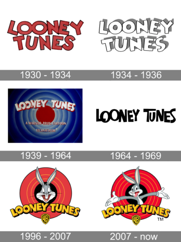
The original wordmarks reflected the older version of the name, “A Looney Tune.” During its first four years, the emblem was given in two or three lines (the third line appeared only for the “A Looney Tune” version). While in some cases, each of the “O’s” stood apart, there were also cases where the letters either formed a single glyph or overlapped.
1934 – 1936
The Looney Tunes badge was redesigned in 1934, with the shapes and contours of the dancing uppercase characters refined and cleaned up: now the white heavy capitals, outlined in thin black, boasting wide gray shadows, and being placed against a plain white background. It was a simple, yet confident and bold badge, which stayed with the cartoon for around two years.
1939 – 1964
The lettering now formed a single line. It was arched, to a larger or smaller extent. This is when the era of overlapping letters started: it seemed as if there was not enough space and the glyphs had to be placed one over the other.
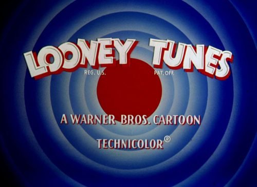
Around this time, the iconic “bullseye” design appeared. The size and the color of the central circle varied, but typically, it featured red or blue. The arched name of the series was placed either above the circle or over its upper part. It was white with shades in various colors, which added some depth.
1964 – 1969
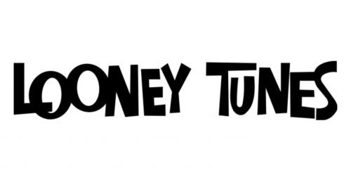
While the old logos were pretty plump and arched to a greater or lesser extent, 1964 marked the beginning of a new style. There was no arch now, although the letters still did not form a straight line (they “jumped” above and below the line). The glyphs lost some of their weight. While in the previous versions, the width of the strokes was more or less the same, this time, they glyphs combined very thin and very thick strokes. The overall style was more casual now.
1996 – 2007
The Looney Tunes logo returned to the earlier style with the arched shape and plump glyphs. However, it did not look exactly like its predecessor. There was now more space, although the letters still partly overlapped.
2007 – Today
The current logo featured on the official Warner Bros. website has bold letters and is not arched. The glyphs are still “dancing” above and below the line and partly overlap.


