Sesame Street is the name of the tv show for kids, which was first launched at the end of the 1960s. Being colorful and educational, the program has instantly become popular all over America and started spreading across the globe. By today there are almost five thousand episodes of Sesame Street created.
Meaning and history
The educational television show Sesame Street has more than 100 Emmy titles and is considered to be the most popular children’s educational program in history according to the Guinness Book of World Records for 2004. This tv show is familiar to children from around the world. Plus, Sesame Street is one of the oldest TV shows in its segment, as it was created in 1969.
The idea for Sesame Street came from Joan Ganz Cooney and Lloyd Morrisett. The story of the popular children’s television show begins with Children Television Workshop, an American non-profit organization that created and developed children’s programs.At the end of the 1960s, executive Producer Joan Ganz Cooney and Foundation Director Lloyd Morrisett developed the idea of a children’s program that would help children of all backgrounds prepare for school through television.
What is Sesame Street?
Sesame Street is one of the popular kids’ tv programs, which was introduced in the 1960s, and is based on educational content, which is easily understood by kids of different ages dues to the bright and playful animation. Sesame Street is a combination of live acting, comedy sketches, animation, video documentaries, and puppetry.
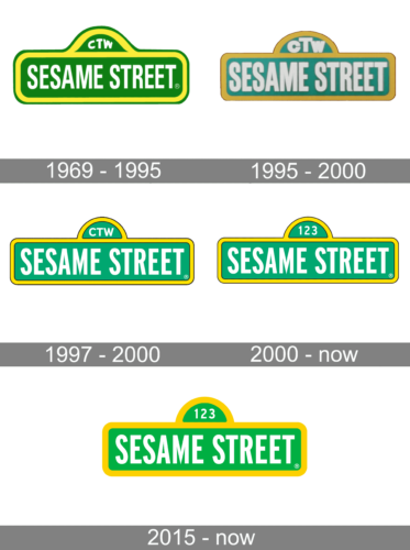
1969 – 1995
The very first Sesame Street logo featured an address plate in yellow and green, with the lettering set in white color, and executed in a traditional and simple sans-serif typeface. The contours of the symbols were slightly narrowed but still looked strong and confident.
1995 – 2000
The redesign of 1995 made the nameplate a bit three-dimensional, adding Wilkie to the logo with gradient colors and slight shadow on the lettering. The frame of the logo became more square, getting a confident and modern look. As for the color palette, it remained almost unchanged, just got its shades a bit darker.
1998 – 2000
The contours of the Sesame Street logo were refined again in 1998. The address plate became cleaner and neater and gained a thin black outline for its yellow frame. The letters were still executed in white but got their contours a bit fuller than on two previous versions of the logo.
2000 – Today
2015 – Today
Once designed, in 1969, the visual identity of the famous kids’ tv-show has never been changed, only slightly modified throughout the years. Its bright green and yellow emblem is known and loved by children and their parents all over the globe.
As everything in Sesame Street, its logo is kind, colorful, and very friendly. Composed of a traditional address-plate framing and simple lettering, it doesn’t look boring at all.
The address plate is drawn in grass-green and features a double, green and yellow, outline, while the sans-serif lettering is written in white, adding a sense of professionalism and care.
The green and the yellow color palette is a reflection of life and growth, as is just a perfect choice for an educational program, created for the youngest ones and dedicated to opening the world and new knowledge for them.
Throughout the years the address plate gained a very thin and delicate black outline, which makes the whole image more professional and confident, and also allows placing it on various backgrounds and patterns.
As for the inscription, it is executed in a strict and simple sans-serif typeface, which features slightly narrowed letters with clean lines and distinct cuts.
Font and Color
The bold uppercase lettering from the primary badge of Sesame Street is set in a narrowed geometric sans-serif typeface with the surface of the characters slightly modified. The closest fonts to the one, used in this insignia, are, probably, ITC Franklin Std Compressed Bold, or CG Gothic No1.
As for the color palette of the Sesame Street visual identity, it is composed of three vivid delightful shades — green, yellow, and white, where green stands for growth, yellow for energy, and white — for reliability. The overall image symbolizes a funny and easy educational process, where the kids can enjoy and have fun, getting new knowledge.


