Logitech is a Swiss brand of computer accessories manufacturer, established in 1981. The company is one of the world’s leaders in production and design of computer peripherals and software.
Meaning and history
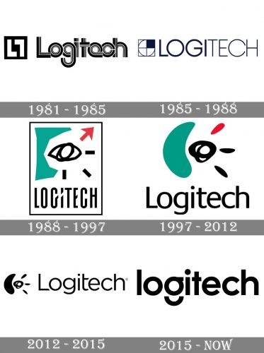
The Logitech visual identity has a very artistic and bright history, which includes several truly remarkable emblems, that can be called a piece of art. The company, which was started in 1981, has always had its unique character and values, and they have all been represented by the logos throughout the years.
What is Logitech?
Logitech is an international company manufacturer of software and computer accessories, which was established in 1981 in Switzerland, and today has another main office in the United States. The products of Logitech are known for their highest quality and are distributed all over the globe.
1981 — 1985
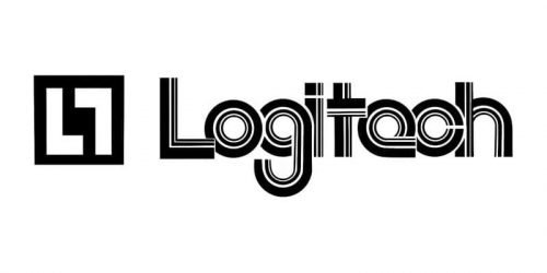
The very first logo for Logitech was introduced in 1981 and stayed with the company for only four years. It was the simplest and the least interesting version of the logo, composed of a geometric emblem and a bold rounded wordmark in monochrome.
The emblem was composed of a solid black rectangle with two white letters “L”, one of them was placed as usual, and the other one — upside-down, to repeat the rectangular contours of the icon.
The Logitech wordmark has its thick rounded letters overlapping each other, and their texture was diluted by thin white lines, creating an interesting geometric pattern.
1985 — 1988
The redesign of 1985 changed the logo, making it more modern and stylish. The emblem still featured a square frame, but now inside the sharp figure, there was a circle, divided into four segments by two lines. The upper-right segment was colored black, so the white parts of the emblem made up the letter “L”.
The wordmark in all capitals was written in a modern and clean sans-serif typeface, with the “Logi” part a bit thicker than “Tech.
1988 — 1997
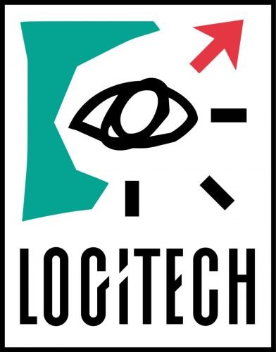
The most iconic emblem for Logitech was introduced in 1988. The image, inspired by abstractionist artists, featured a black hand-drawn eye, placed on the right from the solid green shape, representing a nose, and had three black lines on its right. The red arrow was placed above the eye and pointed upright.
The Logitech inscription was placed under the image and written in all capitals of a narrowed sans-serif typeface, with the letter “I” diagonally divided into two parts by a white line, which was an extension of the “G” tail. The line repeated the direction of the red arrow, making the whole emblem balanced and harmonized.
1997 — 2012
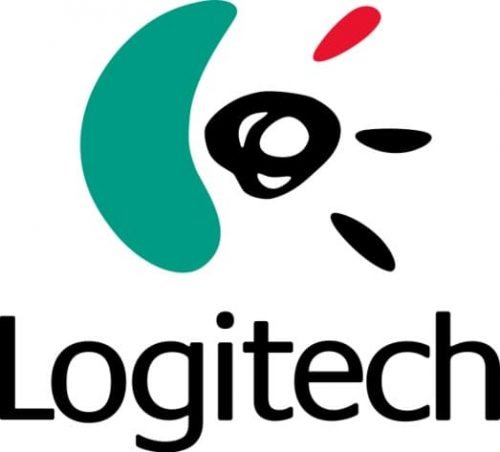
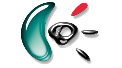
The logo was redrawn and softened in 1997. All the contours Gaines smooth lines, and the red arrow was replaced by a drop-like shape, as well as two black lines. The wordmark was also changed, and now it was set in the title case, executed in a simple and laconic sans-serif typeface with no additional details or modified elements.
This version of the logo was available in three styles: the main one, flat green, black and red, its three-dimensional modification with gradient shades and metallic tones, and a monochrome image, which was used without any lettering.
2012 — 2015
In 2012 the wordmark was rewritten in a more elegant and unique typeface with a diagonal cut of the “T” horizontal bar, wise rounded contours, and distinct edges of the letters. The emblem in monochrome of green and red could be placed on the left from the lettering, or above it.
2015 — Today
The redesign of 2015 removed an iconic graphical part of the Logitech visual identity, making its logotype the main element. The wordmark in black is executed in a bold sans-serif typeface with the letter “G” split into two parts — a circle and an arched line under it, representing a smile. There is also a shortened version of the logo available, where only “Logi” in the lowercase is placed on a white background.
Sometimes the logotype is accompanied by an abstract stylized letter “G” in light blue, which consists of a vertically placed arch and angular figure, and resembles a previous iconic emblem, with its smooth green part on the left and eye on the right.
Symbol
Apart from primary logo, Logitech also has an official symbol, which is often used as a web icon, or for different advertising needs. For many years the company was associated with its iconic “Eye” symbol, which was only slightly changed throughout the time, but with the latest redesign of the Logitech visual identity, the eye was removed from the concept, and a new minimalistic and progressive element was brought up by the brand.
The symbol of the brand today is the stylized “G”, just like the most noticeable letter in the Logitech logotype, but for the symbol the company uses it in the uppercase. The character is formed by two parts — a vertically oriented arch with shortened lines, and a straight corner, set on its right on a pretty significant distance from the arch. Both elements are drawn in thick black lines with straight cuts, making up a distinctive geometry, and representing the progressive approach of the company, brilliantly representing its field of activity and specialization.
Font and color
The traditional and strict bold sans-serif of the Logitech wordmark is complemented by an interesting composition of the letter “G”, so the simple shapes and lines look interesting and stylish. The typeface if the inscription is pretty close to Kontora ExtraBold and also has something in common with Mazzard H Semi Bold.
The monochrome color palette, complemented by a light blue emblem, represents technologies and progress, showing the company as a professional and confident one and reflecting its expertise and authority.


