Johnson Controls is an Irish corporation, specialized in building control and production of fire & security equipment. The company was established in 1885 and today it operates all over the globe.
Meaning and history
The Johnson Controls logo is composed of a wordmark placed on two levels and an emblem on its right. The brand uses blue and green combination as its signature color palette, which represents it as reliable and progressive.
The Johnson Controls wordmark is written in a sans-serif typeface where the upper horizontal bars of the letters are arched. It adds a sense of creativity and a friendly welcoming feeling to the company’s characteristics.
What is Johnson Controls?
Johnson Controls is one of the world’s largest manufacturers of HVAC equipment and building automation systems. In particular, it supplies the international market with the Metasys system, which is characterized by high fault tolerance and almost unlimited possibilities of integration with equipment and systems of other manufacturers.
1902 – 19..
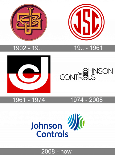
The original Johnson Controls logo was designed at the beginning of the 20th century and featured an elegant composition with an ornate golden monogram set on a solid purple roundel. The intertwined “JSC” uppercase characters have elongated curved lines, which added a sense of luxury and chic to the badge.
19.. – 1961

The redesign of the Johnson Controls visual identity has introduced a modern and bright logo, with the “JSC” abbreviation set in bold red lines of a sharp sans-serif typeface. The inscription was placed against a white background and enclosed into a double circular frame, composed of two thin red lines.
1961 – 1974

In 1961 the Johnson Controls badge got redesigned again, and this time the white “JC” lettering was drawn on a square badge, horizontally divided into black and red halves. The “J” was enlarged and had a smaller “C” placed above its arched tail, filling the negative space and creating an interesting shape.
1974 – 2008

The redesign of 1974 has completely changed the design concept of the Johnson Controls visual identity. The new logo was composed of a two-leveled inscription, executed in the uppercase of a lightweight modern sans-serif font, with the “Johnson” part shifted to the right. This way the “O” of the top line got placed right above the “O” of the bottom line, and the letters were connected by two love rings of the “O”, creating a kind of a stylized chain, set vertically.
2008 – Today
The Johnson Controls emblem is a stylized circle, consisting of nine curved lines. The five blue lines feature different shades from light to dark moving from the left to the right. The green part of the circle is composed of four-line, which start beyond the blue ones.
The color palette of the Johnson Controls logo is fresh and crispy. It reflects the brands willing to move forward and its eternal energy. The light tones make the company’s visual identity look friendly and kind, which evokes a sense of trust and reliability.


