Loblaws is a Canadian chain of supermarkets with chapters spread across Canada itself and also USA. It was established in 1919 and based in Ontario. Loblaws is occupied by selling drinks, basic grocery products, and also goods related to merchandise, medicine and cosmetics. The company is under control of Loblaws Companies Limited, the nation’s most successful food retailer.
Meaning and history
The ‘Loblaws’ name originates from the surname of the supermarket’s founder, Theodore Loblaw. He has established the first Canadian gastronomical store and managed to develop it in the years to come. In the next two decades, Loblaws has spread its operations across the whole Canada and also New York State of US. During the 60s, Loblaws renamed most of their points in western Canada into SuperValu, and later – Real Canadian Superstore. In the 70s, Loblaws has developed the modern version of their stores, close to the supermarkets. This concept remained until today.
What is Loblaws?
Loblaws is a Canadian retail seller, headquartered in Brampton, Ontario. Now, it’s a large retail supermarkets chain with points of presence spread across the whole Canada and in the United States. They’re selling pharmacy, general grocery, some merch, and other products. Loblaws also maintains a house delivery system, launched in 2020. This is one of the first grocery stores in North America. In was founded in 1919 by a businessman named Theodore Loblaw.
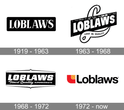
1919 – 1963
The very first logotype of Loblaws depicted the white name caption, written in a capitalized serif typeface with small gaps between the characters. The lettering was placed in a black rectangle. This logotype served rather as a signboard of the stores owned by Loblaw Company.
1963 – 1968
The rectangle was placed on a diagonal, creating a perspective for the inscription. The designers also changed the font to a more basic, bold, sans-serif type. An addition of a beautiful cursive letter “L” behind the rectangular base created an elegant and sophisticated appearance. The horizontal stroke held a “First in Quality” inscription printed in small, uppercase letters. The color palette was preserved black and white.
1968 – 1972
The black rectangle was placed straight again and got decorative elements above and below it. Although the name was printed using a very similar font, it looked a bit different. The letters were italicized and the whole inscription was moved up a bit to give place for a second line. The second line featured two inscriptions that were separated thanks to the use of different font styles. The first one said “Finest Quality” using an elegant cursive typeface, while the second stated “Supermarkets” using a traditional sans-serif font. Just like with the previous logo, the sophisticated design made it clear that only quality products are sold in supermarkets.
1972 – Today
The 1972 logotype includes the text caption, placed to the right from the emblem. The emblem is a signature composed of three curved lines, all looking like a fat ‘L’ symbol, and a dot. The image is limited in a shape of a square with a rounded lower left part. The lines are getting smaller and less bold, until becoming nothing more than a small square. There are two versions of the nameplate, different in the coloring and the positioning of the letters.
Font
The 1972 version of the nameplate has received a fat sans-serif script with the first character capitalized, and the following ones lowercase. The letters have quite a little space in between. There is the version of the name with the letters merged with one another.
Color
The coloring of the modern crest combines black and orange shades. The nameplate is colored black, while the symbols of the emblem change their shades from almost red for the largest element to bright orange for the smallest one. The second edition of the logotype has an enriched coloring of the symbols, with the general palette unchanged.


