Meijer has been on the market for more than 80 years, it is a family business. Since its beginning, the service has steadfastly adhered to three values that attract customers – fair prices, product quality, and a high level of service. The last one is completely independent of whether you are a virtual customer or go to a real store, you can always count on detailed advice and fast resolution of disputes.
Meaning and history
Meijer is one of the largest so-called family-owned department store chains in the United States. It was founded in 1934 and now includes more than 200 shopping centers across the country. It owns the concept called “One Stop Shopping”.
At Meijer there are no fakes, it does not chase the cheapest goods in certain segments – it is a good-quality family hypermarket. There is a well-thought-out system of motivation for customers – discounts, bonuses for the second and subsequent purchases, incremental discounts depending on the check, etc.
Prices compared to competitors are quite high, but Meijer bears its name for the quality and origin of its goods. Particular attention should be paid to the discount system, which allows you to save markedly with each subsequent purchase.
As with any multi-brand hypermarket, Meijer regularly has sales that peak on U.S. public holidays.
Today Meijer is a chain of 258 stores of different formats operating in Michigan, Ohio, Indiana, Illinois, Kentucky, and Wisconsin. The retailer’s financial numbers were not disclosed, but Foodindustry estimates that Meijer’s revenues in 2021 will exceed $25 billion.
What is Meijer?
Meijer is the name of a famous multi-brand hypermarket in the United States. A giant assortment of products – about 40,000 items in stock every day. The main product categories are health and beauty, groceries, clothing, kitchen and baby products, jewelry, gardening, toys, furniture, sports and electronics, and sales.
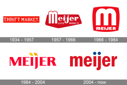
In terms of visual identity, Meijer has changed its logo quite a lot. Although, red color has always been present on all the badges of the company, and by today has become a corporate identifier, standing for the power, passion, and attention of the Meijer chain to its customers.
1934 – 1957
The very first Meijer logo was designed in 1934 when the company’s name was just the “Thrift Market”. The badge was composed of a horizontally-oriented red rectangular banner with white uppercase lettering on it. The unscripted was set in an interesting designer typeface with pretty large triangular serifs on the ends of the bars.
1957 – 1966
The name “Meijer” was brought up in 1957, and the logo was changed in the same year. The new badge featured a pentagon with rounded angles, set in the dark shade of red and overlapped by a bold white title case lettering in a custom sans-serif typeface, with the dots above the “I” and the “J” replaced by two white five-pointed stars. The main wordmark was accompanied by a delicate small “Super Markets” tagline in a traditional sans-serif.
1966 – 1984
The redesign of 1966 adopted the “two-arch” capital “M” from the previous badge as the new emblem of the company. The letter was emboldened and refined and was now placed on a solid red square, and underlined by a smaller “Meijer” inscription, which was also executed in white. It was a cool and contemporary badge, which stayed with the chain for almost twenty years.
1984 – 2004
Another redesign was held by Meijer in 1984. The concept was completely changed, and the emblem was removed from the badge. The new Meijer logo featured bold uppercase serif lettering in a light shade of red, with the dots above “I” and “J” replaced by yellow parallelograms, slanted to the left. It was a very bright and lively logo, with a friendly color palette and welcoming mood.
2004 – Today
The redesign of 2004 has simplified the Meijer logo and made it even friendlier, due to the use of lowercase lettering, set in a traditional sans-serif font with bold and stable characters. The color palette was intensified and the yellow parallelograms were replaced by dark blue circles. No new elements were added to the concept, just deep-red lettering with blue dots on a white background.
Font and color
The bold lowercase lettering from the primary Meijer badge is set in a geometric sans-serif typeface, with stable letters and distinctive contours. The closest fonts to the one, used in this insignia, are, probably, ITC Franklin Gothic Condensed Demi, or Kommon Grotesk Comp Bold.
As for the color palette of the Meijer visual identity, it is based on a combination of deep shades of red and blue, where red symbolized strength and passion, and blue evokes a sense of trustworthiness and reliability.


