A Liverpool crest of some kind was first mentioned by a sports commentator in the fall of 1892 when the team played its first season. According to the report, the flag featured “the letters L.F.A. surmounted with the liver bird.”
Meaning and history
Liverpool Football Club is one of the most iconic and successful teams in the history of football. And not many people know that the history of this legendary soccer club began with a conflict.
The future creator of Liverpool, businessman John Houlding was the owner of the land on which the Anfield stadium was placed, and part-time director of the Everton FC. And one day between John Houlding and the committee of Everton, a dispute broke out over the rent for the stadium, which resulted in the election of a new director of the team, and in March 1892 Houlding was dismissed from the club. It was then that he decided to form his own FC.
It was decided to name the new club in honor of the city. So, on June 3, 1892, the Football Association of England officially recognized a new football club called Liverpool as a professional one. This day is considered the official date of the creation of Liverpool FC.
By today, Liverpool has won 19 English league titles, making them the second most successful club in the history of the English league. The club has also won the FA Cup 7 times and the League Cup 9 times. On the international stage, Liverpool has won the UEFA Champions League 6 times, which is a record among English clubs.
According to the official logo history provided by the team on its website, the earliest Liverpool logo was a replica of the coat of arms of its home city, Liverpool. Here, you could see Neptune, the Roman god of the sea, and Triton, who was the messenger of the sea in Greek mythology. Between them, there were two cormorants, or Liver birds, a very popular motif in the heraldic system of the city of Liverpool, one of its most known symbols. Both Triton and Neptune were holding flags. There was a banner with the Latin text that can be translated as “God has granted us this ease.”
What is Liverpool?
Liverpool is the name of a professional football club from Great Britain, which was established in 1892. Today the club successfully competes in the Premier League, has Anfield Stadium as the home arena, and Arne Slot as the head coach. Liverpool FC is one of the two most titled clubs in England and one of the most popular teams around the world.
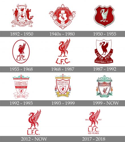
1892 – 1950
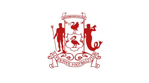
The very first Liverpool logo depicted the official crest of the city of Liverpool, the motherland of the team. It was a red and white composition with two Greek gods — Neptune and Triton, placed on the sides from a vertically oriented banner with the elegant and ornate images of two liver birds. The club’s nameplate was placed under the image, written on an arched ribbon.
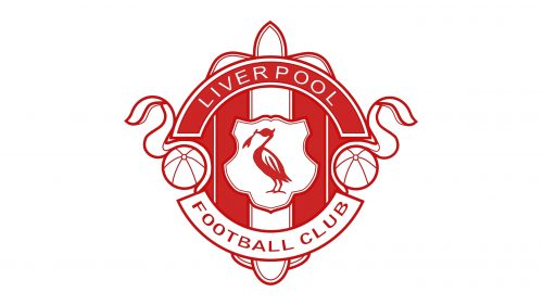
1940s – 1980
In the late 1940s, there was also another crest featuring a cormorant inside a shield shape. The bird was holding seaweed in its beak. The crest didn’t achieve the status of the official logo. However, it lasted several decades – the last time it was used was in the early 1980s.
1950 – 1955
The redesign of 1950 introduced a simplified version of the Liverpool visual identity — it was just the Ted crest in a white outline with the white image of the liver bird on it. No ornaments, ribbons, and lettering here, just the main graphical symbol of the club, in their iconic color palette.
1955 – 1968
In 1955 the logo was redrawn again, and the crest shape of the Liverpool logo was replaced by a clean and neat vertically oriented oval. The color of the background was switched to white, and the red framing was balanced by the elegant red image of the liver bird and the “L. F. C. “ lettering in sans-serif arched under it.
1968 – 1987
The contours of the bird were refined and modernized in 1968, and the oval framing was removed from the badge in the same year. The color palette was slightly elevated and now the club started using a brighter shade of red, which was close to scarlet-red.
1987 – 1992
In 1987 Liverpool came back to the darker red, and a more complicated composition of the emblem. The new version featured a bold dark red silhouette of the bird placed on a white triangular crest with a thin red outline. The crest had two dark Ted ribbons placed along its bottom sides, and containing white “Liverpool” lettering in the uppercase. The “Football Club” inscription was set on a horizontal banner under the badge.
1992 – 1993
To celebrate the 100th anniversary of the club the new logo was I traduced in 1992 and stayed with the club for a year. It was a bright and light composition with green and yellow details around the white triangular crest. The yellow ribbon with the “1892 — 1992” datemark in red was set under the crest, and the ornate green leaves were placed over a yellow horizontal banner with the clubs’ motto “You’ll never walk alone” on it. The main crest featured the iconic liver bird image set under the red horizontal banner with “100 years” written on it, and the red “Liverpool Football Club” on the upper part.
1993 – 1999
In 1993 the ornate logo from 1992 was refined and redrawn in thinner and cleaner lines. The “100 years” part was removed from the crest, keeping all other elements where they were. On both sides from the crest, there were two stylized flame images added in red white, and black. This badge stayed with the club for another six years.
1999 – Today
The yellow details on the Liverpool heraldic badge were switched to the green ones in 1999. There were also some gradient shades added to the image, to make the badge dynamic and to show the lotion and progress of the famous British club. The liver bird was redrawn with white accents and started looking more realistic.
2012 – Today
The redesign of 2012 brought back the Liverpool emblem from 1968, but in its modified version – the red liver bird’s contours were strengthened and cleaned, and the “L. F. C. “ inscription under it was now set in a straight line and executed in an elegant and fine serif typeface.
2017 – 2018
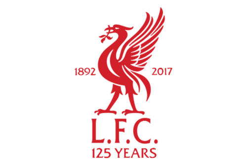
In April 2017, two updated FC Liverpool emblems were introduced. They were created for the 2017/2018 playing season, to mark the team’s anniversary. In fact, they didn’t change that much, as each of the meaningful elements stayed where it was.
The full shield looks exactly as its predecessor, apart from the dates “1892” and “2017,” which appeared from either side. The first date is the year when the club played its first game, while 2017 is the year of its 125th anniversary. Also, the text “125 years” appeared below the shield.
The second version of the crest, which is emblazoned on the kits, is much simpler. There’s only the bird (and it looks almost exactly as on the primary logo, except that it’s flat) and the lettering “L.F.C.” (Liverpool Football Club). Similar to the primary logo, the anniversary version of the crest also includes the dates “1892” and “2017,” as well as the lettering “125 years” beneath.
Font
The glyphic serif typeface featured on the Liverpool logo reminds several fonts. Some of the closest fonts are Albertus Roman, Flareserif 821, and Narkisim.
Colors
The current palette is based on not less than four bright and vivid, great for soccer colors, including Persian green (looking very much like #00A398), red (#D00027), and a vivid shade of yellow called Icterine (#FDF667). We should also point out, that as the Liverpool logo is a 3D one, in fact, there’re more colors. The multiple shades of green, red, and yellow are indispensable as they help to create the 3D effect.
RED
PANTONE: PMS 186 C
HEX COLOR: #C8102E;
RGB: (200, 16, 46)
CMYK: (2, 100, 85, 6)
GREEN
PANTONE: PMS 326 C
HEX COLOR: #00B2A9;
RGB: (0, 178, 169)
CMYK: (81, 0, 39, 0)
GOLD
PANTONE: PMS 100 C
HEX COLOR: #F6EB61;
RGB: (246, 235, 97)
CMYK: (0, 0, 56, 0)


