Rosenberg is the name of a Norwegian football club, which was established in 1917. One of the strongest and most reputable Scandinavian clubs today has Age Hareide as the head coach and Iwar Koteng as the chairman.
Meaning and history
Rosenborg Ballklub, commonly referred to as Rosenborg or RBK, was founded on May 19, 1917, in Trondheim, Norway. The club was established by a group of enthusiastic football players led by Ørnulf Holm, who were previously part of a local team named Odd. Over the years, Rosenborg has evolved into one of the most successful football clubs in Norwegian history. The pinnacle of their achievements includes winning a record 26 league titles in the Eliteserien, Norway’s premier football division. They have also triumphed in the Norwegian Cup 12 times, showcasing their dominance in national football.
Internationally, Rosenborg has made a significant mark in European competitions, most notably in the UEFA Champions League. They have participated in the group stages of the Champions League 11 times, reaching the quarter-final stage in the 1996-97 season. This feat marked them as a formidable force in European football, particularly during the 1990s and early 2000s. In recent times, the club continues to be a strong competitor in Norwegian football. They consistently challenge for top positions in the Eliteserien and strive to reclaim their status as the leading force in Norwegian football. Rosenborg’s current position reflects their ongoing commitment to excellence and their enduring legacy in Norwegian and European football.
What is Rosenborg Ballklub?
Rosenborg Ballklub is a professional Norwegian football club based in Trondheim. Known for its remarkable success in the Eliteserien, Norway’s top division, the club has a rich history of domestic and European achievements. Renowned for its legacy in Norwegian football, Rosenborg remains a pivotal player in the national football scene.
1970
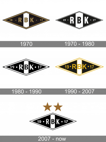
The 1970 logo depicts a wide rhombic shape, mostly colored in black but with a single white stripe in the middle. They’ve further outlined it in gold. Inside, there is an acronym that says ‘RBK’ in the same color as the frame. On its either side lay two halves of the year 1917, when the club was created.
1970 – 1980
In the next version, they introduced a brighter yellow shade and reimagined the frame into 3 layers of gold, white and gold.
1980 – 1990
The 1980 version is largely the same design, but turned black-and-white and with taller letters inside.
1990 – 2007
In 1990, they made the rhomb yet wider, placed the letters closer together and made them smaller again.
2007 – Today
The Rosenborg football club visual identity is definitely one of the most minimalist badges not only in Scandinavia but in Europe. It is strict and laconic from all sides — shape, graphics, and color palette. There is not even a wordmark in the club’s badge.
The Rosenborg logo is composed of a horizontally stretches rhombus in a black and white outline. The body of the badge is all black with a wide white stripe, placed vertically in the middle.
The “RBK” lettering is located in the center of the emblem, with the black “B” on white and white “R” and “K” on black background. The “1917” date mark in white is placed from both sides of the inscription, being separated from the letters by solid white dots.
Two massive dark gold five-pointed stars are placed above the rhombus to celebrate the club’s winnings. And this is the only colored element of the Rosenborg visual identity, which adds power and style to the whole image.


