

![]() Lens Logo PNG
Lens Logo PNG
Lens is the name of a French football club, which is also known as “Sang et Or” (the nickname translates to English as “Blood and Gold”). The club was established in 1906 and played in Ligue 1 until 2019. Today it is a Ligue 2 team, which has Franck Haise as the head coach.
Meaning and history
![]()
The visual identity of the French football club has been very consistent and followed the same color palette and symbolism since the middle of the 1950s. The red, yellow, and black combination was adopted by the team to represent blood and gold of the mining industry which the region was known for. The main symbol of all the logos, the miner’s lamp, has also never left the team’s emblems, showing its strong connection with its history and value of its roots and heritage.
1955 — 1968
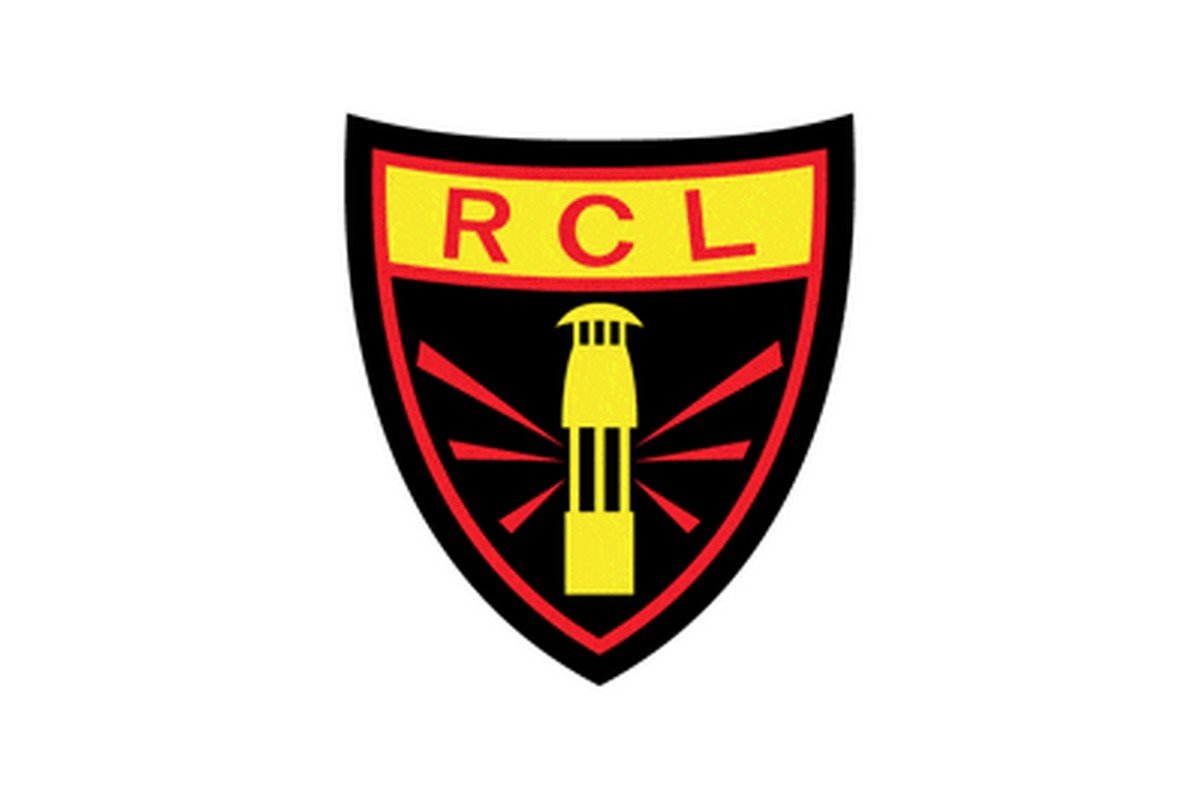
The Lens logo designed in 1955 was composed of a dark and intense crest, executed in black with a red outline and a yellow banner with the wordmark on top. The wordmark contained only three letters “RCL”, which were written in red sans-serif with a lot of space between the symbols.
On the main part of the emblem, there was an image of the miner’s lamp, drawn in yellow with six red rays coming out of it to the sides.
It was a strong and mysterious badge, which evokes a sense of power and masculinity, showing the team’s connection with its roots and its pride in the background.
1968 — 1979
In 1968 the logo was redrawn in a lighter and more modern manner. Now the shield diagonally divided into two parts featured yellow and orange colors and black details.
Outline in white and black, the crest contained “RCL” lettering on its orange part, and the black miner’s lamp on the right, the yellow one.
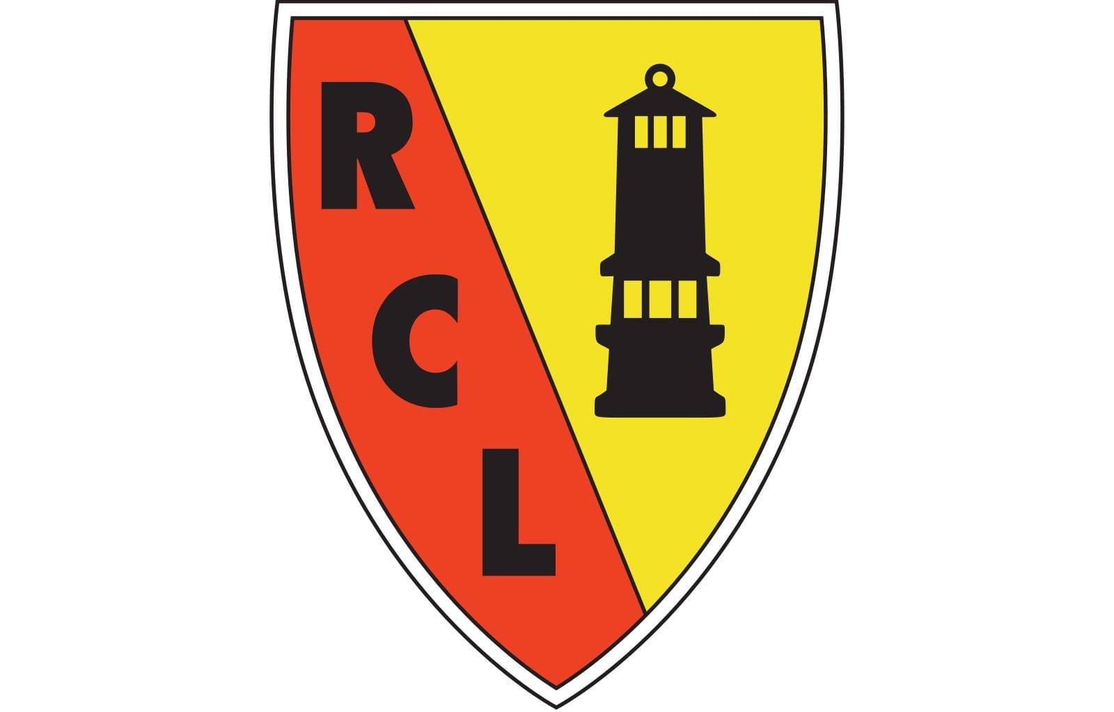
1979 — 2001
![]()
A new symbol was brought to the logo in 1979z the composition remained untouched — the diagonally split shield with the monogram on the left and picture in the right, but some additions were made.
First of all, the orange color of the crest was changed to a classic red, and the “RCL” lettering was now executed in white in order to create better contrast.
The black miner’s lamp was now not the only graphical element on the yellow part of the crest. Now it was located on a White Castle tower and had two fleur-de-lys symbols on the sides.
Another new thing from 1979 — the “Racing Club De Lens” inscription in black sans-serif was now placed on the top part of the crest, on a white background.
2001 — 2014
The contours of the logo have been refined and modernized in 2001. The white tower with floral heraldic symbols gained a distinct black outline, the typeface of the “RCL” monogram was changed to a sleeker and a more traditional one.
The black lettering on the top part of the shield became bolder and more visible, and the “Depuis 1906” inscription in thin small letters was added above it.
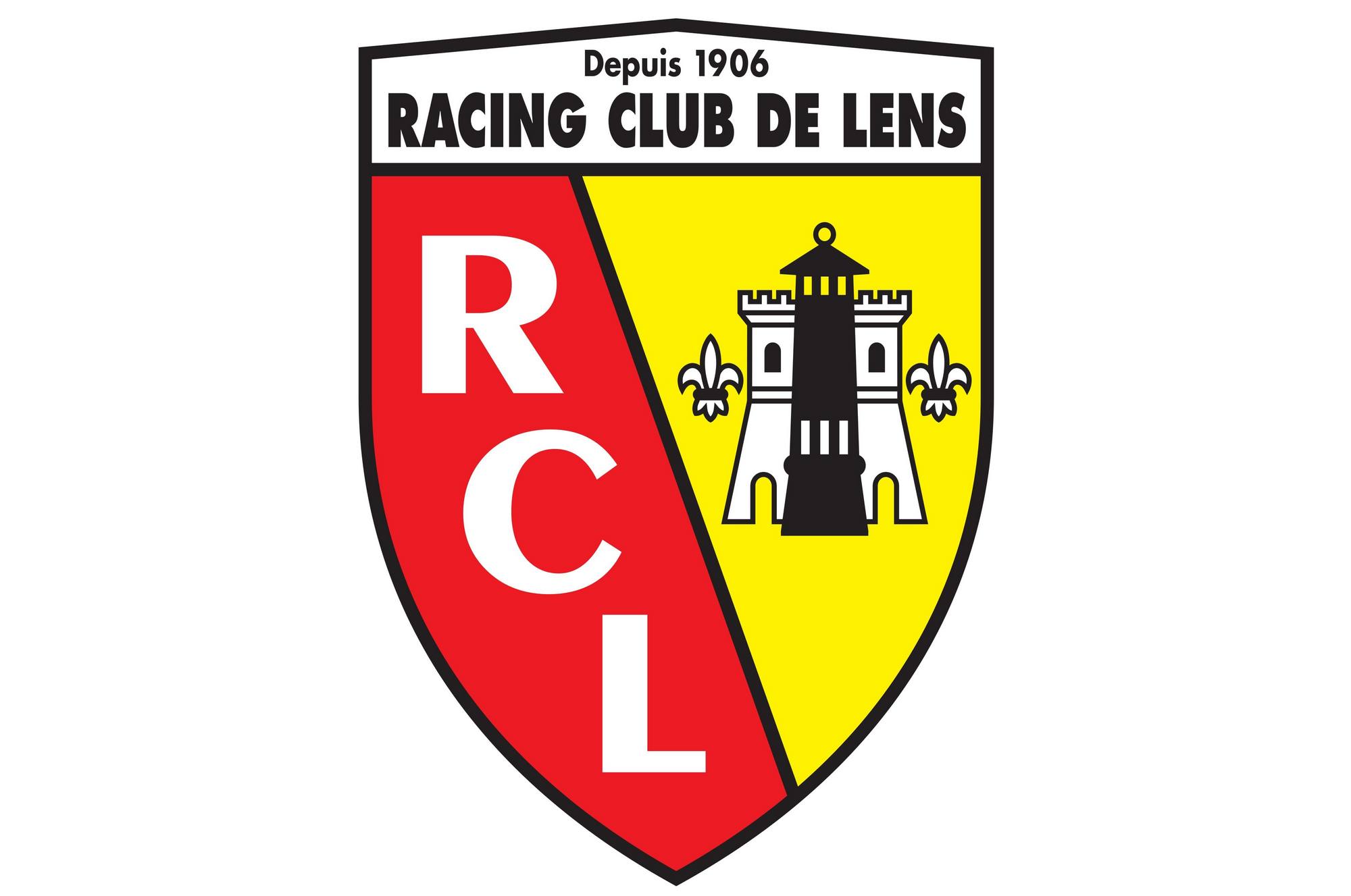
2014 — Today
![]()
The version of the logo from 2014 is fully based on the previous one, but with contours cleaned and modified. The main change was made to the “RCL” lettering which became bolder and more modern, with thick smooth lines and distinct cuts of the letter lines.
Lens Colors
RED
PANTONE: PMS 485 C
HEX: #E01E13
RGB: (224, 30, 19)
CMYK: (6, 99, 100, 1)
BLUE
PANTONE: PMS 2119 C
HEX: #24216A
RGB: (36, 33, 106)
CMYK: (100, 100, 27, 16)
WHITE
HEX: #FFFFFF
RGB: (255, 255, 255)
CMYK: (0, 0, 0, 0)


