

![]() Atlanta United Logo PNG
Atlanta United Logo PNG
Atlanta United is the name of a young football club from the United stayed, which was established in 2014 in Georgia. Today the soccer team is considered to be one of the most successful in the American League and is owned by Arthur Blank with Stephen Glass as the head coach.
Meaning and history
![]()
Atlanta United is a very young club, so it’s visual identity history doesn’t have many redesigns and images in it. Just two versions of the club’s logo were created since 2014, and only one of them became official.
2014 — 2015
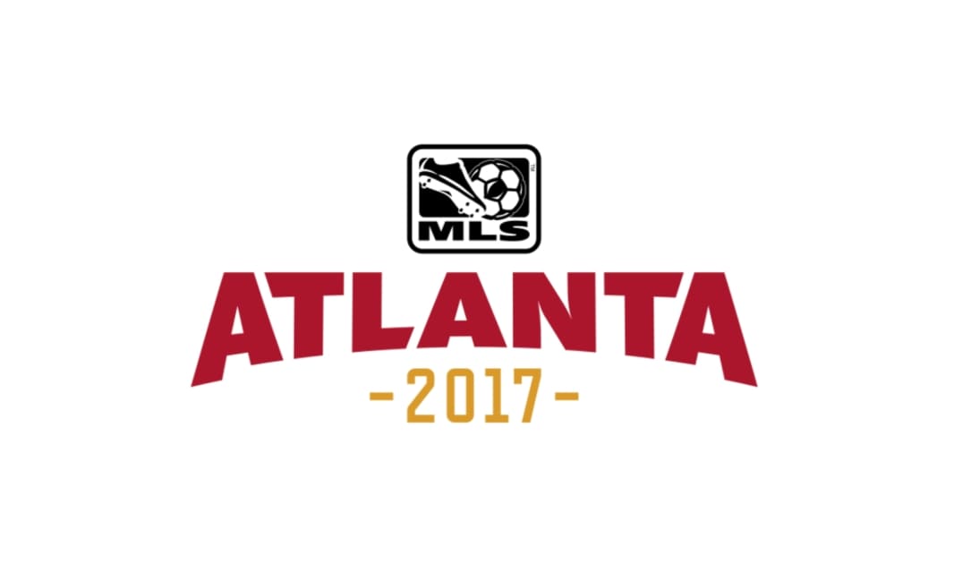
The first logo for Atlanta was created in 2014 for the club’s pre-laugh and featured not too many elements. The badge was composed of a bold arched wordmark and a monochrome MLS emblem above it. Under the wordmark the “2017” digits were placed, symbolizing the planned season for the club.
The burgundy and gold color palette of the logo represented a strong and professional approach of the club, reflecting its power and confidence, while the monochrome icon of Major League Soccer, showed its affiliation to the main American League.
2015 — Today
![]()
The official badge was designed for the club in 2015 and took the color palette of the previous version. The logo of Atlanta United is composed of a circle with a vertical black and red striped pattern and a bold letter “A”, executed in two shades of beige-gold, which makes it look strong and three-dimensional.
The striped circle with the letter is enclosed in a thick black frame with a delicate gold outline. The “Atlanta United FC” inscription in gold geometric sans-serif is placed around the framing perimeter, with smooth gold lines separating the parts of the wordmark.
The Atlanta United Logo is sleek and very stylish. Using the traditional elements, such as vertical stripes and circular shape, it looks very modern and actual and will stay like that forever, as the choice of the color palette and the custom contemporary typeface of the lettering make the whole image look very confident and powerful.
Font and color
The stylish and chic logo of Atlanta United FC has its arched wordmark executed in a simple and neat sans-serif typeface with traditional shapes and cuts of the letters, which are perfectly spaced. The typeface of the inscription is very close to such fonts as Tadeo Sans SC Bold and Kamerik 205 Text Heavy.
The black, burgundy, and gold color palette is usually associated with royalty and nobility, evoking a sense of luxury and exquisite style. In the case of Atlanta United FC, this color combination stands for confidence and determination, pointing to the strongest qualities of the club, such as professionalism, strength, and discipline.
Atlanta United Colors
DARK RED
PANTONE: PMS 1815 C
HEX COLOR: #80000A;
RGB: (128,0,10)
CMYK: (29,100,100,38)
HSB: (355,100,50)
BLACK
PANTONE: PMS 419 C
HEX COLOR: #221F1F;
RGB: (34,31,31)
CMYK: (70,67,65,74)
METALLIC GOLD
PANTONE: PMS 451 C
HEX COLOR: #A19060;
RGB: (161,144,96)
CMYK: (37,37,71,6)
HSB:(44,40,63)
DARK GOLD
PANTONE: PMS 4243 C
HEX COLOR: #817144;
RGB: (129,113,68)
CMYK: (45,46,81,20)


