

![]() Everton Logo PNG
Everton Logo PNG
Everton is the name of the famous British football club, which is also known as The Blues and The Toffees. The club was established in 1878 in Liverpool and is con-sidered to be one of the oldest teams in the British league. Today Everton is owned by Farhad Moshiri and managed by Carlo Ancelotti.
Meaning and history
![]()
Everton is the club with a very intense visual identity history. Throughout the last 100 years of its existence, the club redesigned its logo for ten times, and came back to the most traditional version, created in the very beginning, but with modern symbols and more confident lines on it.
1920 — 1931
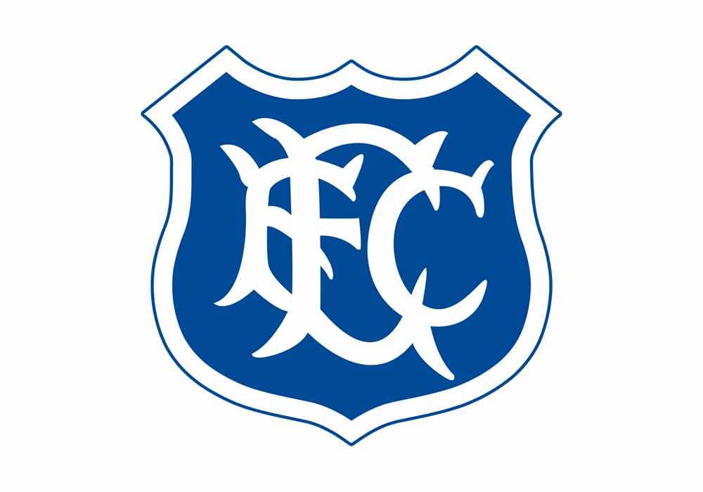
The badge designed for Everton in the 1920s was composed of a solid blue crest with sharp angles and a thick white outline. The main element of the logo was a wishbone-style monogram, composed of “EFC” white letters in bold lines with sharp tails.
1938 — 1972
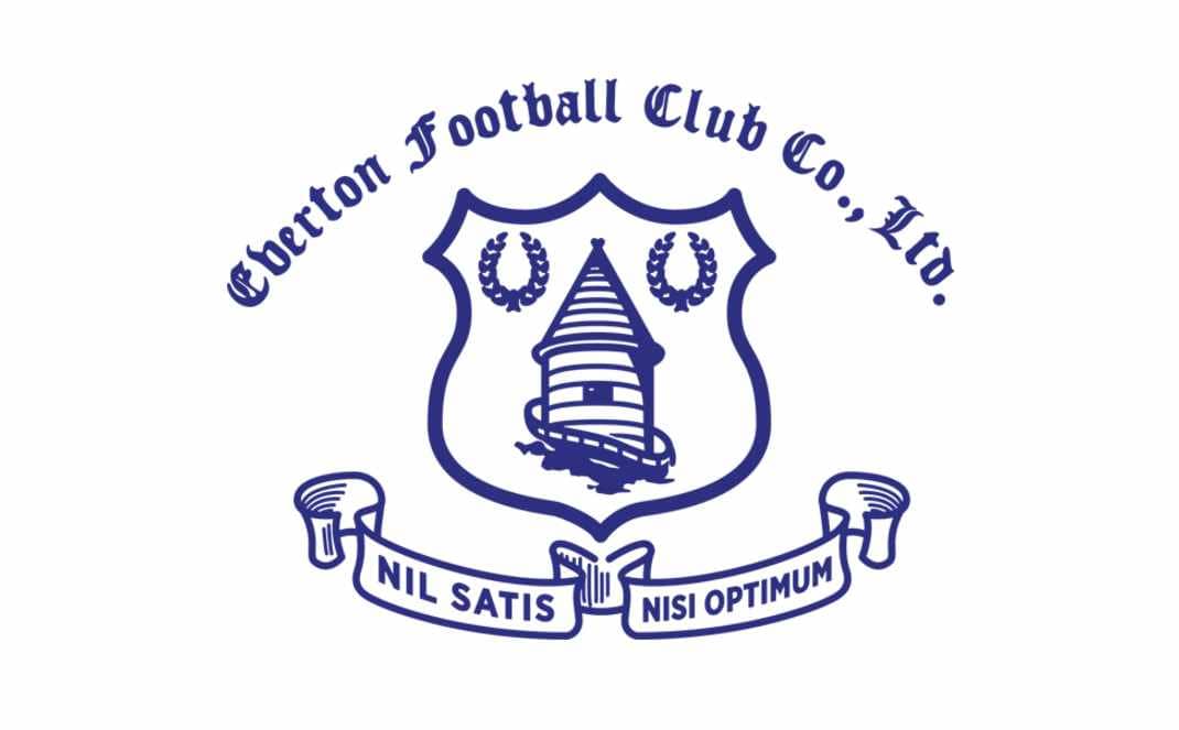
In 1938 the new corporate logo is being created. A white shield in a blue outline featured an image of a rounded tower and two laurel wreaths on its sides. Above the shield, there was an arched old-style wordmark, and under it — two smooth ribbons with “Nil Satis Nisi Optimum” Latin motto in all capitals.
1972 — 1976
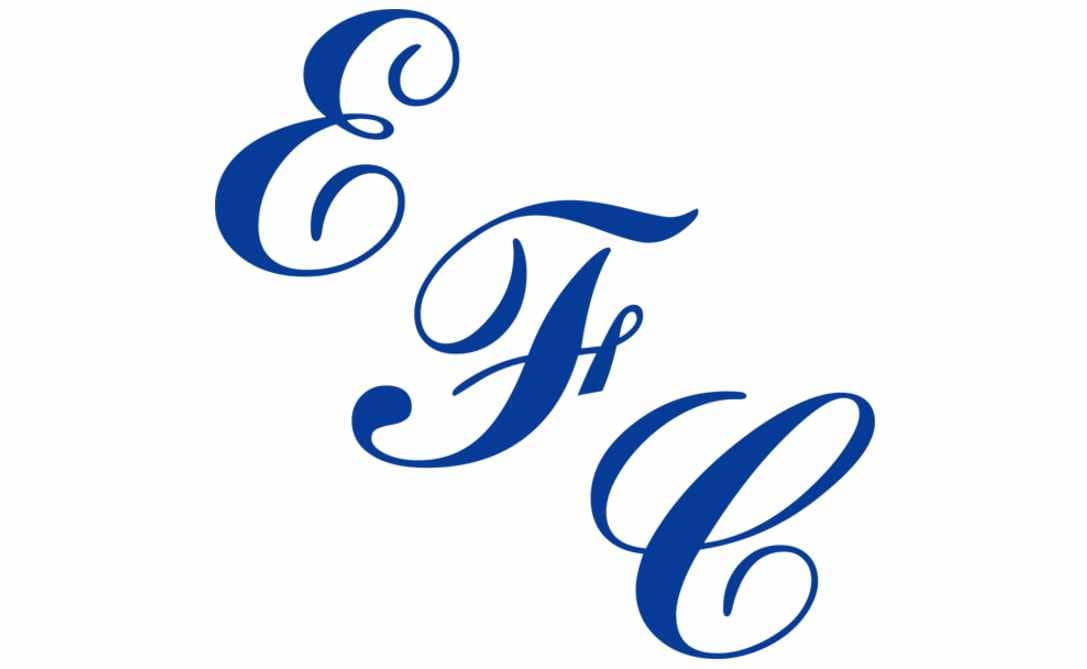
In the 1970s the club starts using a simple “EFC” monogram as the main logo. The cursive letters are placed vertically in a diagonal line from the upper left corner to the bottom right. The color palette remains blue and white.
1976 — 1978
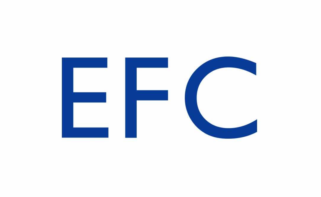
The smooth cursive letters are being replaced by a straight and clean sans-serif in-scription, placed in one horizontal line. It was the most minimalist and simple badge in the club’s history.
1978 — 1982

In 1978 the emblem of the 1930s is being redrawn in blue, white, and green and placed on a white circle with a thick blue outline. The “Everton FC” wordmark in tra-ditional serif font is now placed in one line above the blue shield.
1982 — 1983
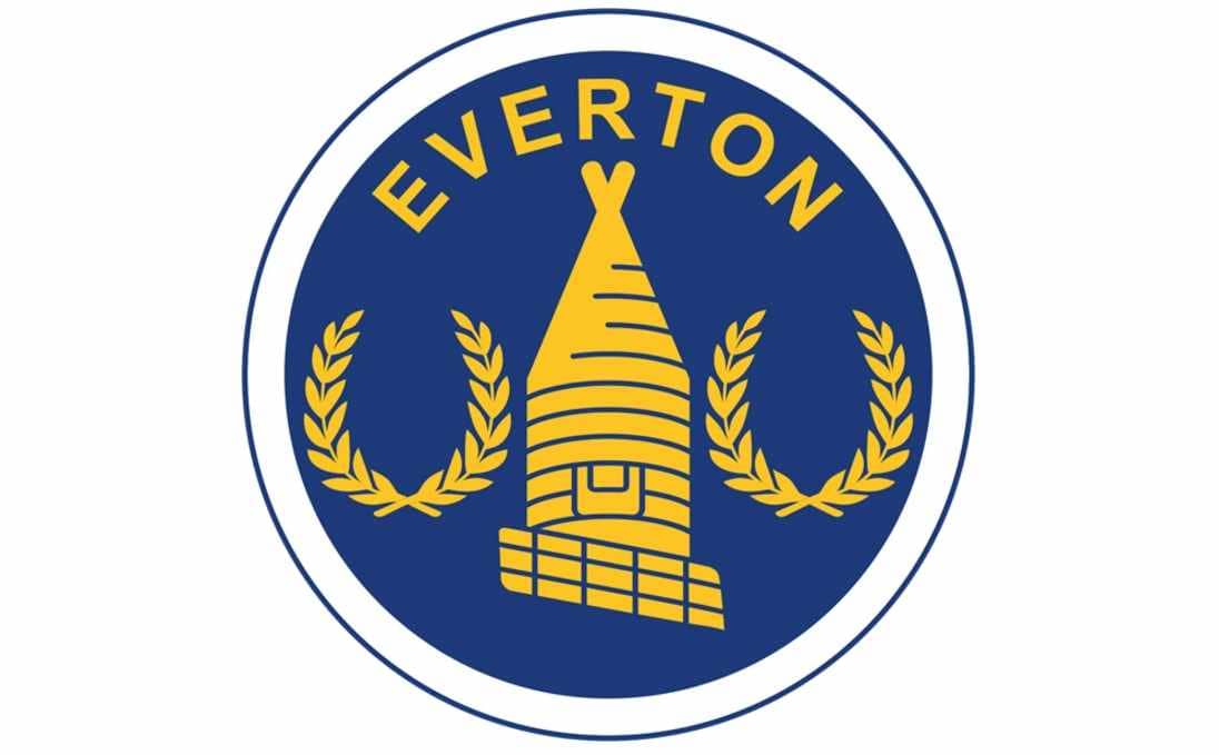
The logo gets a new blue and yellow color palette in the 1980s — the yellow tower and two yellow wreaths are drawn on a solid blue circle, with the “Everton” inscription in all capitals arched along the upper part of the badge.
1983 — 1991
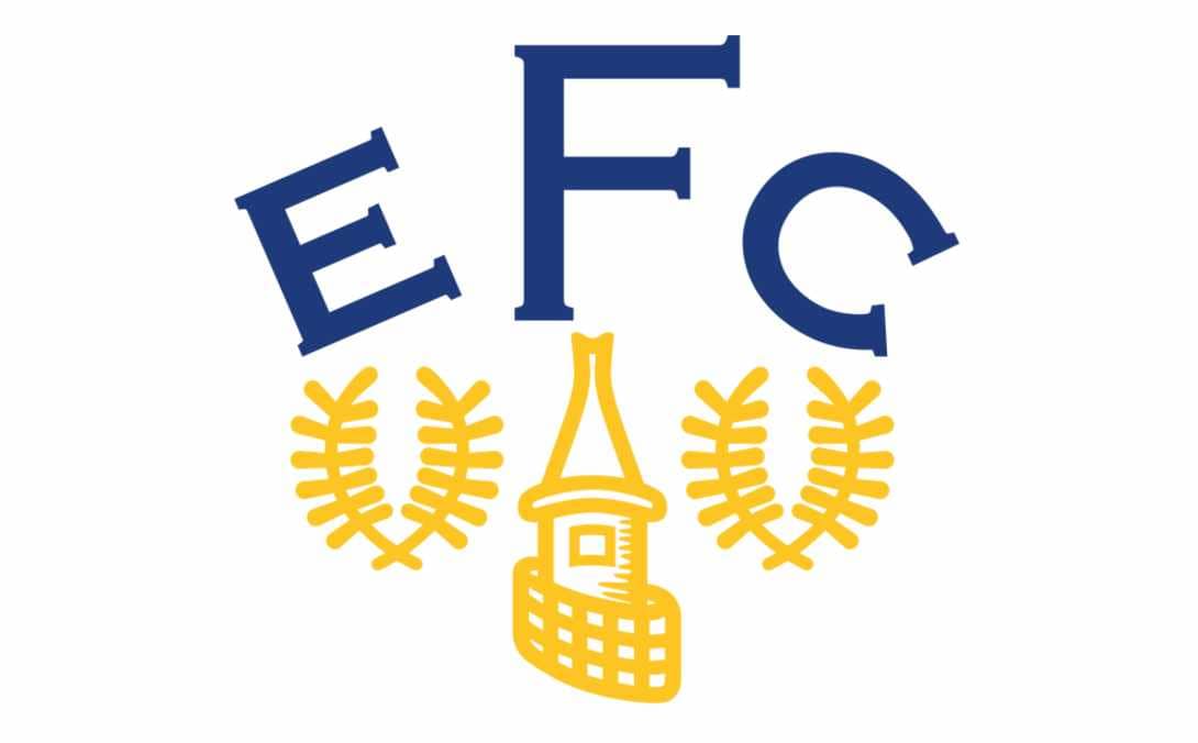
The main graphical symbols of the logo are being redrawn in a more modern manner and placed on a white background without any frames. The wordmark was simplified to “EFC” in a classy serif font with the letter “F” larger than two others. The inscription was executed in deep blue.
1991 — 2000
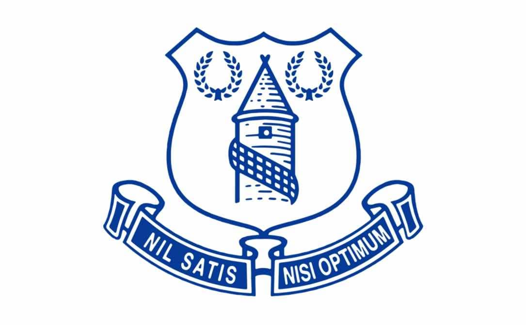
At the beginning of the 1990s, the club comes back to its logo version from the 1930s again. The shield with the tower and wreaths, executed in the blue and white palette is placed above two ribbons with the “Nil Satis Nisi Optimum” motto in capital letters.
2000 — 2013

The iconic Everton logo gains gradient shades and starts looking vivid and three-dimensional in 2000. The main color palette remains blue, white, and yellow, but there are also white and blue and pink and black versions, designed for the club and used as additional badges, depending on the placement and the team’s uniform. The “Everton” wordmark is now placed under the emblem and executed in a sleek modern serif typeface, written in a title case. The year of the club’s foundation is now added to the logo, placed on both sides of the shield.
2013 — 2014
The crest is being simplified in 2013. Now the calm blue shield with a tower is flat again. The wreaths are removed and replaced by “1878”, celebrating the history of the famous club. The wordmark is placed inside the shield, under the tower and is written in white.
2014 — 2021
![]()
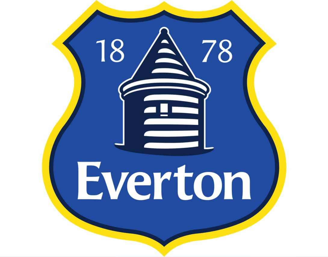
The current Everton logo was designed in 2014 and is based on previous versions. It features a blue crest with a tower, two wreaths, and the date of the club’s foundation in white. The “Everton 1878” in thin traditional lines is placed on the bottom part of the shield.
The ribbon with the Everton motto in Latin is now arched along the bottom part of the crest.
2021 — Today
![]()
The new logo of the football club showed off a more vivid blue. It infused more life and freshness into the familiar emblem, giving it a completely new look even though all the elements otherwise were preserved unchanged.
Font and color
The elegant and chic Everton logo has two inscriptions in it, and they are executed in different styles. The main wordmark is written in a title case of a smooth and sleek typeface, which is very similar to Angie Sans Std Bold. As for the slogan in Latin, arched under the crest, it is written in all capital letters of a more traditional and simple sans-serif font, which is pretty close to Latinaires Pro SC Bold and Brava Sans Extra Bold.
The blue and white color palette of the Everton logo looks fresh and calming, representing the football club at its best, pointing to its reliability and professional qualities, along with loyalty to its fans and willingness to grow and move forward. This traditional combination complements the classic shapes and lines of the emblem, adding harmony and style to it.
Everton Colors
BLUE
HEX COLOR: #003399;
RGB: (39,68,136)
CMYK: (98,85,16,3)
WHITE
HEX COLOR: #FFFFFF;
RGB: (255,255,255)
CMYK: (0,0,0,0)


