Aston Villa is the name of a professional football club from Birmingham, UK, which was established in 1874. One of the oldest football clubs in its country and Europe, Aston Villa plays in the English Premier League and has the Villa Park Stadium in Aston as its ground.
Meaning and history
Aston Villa was founded by members of the Villa Cross Church in 1874 when players from the local cricket team were looking for something to do for the winter season. The club quickly enough became the premier team in its region, and in 1888 Aston Villa became one of twelve clubs involved in the creation of the Football League.
During its long history, Aston Villa several times dropped out of the first division of the Premier League, but each time came back, and today it quite confidently holds itself in the middle of the standings.
What is Aston Villa?
Aston Villa is a professional football club from England, which was established in 1874, and was one of the teams-creators of the Football League in 1888. Today Aston Villa plays in the first division of the Premier League and is a seven-time champion of England (last time in 1981).
In terms of visual identity, Aston Villa Football Club has always been loyal to one heraldic symbol, Lion rampant, which was chosen as the club’s mascot by its President, William McGregor, who was Scottish and wanted to establish and show the affiliation of Aston Villa to his motherland. And only one version of the logo did not have any Lion depiction on it.
1880 — 1881
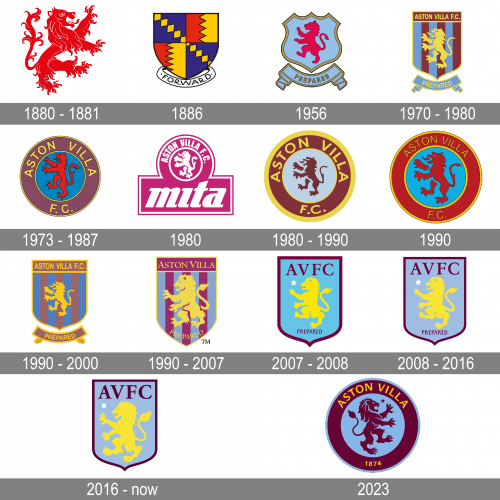
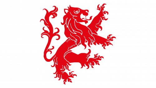
The initial Aston Villa badge has just one element — a red Lion rampant, drawn traditionally, with all the ornamental details. The animal was standing in profile turned to the right, had its mouth open, and the long stuck out. No additional details were present on the logo, the red Lion was simply placed on a plain white background.
1886
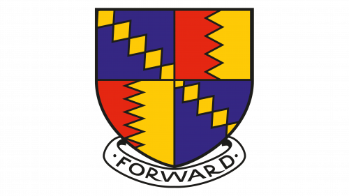
In 1886 the only Aston Villa logo with no Lion was presented. The classic crest in a black outline has an interesting geometric pattern. It was divided into four segments: two were red and yellow, with a vertical zig-zag line, and the other two featured bright blue color and an ornament of yellow rhombuses, making up a diagonal line. The crest was underlined by a white ribbon with the black uppercase “Forward” inscription.
1956
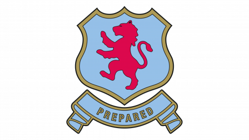
The logo from 1956 boasted a sleek and elegant sky-blue and crimson red color palette, with the abstract red Lion, turned to the left, placed on a solid blue crest in a thick golden outline. Under the crest, there was a wide blue ribbon, outlined in gold, and having a gold “Prepared” inscription written on it in the uppercase of a strong sans-serif typeface.
1970 — 1980
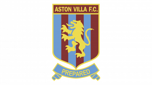
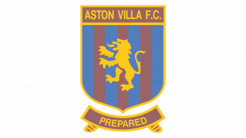
The Lion from the 1970s was drawn in yellow and placed on a narrow strict crest with a vertical striped pattern in light blue and burgundy. The “Aston Villa F. C” inscription was written in yellow capitals over a burgundy rectangular banner, set on top of the crest in a yellow framing. The blue ribbon with the yellow “Prepared” was shortened and arched under the main part of the logo.
1973 — 1987
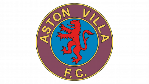
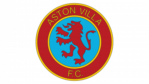
The crest shape was replaced by a circle in 1973. It was a solid blue background with a bright red Lion on it, enclosed into a thick purple frame with a yellow outline and a yellow uppercase “Aston Villa F. C.” Inscription. The Lion on this version looked very heraldic, with a shortened mane, and hypertrophied tongue. As for the lettering, with its clean lines and refined contours, that was the only element adding a modern feeling to the badge.
The 1980s
 To celebrate the new sponsor, Mita, the football club redesigned its logo again at the beginning of the 1980s. The badge was executed in a bright pink and white color palette, with the white Lion enclosed into a circular frame placed above the bold and enlarged Mita logotype in the lowercase of a fancy italicized typeface. The “Aston Villa F. C.” Inscription was arched above the circular icon, executed in a narrowed sans-serif, in white.
1980 — 1990
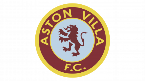
Another logo used during the year was a brown and sky-blue roundel, with a very elegant depiction of the lion rampant. The circular badge was outlined in yellow and has wide yellow lettering written around its brown perimeter. The new stable and modern sans-serif typeface of the Aston Villa logotype added a sense of power and professionalism to the badge, showing its fighting spirit and energy.
The 1990s
In the 1990s the color palette of the Aston Villa logo was brightened and intensified. The brown color gained red shades, and the sky-blue turned into medium blue. As for the yellow inscription, it kept its color but completely changed the typeface, becoming lightweight and elegant, with the narrow letters, and a lot of free space on the brown framing of the logo.
1992 — the 2000s
In 1992 the club brings back the striped crest from the 1970s, softening its color palette and refining the contours of the elements. The muted purple was now accompanied by bright blue, and the yellow framing and lettering looked darker on this version too. The logo was underlined by a ribbon with “Prepared”, arched from the center, which was now colored in dusted purple.
The 1990s — 2007
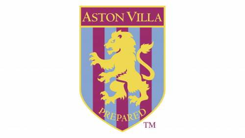
The colors on the striped crest were changed again, and the yellow Lion was redrawn, with its mane, claws, and eyes visible better now. The ribbon under the crest was removed, and the yellow “Prepared” was now set on the crest, eight under the Lion, executed in an elegant medium-weight serif font. The upper banner had the “F.C.” part of the lettering removed, and the new “Aston Villa” inscription was set in the same serif typeface, written in the uppercase, with the “A” and “V” enlarged.
2007 — 2008
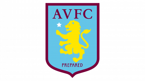
In 2007 the Aston Villa logo was redesigned again to honor the new owner of the club, Randy Lerner. The striped background of the crest was replaced by a solid bright blue, and the white five-pointed star appeared on the left from the yellow lion. The full logotype was removed, and the “AVFC” abbreviation in burgundy was written above the Lion, with no additional framing. The “Prepared” was still there but now written in a straight line, executed in small-cape of a modern sans-serif typeface.
2008 — 2016
The color palette of the Aston Villa crest was changed in 2008, with the blue getting more purple, but in its every tender and smooth shade, and the burgundy becoming darker, closer to chocolate. The new palette added a sense of sophistication and timelessness to the badge, showing the team as the one with rich history and expertise.
2016 – 2023
The redesign of 2016 refined some elements of the previous badge and removed the “Prepared” tagline. The yellow lion was enlarged, due to more space available on the crest after the tagline removal, and got its claws enlarged. Now the animal looks more powerful and dangerous. And the color palette of the Aston Villa only elevates this feeling of strength and confidence.
2023 – 2024
The redesign of 2023 has brought back the rounded medallion, used by the football club in the 1980s — 1990s, but turned the Lion to the right, and redrew it with cleaner and more confident contours. The new roundel is executed in a burgundy and sky-blue color palette, with yellow lettering, written around the perimeter of the medallion.


