LEGO is a famous toy manufacturer, which was established in 1932 in Denmark. The company is best known for its colorful construction blocks and has its products distributed all over the globe through big toy stores and their own branded retail shops. The Danish group also owns a few Legoland parks in different countries.
Meaning and history
One of the most famous toy manufacturing companies in history was founded in the early 1930s and specialized only in the design and production of wooden toys until 1949. The name of the brand, which today is synonymous with colorful building blocks, was derived from the Danish for “play well” (“Leg Godt”) and has always been written in capitals.
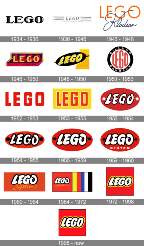
And the case of the letters is probably the most if not the only constant feature of the company’s visual identity, as there have been more than 15 redesigns of the toy manufacturer’s logo designed throughout its history — various shapes, styles, and colors were being adopted.
1934 – 1936

The very first official LEGO logo was composed of a strong and solid wordmark in all capitals, drawn in black and used exclusively for documents and printables. The lettering was executed in an elegant serif typeface with thick vertical bars and playful diagonal serifs. It was a bright and powerful logotype, which only stayed with the brand for a couple of years.
1936 – 1946
In 1936 the company started placing its mark on the products, and the logo was redesigned in order to fit the wooden toys. An italicized brand name in fine lines was placed in the center with two parallel horizontal lines on both sides. The “Fabriken Billund” lettering was placed inside the lines.
It was a very modest and simple logo, which stayed with the company for almost ten years.
1946 – 1950
The first colorful version of the logo was designed in 1946. The palette included orange and black, two colors standing for happiness, energy, and confidence. And again, it was a text-based logo, executed in two different styles.
The orange “LEGO” lettering in clean and neat sans-serif typeface was complemented by a black cursive “Klodster”, placed over its bottom part. It was a more modern and professionally executed emblem, which was a better reflection of the company’s purpose and essence, than all the previous versions.
1946 – 1948
Another logo was created during the same time period. It was a three-dimensional wordmark placed on a brown and black pedestal, resembling a toy package. It was used only for the brand’s wooden toys, even a few years after the first plastic toy was manufactured.
1948 – 1950
There was one more version design in 1949 — a yellow bold inscription is a black horizontal oval. As we can see today, the company adopted the color palettes of both versions from the 1950s for their current visual identity. The style of the current inscription is also based on the logo from 1949 — thick rounded letters.
1950 – 1953
The plastic block era started in the 1950s and the company designed a new visual identity to celebrate it. It was a white circle with a thick black outline and white “Billund Denmark” lettering around its perimeter.
The red stylized “LEGO” lettering was placed in the middle of the circle, repeating its contour.
1952 – 1953
The redesign of 1952 has created a very simple yet modern and stable Lego badge with the uppercase lettering set in a heavy geometric sans-serif font; in solid red lines with the massive capital characters set against a plain white background with no outlines. This version of the logo only stayed active for several months.
1953 – 1955
Another experiment of the 1950s — bold red wordmark in a strong geometric sans-serif typeface. There were two color schemes — red in white outline, placed on different backgrounds, and red inscription is a yellow rectangle. Both logos were bright and friendly, evoking a sense of happiness.
1953 – 1954
Another redesign of the 1950s has rewritten the Lego wordmark in a fancy bold italic typeface, with heavy white letters outlined in black and placed on a solid red oval, with two solid white circles connected by a thin white line behind the inscription.
1954 – 1955
In 1954 the outline of the white inscription got emboldened, and the contours of all letters were refined and strengthened. The white circles with the white line were also switched to black and got thicker.
1955 – 1959
In 1955 the prototype of the current visual identity was designed. The LEGO logo featured a red horizontal oval with white smooth lettering in black outline. There was another detail on this emblem — a thin white horizontal line with two solid circles on its ends. The element resembled a dog bone or made the whole badge look like a button. Whatever it was, it added individuality to the logo and made the brand’s products stand out on the shelf.
It was slightly redesigned throughout the years, and the white home turned into the black one, while the outline of the letters became bolder and made the whole image look more powerful and confident. During a couple of years, the company used the version where the wordmark was in yellow, not white.
1959 – 1960
The version of the Lego logo, designed in 1955, was refined in 1959, with all the elements remaining the same, but one additional details placed on the bottom of the medallion. It was a white uppercase “System” in a geometric sans-serif font, which was written right under the “Lego”.
1960 – 1964
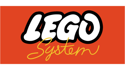
In 1969 the oval was replaced by a rectangle and the letters of the nameplate were placed closed to each other. There was also a cursive yellow “System” inscription, placed under the main lettering.
The logo from the 1960s looks pretty similar to the current one, the main difference is that on the older version the inscription was slightly extended.
1964 – 1972
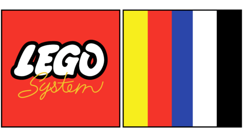
The rectangle turned into a square and became a part of a bigger geometric shape. The logo of the toy manufacturer, designed in 1964 was the most colorful of all versions.
The horizontal rectangle was vertically divided into two equal squares — the red with the wordmark on the left and the multicolored square, composed of several vertical lines on the right. It was a reflection of joy, happy playtime and passion, evoking a smile.
1972 – 1998
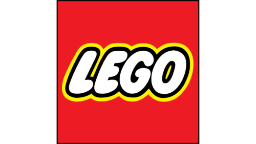
The red square remained, while the colorful stripes were gone. Now the logo was composed of a white wordmark in a double black and yellow outline. The letters were executed in a bold rounded sans-serif typeface, looking solid yet friendly and kind.
1998 – Today
In 1998 the LEGO visual identity was only slightly refined. The letters are now placed closer to each other and the whole inscription is narrowed, looking neater and more professional.
The signature red, white, yellow and black color palette remains untouched as well as the composition and the mood of the iconic image.
The Lego logo does not at all appear to be too pointed or pedantically even. However, these are exactly the characteristics which meet the main requirement of the Lego factory (with accuracy up to 0.002 mm). But in reality, the Lego logo creates the mood corresponding to its hidden meaning – “Leg Godt” – which means “play well”. Indeed, bright colors of the logo invite to the game.
Font
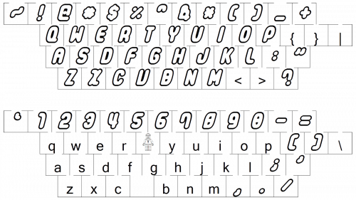
The typeface designed for the emblem in late 1954 looked very much like the current one. In the course of time the characters grew a bit “plumper”.
Color
The combination of white, yellow, red, and black has been present in the Lego logo since 1960. The diversity is supposed to remind of the basic colors of the Lego blocks themselves.


