

![]() Steyr Logo PNG
Steyr Logo PNG
Steyr Arms (before 2019 – Steyr Mannlicher AG) is an Austrian brand producing firearms. It used to be part of Steyr-Daimler-Puch but turned into an independent company in 1989 when the conglomerate was broken up.
Meaning and history
![]()
The brand’s roots can be traced to 1821, when Leopold Werndl, a blacksmith in Steyr, started making iron parts for weapons. It was only in 1864, however, that his son Josef Werndl founded his company. In 1869, it turned into “Österreichische Waffenfabriksgesellschaft” (ŒWG, Austrian Arms-Manufacturing Company).
1869 – 1926
![]()
The old Steyr logo featured the abbreviated name of the company in a serif type. The design looked pretty simple – nothing but the four letters (two of them forming the first line, the other two forming the second line). The type looked refined and was rather popular in its era.
1950 – 2019
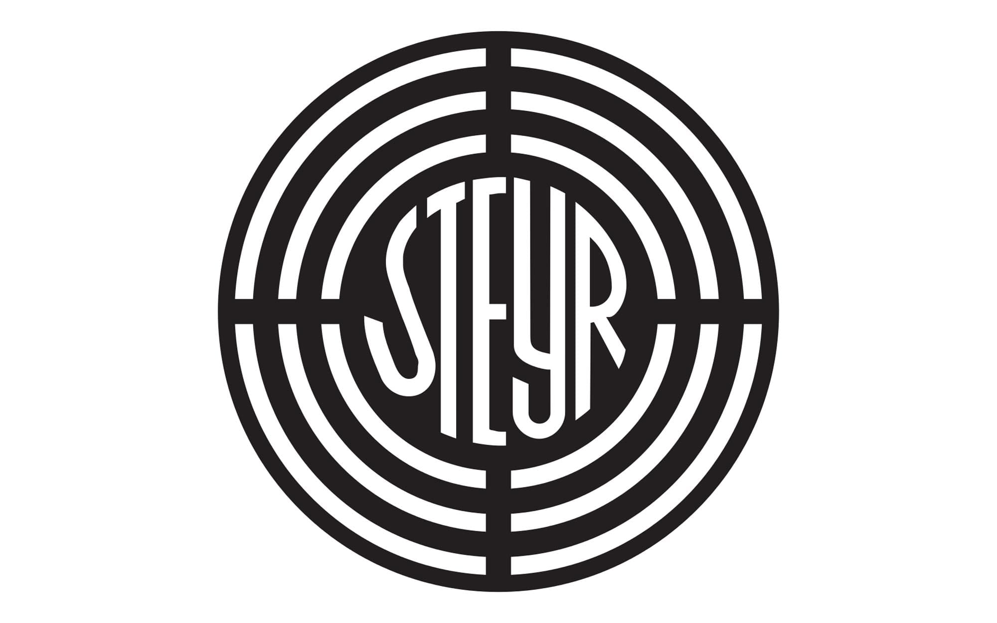
Steyrer Werke merged with Austro-Daimler-Puchwerke to form Steyr-Daimler-Puch. The company used a double logo consisting of two roundels.
First, there was a circle featuring the word “Steyr” in the center. The word was surrounded by curved lines. The design was inspired by the gunsight.
To the right, there was the Puch logo. In addition to the name of the brand, it contained a traditionally-shaped shield broken down into four fields (two of them were dark green, while the other two were white).
1964
There first part of the logo was often used independently. While there was some experimenting with the minor details (the width of the lines, the type), the overall look remained unchanged.
2019 – Today
![]()
When Steyr Mannlicher was renamed Steyr Arms, it updated its visual brand identity, too.
The structure and the core visual metaphor of the Steyr Arms logo remained the same. There was the gunsight with the word “Steyr” in the middle.
Now, it also included the word “Arms” below set in simpler and smaller letters. All the strokes grew narrower, which made the design cleaner and clearer.


