Lava a in a famous Italian brand of coffee, established in 1895. The company is still managed by the founder’s family and runs a few more brands under different labels. The Lavazza coffee products are one of the most popular across the globe.
Meaning and history
The brand has belonged to the family of the same name since 1895. Back in 2013, it became the world’s seventh-largest coffee roaster. In 2017, the number of employees almost reached 3,100.
1895
The company’s first shop in Turin featured a sign saying “Drogheria Lavazza.” The lettering was yellow on the green background. Interestingly, the “A’s” already had a squarish top, which made them vaguely reminiscent of the current Lavazza logo.
1920s-1930s
The packaging of the 1920s featured a different style with “dancing” red and black letters.
A retro photo made in 1930 has preserved for us the wordmark written on one of the company’s vehicles. While the “A’s” had a triangular top, the style of the font, with its pretty heavy block letters, was not far from the following versions.
1946
This is when the prototype of the current Lavazza logo was born. The packaging of this era shows the word “Lavazza” in bold capitals looking almost exactly like on the current one, with just a couple of alterations.
Most importantly, you can see the disproportionally large “A” in the middle, while the letters from both sides are tilted towards the center. However, in this version, the “A” stretches beyond the line in both directions (up and down), while in the current one, only its top is higher than the tops of other letters.
The color choice – red and black on the white background – was inspired by the 1920s packaging.
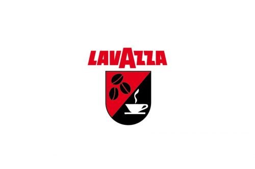
Also, we should add that below the wordmark, the company placed a shield divided into two fields. The top housed three black coffee beans over the red background, while the second field housed a steaming white cup over the black background.
1950
The shield and wordmark merged. Now, the name of the brand in white was placed inside a rectangle divided into two fields by a diagonal bar. Similar to the previous logo, one field was black while the other field was red.
Over the following decade, the company experimented with the proportions of the “A” making it larger in comparison with other letters. Also, additional words (in yellow or white) were added from both sides.
In addition to the rectangular-based primary logo, the company also used a simpler wordmark featuring only the name of the brand. It could be given in different colors depending on the color of the packaging (red on the beige packaging, yellow, white, black, orange, etc.)
1970
A black-and-white print material captured the first version where the lower part of the “A” was leveled up – it was not lower than other letters anymore.
In this logo, which was designed by Armando Testa, you could see a stylized hand holding a full cup, which was “standing” on the wordmark.
1986
The hand and the cup were replaced by the steam going out of the “V” as if it had been a cup. The 3D effect was gone. The logo was designed by Di Robilant.
1991
The most obvious alteration was that a red horizontal bar appeared below the wordmark. Yet, there were also other modifications. The steam was redrawn, while the type grew slightly lighter and more elegant. It was built on the interplay of thin and thick strokes.
The author of this version was again Di Robilant.
1992
Di Robilant redrew the steam making it larger – it now filled a whole square above the wordmark. In addition to black and white, red was added to the steam. It was now going out of the “A” instead of the “V.”
The lettering “Caffe’ Espresso” was added below. However, it was occasionally replaced by the familiar red bar.
1994
The redesign made by the Testa studio included not only an updated type but a completely different palette, too.
The type grew heavier, which made it closer to the older versions. The lettering in white was now placed inside a dark blue square or circle.
2012
There was some experimenting with the blue. The result looked somewhat muted in comparison with the brighter predecessor. You could see a stylized cup in white next to the wordmark in some versions. The current emblem is typically blue on the white background. The text “Torino, Italia, 1895” is often added.


