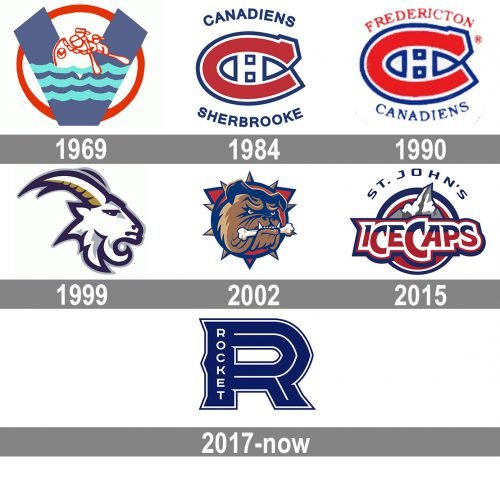
The Laval Rocket (also known as The Rocket de Laval) is the Montreal Canadiens‘ AHL affiliate team. It used to play under the name of the St. John’s IceCaps.
Meaning and history
Laval Rocket, an ice hockey team based in Laval, Quebec, Canada, was founded in 2015 by the Montreal Canadiens of the National Hockey League (NHL). As an affiliate of the Canadiens, Laval Rocket plays in the American Hockey League (AHL), serving as a primary development venue for players destined for the NHL. The inception of the team was part of a broader strategy by the Canadiens to localize their developmental efforts, providing a closer and more integrated system for nurturing their future stars.
Throughout its history, Laval Rocket has been recognized for its strong performance and contribution to the development of ice hockey talent. While the team has not yet secured major championships like the Calder Cup, its impact is evident in the quality of players who have graduated to the NHL, contributing significantly to the Montreal Canadiens’ lineup. Many of these players have gone on to achieve considerable success, underlining the effectiveness of Laval Rocket’s developmental program.
As of the latest season, Laval Rocket continues to play a pivotal role in the AHL, maintaining a competitive edge and striving towards higher achievements. The team’s current position reflects a commitment to excellence and a steady progression towards becoming a powerhouse in the AHL. This trajectory not only benefits the Montreal Canadiens but also enriches the broader ice hockey landscape by fostering high-caliber talent.
What is Laval Rocket?
Laval Rocket is a professional ice hockey team in the American Hockey League (AHL), serving as an affiliate of the NHL’s Montreal Canadiens. The team, focused on developing young talent, plays a key role in preparing players for the NHL.
1969 — 1984
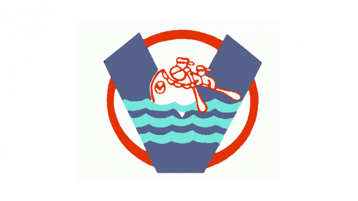
The very first logo of the club saw the light in 1969 and stayed as an official one for more than a decade. It was a light and elegant badge, naive yet typical for its times. The stylized blue “V” with a light wave pattern was set in the middle of a circle with a thick red outline. The contoured red drawing with two men in a boat was set on the top part of the letter. No lettering was written on the badge. The color palette, cleanliness, and simplicity of the logo contours — that’s what made the badge unique and memorable.
1984 — 1990
The redesign of 1984 brought character and strength to the Sherbrooke Canadiens visual identity. The blue and red color palette remained, but got stronger and deeper — both shades got calmer and darker. The new concept was composed of a stylized enlarged letter “C”, with a short serif on its top part. The letter was horizontally extended and outlined in white and blue. Inside the red “C” there was a small square white “H” outlined in blue. As for the full wordmark, it was arched above and under the emblem, with the “Canadiens” in the uppercase on top, and the “Sherbrooke” at the bottom. Both lines were executed in a simple and bold sans-serif font with clean contours of the letters.
1990 — 1999
The name of the club was changed to the Fredericton Canadiens in 1990, and the logo was redrawn in the same year. The concept of the emblem remained the same, but the color palette became brighter and lighter. As for the inscription, it was now in both red and blue, with the “Fredericton” in red arched above the emblem, and the blue “Canadiens” under it. The wordmark switched its strong and confident sans-serif typeface to an elegant serif with thinner lines.
1999 — 2002
Something completely different from all the previous logo versions was brought up by the club to their official insignia in 1999. No more stylized letters, no more wordmarks, only a modern and sleek image of a goat. That was a portrait of an animal in profile, turned to the right. The portrait was executed in thick navy blue contours with thinner gray accents, and the two sharp long horns featured dark gold strokes. It was a clean and professionally executed badge, evoking a sense of power, energy, and commitment.
2002 — 2015
The club switched to a new mascot in 2002. The elegant and graceful goat was replaced by a dangerously looking bulldog. It was also just the head of the animal on the badge, but this time it was drawn over a solid blue circle with a blue and red frame decorated with numerous spikes. The dog was holding a white bone in its mouth, and the red eyes of the mascot made the badge look a bit scary and reflected the strength and masculinity of the club, along with their willingness to win and no fear to fight.
2015 — 2017
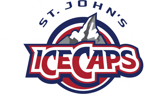
In 2015 the club’s name was changed to the St. John’s IceCaps, so the new logo has been designed in the same year. It was a cool modern badge in a blue, red and white color palette, with some gray additional details. The circular emblem featured a solid red background and a double blue and white framing. The body of the insignia was overlapped by an extra-bold wordmark in a custom typeface, where some of the uppercase letters featured elongated lines with sharptails. The inscription boasted a blue and red pattern and was set on a white banner, which was repeating the contours of the letters and was outlined in red and blue. Above the logotype, the gray and white ice mountain was drawn, with its peak coming up off the framing and pointing to the “St. John’s” arched lettering in blue capitals.
2017 — Today
The logo for the 2017/18 playing season was developed by the agency lg2. The emblem is built around a large “R,” which is a unique take on the spiky, multi-stroke, inline aesthetic of sports logos. There’re a lot of small details inside the “R.” The primary Rocket de Laval logo can be placed over a white and red flag.
Colors
The main version of the Laval Rocket logo features dark blue and white, and it can also feature red for the flag background.


