

![]() Lansing Lugnuts Logo PNG
Lansing Lugnuts Logo PNG
The Lansing Lugnuts are a professional minor league baseball team based in Lansing, Michigan. They are owned by the Jackson Sports Group. The team operates in the Midwest League and serves as the Class A affiliate of the Oakland Athletics.
Meaning and history
![]()
The Lansing Lugnuts is a professional Minor League Baseball team based in Lansing, Michigan. The team was founded by Tom Dickson and Sherrie Myers in 1996. They play their home games at Cooley Law School Stadium, which has a seating capacity of approximately 11,000.
Throughout their history, the Lugnuts have achieved several notable accomplishments. They have won multiple Midwest League championships, with victories in 1997, 2003, and 2007. The team has also been a part of the playoffs in various seasons, showcasing their consistent performance on the field.
As of 2023, the Lansing Lugnuts continue to compete in the Midwest League as an affiliate of the Oakland Athletics. They serve as a crucial developmental team, nurturing young talent and preparing players for the next level of professional baseball. The Lugnuts maintain a strong fan base and are committed to providing an exciting and enjoyable baseball experience for their supporters.
What is Lansing Lugnuts?
The Lansing Lugnuts is a minor league baseball team based in Lansing, Michigan. They are part of the Midwest League and serve as an affiliate of the Toronto Blue Jays.
Primary symbol
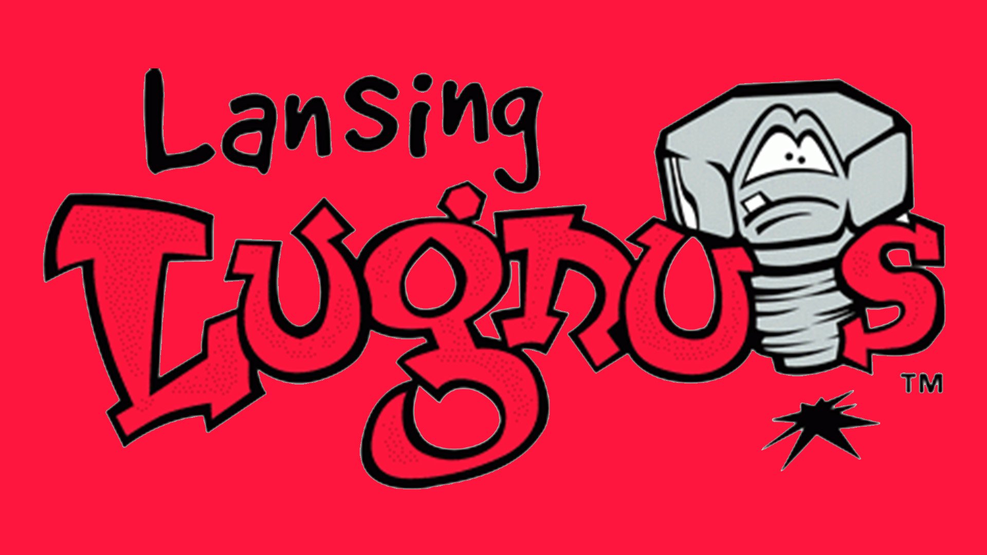
The centerpiece of the Lansing Lugnuts logo is an anthropomorphized grey lugnut forming the “T” in the wordmark “Lugnuts.”
Cap emblem
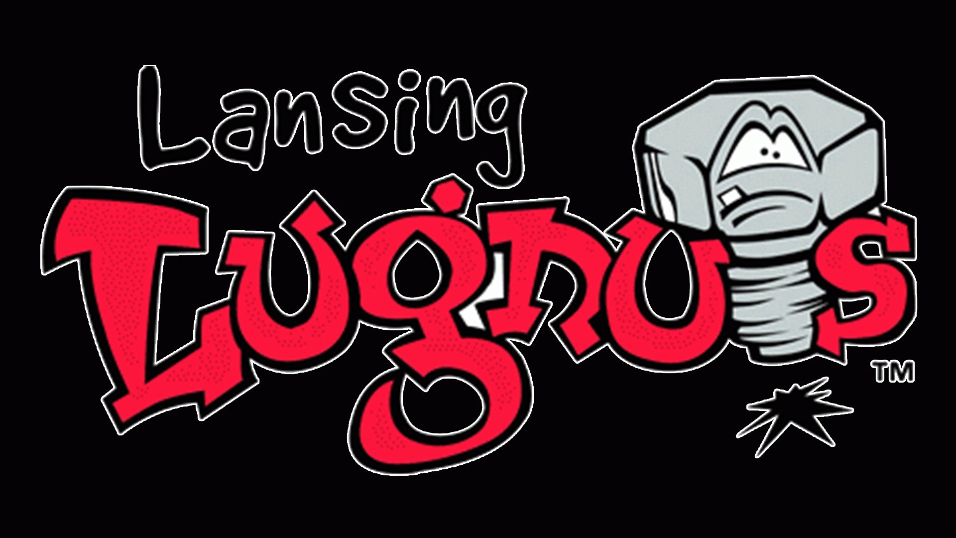
The same lugnut is positioned at a slightly different angle. The background is red.
Colors
![]()
The three-color palette is comprised of a bright shade of red, grey, black, and white.


